New Concepts

New Concepts

  • عالی

    رای: 126 62.4%
  • خوب

    رای: 56 27.7%
  • متوسط

    رای: 13 6.4%
  • بد

    رای: 7 3.5%

  • مجموع رای دهندگان
    202
  • نظرسنجی بسته .

کدخدا

مدیر بازنشسته

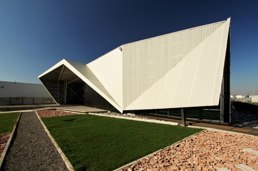
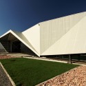
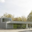
Ecolodge by Laetitia Delubac and Christian Félix


Paris architects Laetitia Delubac and Christian Félix have completed a holiday home and guest house in Siwa, Egypt.

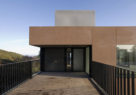
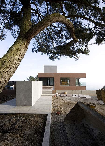
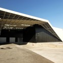
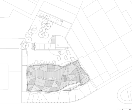
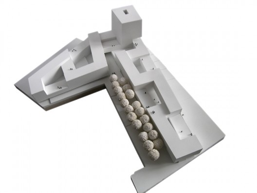
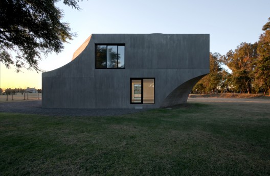
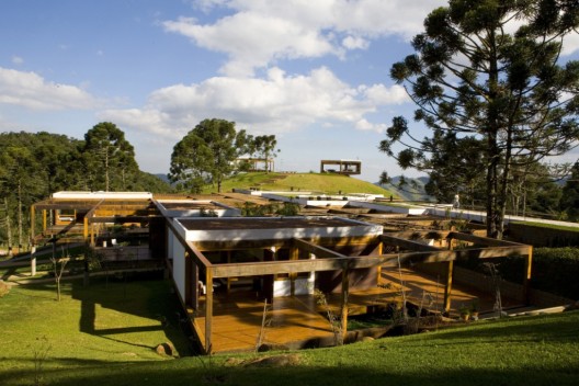
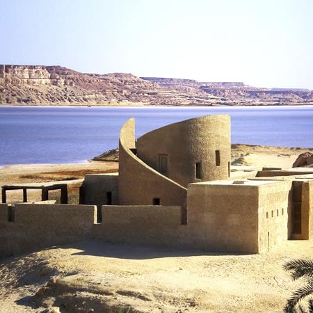
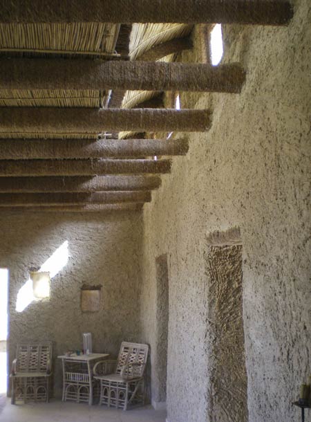
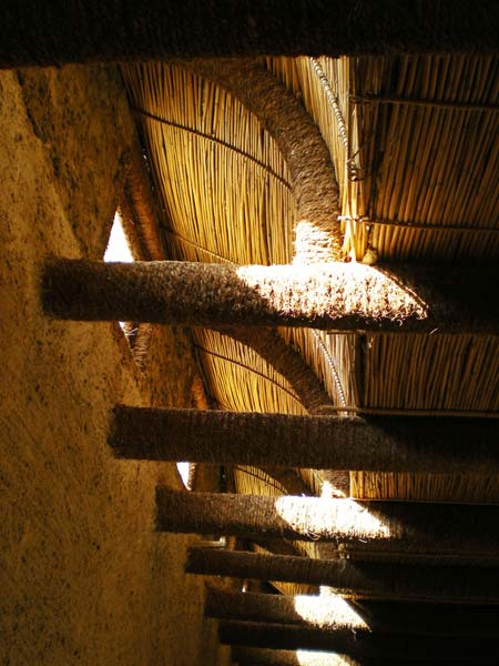
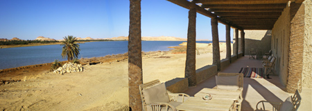
Called Ecolodge and situated overlooking the desert, the building is constructed from locally-available materials including mud, sun-fired bricks, palm wood, reeds and stone.

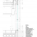
The walls are made of a traditional local building material called kershef that consists of mud, sand and salt from the nearby salt lakes.

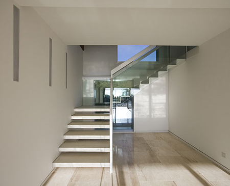
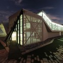
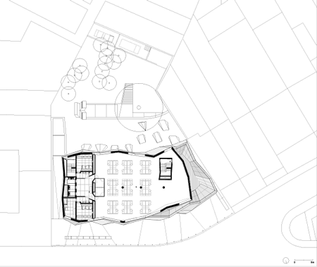
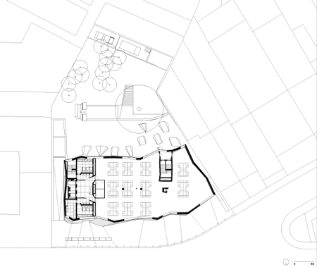
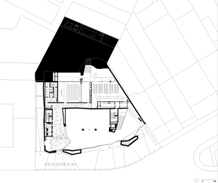
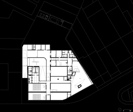
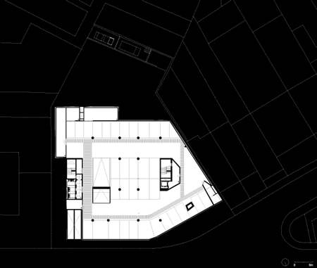
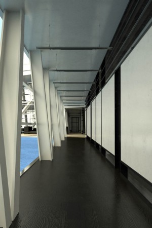
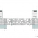
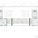
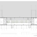
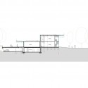
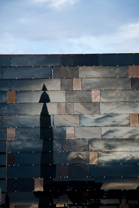
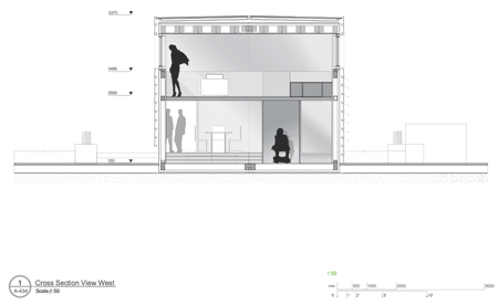
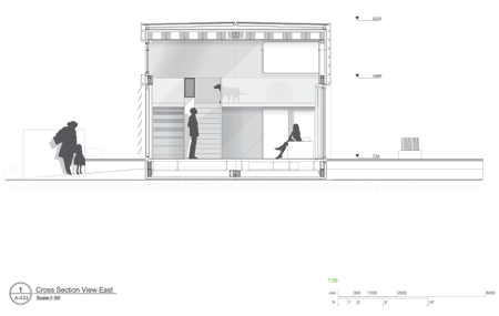
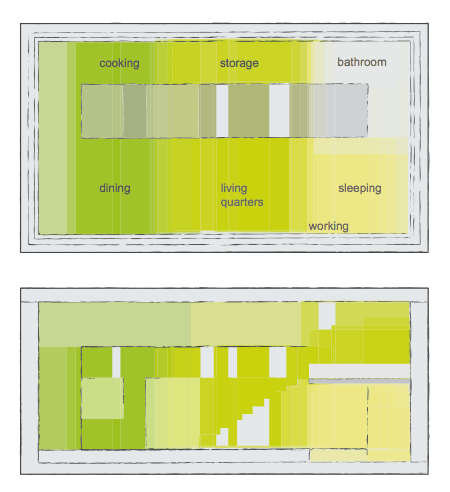
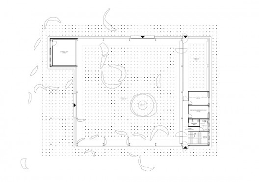
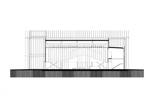
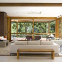
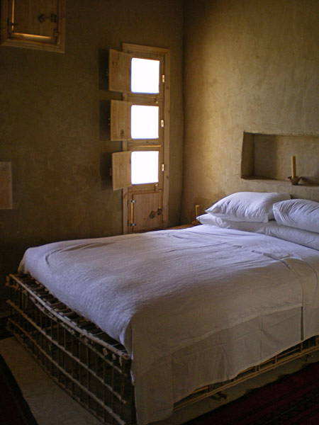
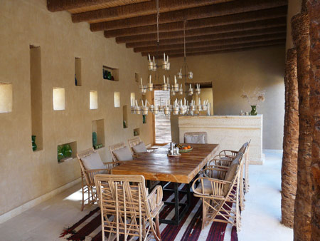
Intended as a retreat, the building incorporates guest rooms with patios, courtyards and gardens arranged around a central tower for the owners’ rooms.

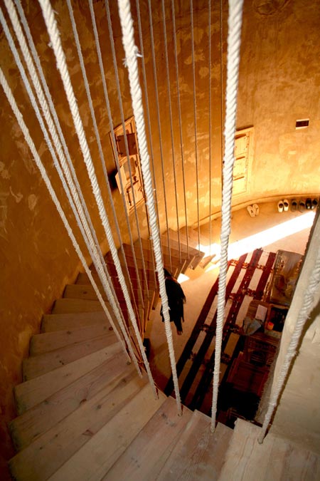
The tower draws air upwards from a water basin to cool the rooms.

Photographs are by Laetitia Delubac.

Here’s some more information from the architects:

A retreat in the Egyptian desert.
A retreat which also is a guest house.
A retreat fully dedicated to contemplation and rest.

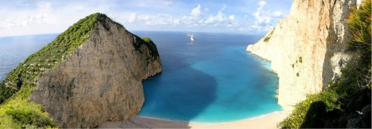
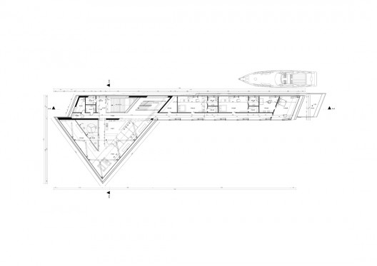
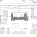
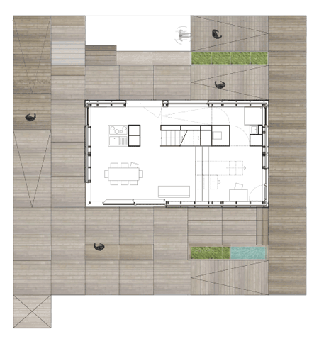
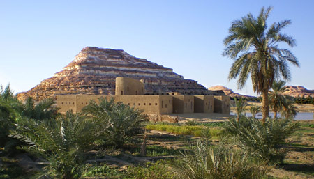
The piece of land, 35 x 35 m, is located in the peninsula of Siwa oasis at the bottom of Adrere Amellal (“white mountain” in tasiwit, the Berber dialect of this area).

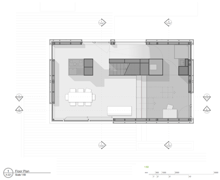
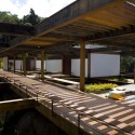
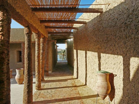
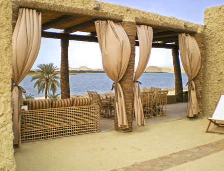
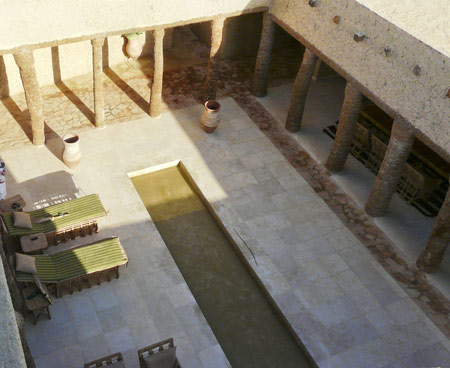
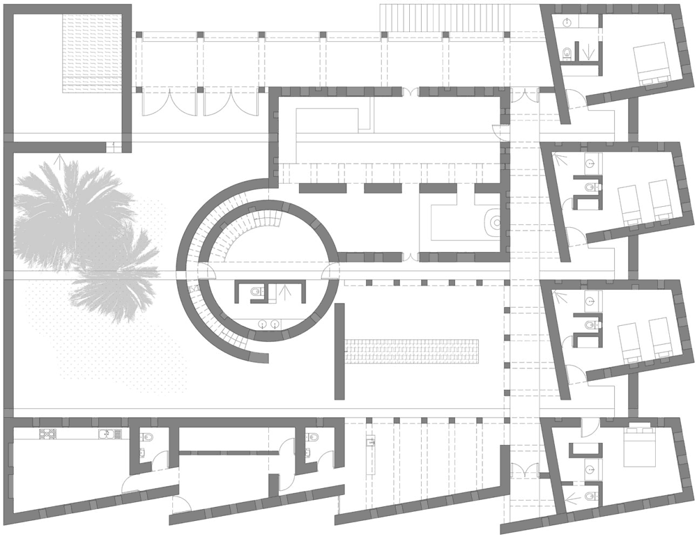
We have chosen to dilate the project in order to cover the plot completely. This allows to provide as many patios as guest rooms, closed courtyard and garden; so many quiet places facing the desert.

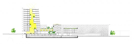
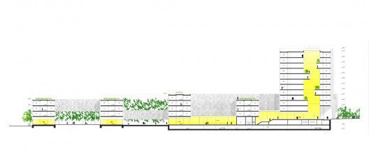
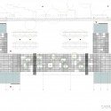
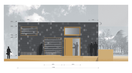
Facing the four viewpoints that this site offers and the four cardinal points, four distinct façades reply to.

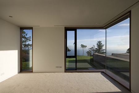
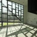
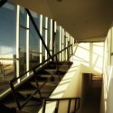
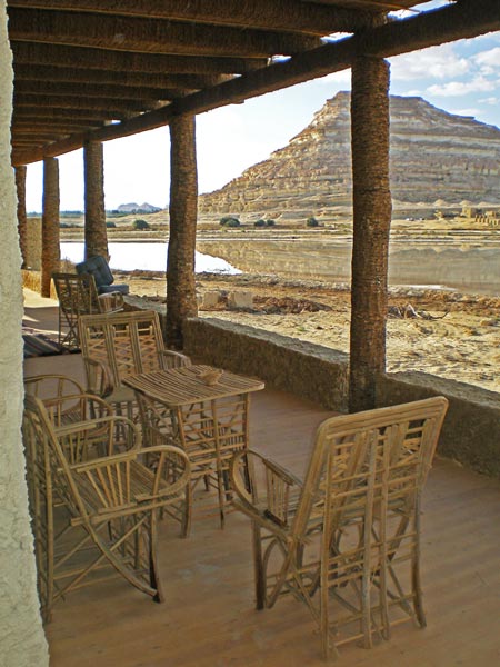
The main living room in the north is protected from direct sun. It opens onto a long pergola looking over the salt lake.

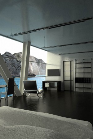
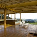
In the west, the guest rooms look over the Adrere Amellal. Varied views whether you are standing, sitting or lying down.

In the south, the façade evenly bored with minimal openings to the palm grove, rampart against sandy winds, borders staff quarters.

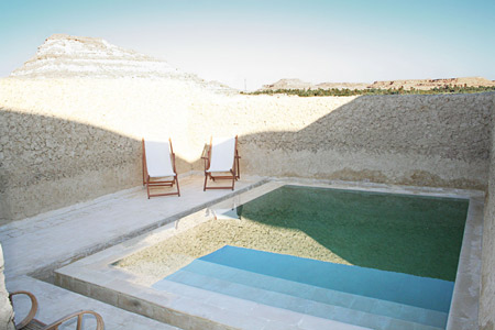
Finally in the west, towards the gates to desert, the garden and the swimming pool are isolated from the sole neighbour by a high wall in earth fissured on an ad hoc basis.

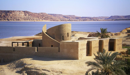
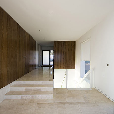
Here, quite isolated, the house was built with materials made available by desert, oasis and salt lake: mud, sun fired bricks, palm wood, reeds, red stone and salt stone.

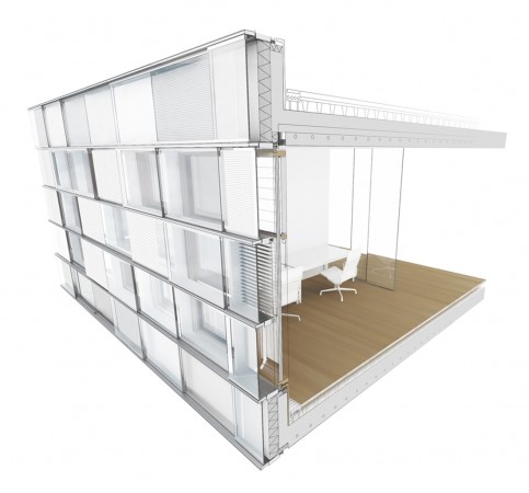
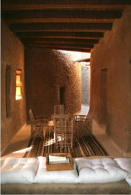
Walls are built by local craftsmen with kershef, a traditional building material made out of mud, sand, and sun-dried salt harvested from the Siwa’s salt lakes. In addition to blending in with the surrounding natural environment, kershef acts as a natural insulator, keeping indoor air temperatures mild in both hot and cold seasons.
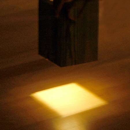
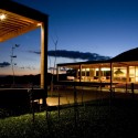
No electricity in the house. Niches have been installed within the thick walls in kershef to place candles.
A spring spurting out in the bottom of the mountain, not very far in the south, irrigates the palm grove and continuously feeds the kitchen and bathrooms with fresh and healthy water, as well as a small pool and the basin at the centre of the peristyle intended for cooling the courtyard and adjacent rooms.
Waste water treatment is ensured with reed grove.
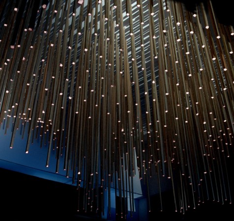
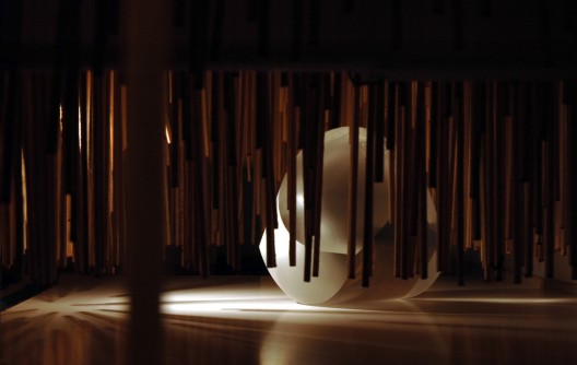
The tower, master room of the property has a natural air conditioning system using draughts: warm air in the rooms is vented within its two walls for fresh air coming from evaporation of water of the basin in the centre of the courtyard.
It welcomes the owner’s suite and dominates the whole house. The terrace roof offers panoramic views of the exceptional landscape.
Architects: Laetitia Delubac and Christian Félix architects, Paris, France
Location: Siwa, Egypt
Client: Private
Project Area: 390 sqm
Project year: 2004-2007
Photographs: Laetitia Delubac


king kurosh

عضو جدید
MAXXI National Museum of XXI Century Arts by Zaha Hadid

MAXXI National Museum of XXI Century Arts by Zaha Hadid

MAXXI National Museum of XXI Century Arts by Zaha Hadid


MAXXI National Museum of 21st Century Arts, Rome, 2009.
photo © Roland Halbe
Image Courtesy of Zaha Hadid Architects

MAXXI National Museum of XXI Century Arts by Zaha Hadid
Total site area:
29,000 square meters
Exterior spaces: 19,640 square meters
Interior spaces: 21,200 square meters
Display space: 10.000 square meters
Services (auditorium, libraries, cafeteria, restaurant, etc.): 6,000 square meters
MAXXI art: 4.077 square meters
MAXXI architecture: 1,935 square meters​
MAXXI National Museum of 21st Century Arts, Rome, 2009.
photo © Roland Halbe
Image Courtesy of Zaha Hadid Architects
MAXXI National Museum of XXI Century Arts by Zaha Hadid
text by Marcia Argyriades for Yatzer
Designed by Zaha Hadid Architects, the MAXXI National Museum of XXI Century Arts, instituted by the Italian Ministry for Cultural Heritage and Activities is Italy’s first national public museum dedicated to contemporary creativity.

Zaha Hadid, the winner of the 1999 international design competition for this project is currently approaching completion in Rome’s Flaminio neighborhood, on the site of the former Montello Barracks. Since 2003 an experimental and innovative construction site has been working to complete this new, ultramodern and contemporary museum. The museum runs over a surface area of 27,000 square meters, the complex was designed in such a way that it acts as home to two individual institutions: MAXXI Art and MAXXI Architecture. The MAXXI’s 27,000 square meters include in addition to the two museums, an auditorium, a library and media library, a bookshop, a cafeteria, temporary exhibition spaces, various open spaces for live events, commercial activities, workshops and spaces of study and recreation.​
MAXXI National Museum of 21st Century Arts, Rome, 2009.
Image Courtesy of Zaha Hadid Architects
Zaha Hadid designed a museum where form follows function. The building is distinguished by two key architectural elements _ concrete and glass. The exposed concrete walls set the boundaries of the exhibition halls and establish the interweaving volumes, while the transparent glass roof modulate and filters natural light passing in. In this project the two museums - MAXXI Art and MAXXI Architecture – rotate around a large, double storey atrium, the point of connection with the permanent collection galleries and temporary exhibition spaces, the auditorium, reception area, cafeteria and bookshop. While the arrangement of the concrete walls, the glass roof and the steel stairs and columns characterizes the neutral appearance of the display areas, while portable panels ensure the plasticity of their use. The organic and flowing forms and the variation of the interweaving different levels in combination with the natural light flowing in create a highly complex spatial and functional experience that offers ever-changing unexpected views from the interior towards the open spaces.​
MAXXI National Museum of 21st Century Arts, Rome, 2009.
photo © Roland Halbe
Image Courtesy of Zaha Hadid Architects
An interesting thing about the museum in Rome is that it is no longer an object, but rather a field, which implies that many programs could be attached to the museum. It’s no longer a museum, but a center. Here we are weaving a dense texture of interior and exterior spaces. It’s an intriguing mixture of permanent, temporary and commercial galleries, irrigating a large urban field with linear display surfaces. It could be a library; there are so many buildings that are not standing next to, but are intertwined and superimposed over one another. This means that, through the organizational diagram, you could weave other programs into the whole idea of gallery spaces. You can make connections between architecture and art - the bridges can connect them and make them into one exhibition. That gives you the interesting possibility of having an exhibition across the field. You can walk through a whole segment of a city to view spaces. In Rome, the organization will allow you to have exhibitions across the field, but they can also be very compressed, so you have a great variety.
Zaha Hadid
MAXXI National Museum of 21st Century Arts, Rome, 2009.
photo © Roland Halbe
Image Courtesy of Zaha Hadid Architects
The projects interior finishes and furnishings are going to be completed within this year and the exhibition design and official inauguration of the museum will take place in the beginning of 2010. The form and the design which was given to this program has a flowing aspect which is actually very encouraging for the visitor as a museum is asked to function in this way. The form has a continuous flow and asks of the visitor to keep moving in the same pace that the building progresses. The architecture and the materials used enhance the natural light which is cleverly controlled through the interior architectural form. The natural light allows for the optimum natural lighting of the art works as well as the other pieces exhibited. The concrete walls create the perfect background setting to promote the arts, while the high ceilings with a maximum height of 22.90 meters make room for important pieces to be exhibited. Nonetheless, the intertwining structures are truly fascinating as all of Zaha Hadid’s works are. As an architect Hadid has managed to create the impossible – possible, and to amaze us with the unique forms which she and her architectural team design for projects worldwide.​
MAXXI National Museum of 21st Century Arts, Rome, 2009.
Image Courtesy of Zaha Hadid Architects
The MAXXI National Museum (via Guido Reni, 2f 00196 Rome/Italy) is focused on promoting the arts and architecture through the collection, conservation, study and dissemination of the most current movements. To date, the MAXXI Art collection contains over 300 works by such artists as Boetti, Clemente, Kapoor, Kentridge, Merz, Penone, Pintaldi, Richter, Warhol and others of equally prominent persons. The MAXXI Architecture collection features the personal archives of Carlo Scarpa, Aldo Rossi, Pierluigi Nervi and others, as well as projects by contemporary architects such as Toyo Ito, Italo Rota and Giancarlo De Carlo, together with the photographic collections of the Atlante italiano and Cantiere d’autore projects. The official inauguration of the MAXXI National Museum is scheduled for 2010.​
MAXXI National Museum of 21st Century Arts, Rome, 2009.
Image Courtesy of Zaha Hadid Architects
About Zaha Hadid Architects //
Zaha Hadid is an architect who constantly challenges the known limits of architecture, urban planning and design. Through her research, Zaha Hadid pursues a continuous exploration focused on defining new spatial concepts. Fundamentally for Zaha Hadid it is the relationship between architecture and landscape that, when combined together, produces unexpected results and dynamic forms. At present Zaha Hadid is working on a significant number of projects, including: the Aquatic Center for the 2012 London Olympics; the Signature Towers in Dubai; the Performing Arts Center in Abu Dhabi; the Opera Theater in Guangzhou, China; private residences in the United States and Russia; and master plans in Spain, Istanbul and the Middle East.​
MAXXI National Museum of 21st Century Arts, Rome, 2009.
photo © Roland Halbe
Image Courtesy of Zaha Hadid Architects
 

کدخدا

مدیر بازنشسته
Gimpo Art Hall by G.Lab*


Seoul architects G.Lab* of Gansam Partners have unveiled their proposal for an art centre with a branch-like structure for Gimpo, South Korea.


Called Gimpo Art Hall, the design is inspired by the image of a tree, symbolising the area’s agricultural history.

The bulk of the building is elevated, creating a public plaza and walkway at street level.

Visitors enter via steps up to the first floor.

Construction is due to begin in 2010.

More by G.Lab* of Gansam Partners on Dezeen: Casamoro Condominiums.

Here’s some text from the architects:

Gimpo Art Hall
The proposal for the Gimpo Art Hall embraces the city’s status as an emerging regional hub while reflecting upon history and local environment.

This Art Hall aims to become a signature destination in the city.

The image of a tree was chosen to reflect the culture of Gimpo’s agrarian past and also as a symbol of the central gathering space for the community.

The concept for the design was derived from considering the City’s History and newly found economic status in South Korea.

Situated on the southern bank of the Han River, Gimpo is a city in the process of transforming from an agricultural economy towards a contemporary consumer-based economy.

Flow and Branch:
Fluidity and Linkages describes the culture of this region.

The ability to adapt and stay the course, while connecting to and impressing upon a variety of cultures and economies are traits.

Aesthetically, the Structure sprouts from the ground, branches, multiplies, and envelopes the building Core and Nesting it above the street.

This structural-aesthetic reinforces Gimpo’s roots and modernization, while creating an interesting play on light and shadow.

The site also offers opportunities of pedestrian connectivity and guided views.

Sub-Basement Plan. Click for larger image
The Art Hall is located on the eastern end of a city block, with street access in all directions excluding the west and views toward a park and mountainscape to the south and southeast.

Basement Plan. Click for larger image
There is a pedestrian friendly walk connecting the site to the new gymnasium opposite the eastern road which is incorporated in the design. The emphasis on pedestrian access is inherent and accentuated in the design.

Ground Floor Plan. Click for larger image
Float, Cover, and Reveal:
By lifting the building mass above the street level, a covered pedestrian plaza is created. The formal Entrance is also elevated, resulting in a public viewing deck which amplifies unobstructed sightlines.


First Floor Plan. Click for larger image
The Floating Theater nested inside the building volume along with the branching facade allows for varying degrees of apertures /openings which punctuate views from the interior and reveal the city/landscape beyond.

Second Floor Plan. Click for larger image
“Growth with Elegance and Sophistication, re-imagined in the Gimpo Art Hall”
Architect: G.Lab* by Gansam Partners
Location: Gimpo, South Korea
Client: City of Gimpo
Project architect: Chuloh Jung
Design team: Youn-Sook Hwang, Lawrence V. Ha, Sang-Hyun Son, Krittin Campitak, Kyung-Mi Ahn, Namjoo Kim
Project area: 8,150 sqm
Competition Year: 2009
Construction Year: 2010
Status: Construction Documentation Phase

Third Floor Plan. Click for larger image
 

کدخدا

مدیر بازنشسته
recast House by FKL Architects

November 16th, 2009

Dublin practice FLK Architects have completed a precast concrete residence overlooking Dublin Bay in Howth, Ireland.


Called Precast House, the project comprises three separate volumes emerging from the sloping site – a house, garage and swimming pool.

The three buildings are made of polished precast concrete, combined with large windows and glass balustrades to reflect the surrounding landscape.

More about FKL Architects on Dezeen: A House

Photographs are by Verena Hilgenfeld.

Here’s some more information from the architects:

Precast House
The site is long, sloping, falling towards cliffs and the sea.

Entering the site the viewer’s eye is drawn to the horizon, the viewer is pulled towards the abstracted line.

The project is defined in conceptual terms as three discrete forms – garage, house and swimming pool – each emerging from the landscape, their respective heights being determined by the use of each form.

The relationship between the three elements is a casual one, slipping past each other, sliding towards the sea.

The three forms are detailed in the same manner and use the same material, polished precast concrete.

The surface tension across the facades is maintained by the flush detailing of the windows and the glass balustrades.

The reflected landscape is visible in both materials glass and polished precast concrete.

At first floor level (entry level) the plan is open with the primary living spaces and entrance having an overlapping relationship.

Within the field of the first floor a number of walnut clad timber elements are slipped between floor and ceiling planes, defining the flow of the space and adding richness to the interior.

At ground floor level (sleeping level) the situation is more introverted.

The figure ground relationship is the reverse of the first floor, the plan is treated as a solid mass that has been carved out to make a cruciform circulation space with the bathrooms and bedrooms retained inside the remaining form.


کدخدا

مدیر بازنشسته
Rotterdam Market Hall by MVRDV


Construction has begun on a combined residential project and market hall in Rotterdam, designed by Dutch architects MVRDV.


Called Rotterdam Market Hall, the building will comprise 228 apartments forming a tunnel over the market hall, glazed at each end.

The market hall itself will house 100 market stalls, shops and restaurants.

1,200 parking spaces and a supermarket will be located underground.

Each apartment will feature a balcony on the exterior of the building and a window onto the market hall below.

The project is due to be completed in 2014.

More information on the project website.

Images are by Provast.

Here are some more details from the architects:

Construction Start MVRDV Market Hall
Today the mayor of Rotterdam, Ahmed Aboutaleb and city councilor Hamit Karakus have officially started the construction of the new Rotterdam Market Hall. The arched building located in the centre of Rotterdam, developed by Provast and designed by MVRDV is a hybrid of public market and apartment building. Completion is set for 2014. Total investment is 175 million Euro with a total surface of 100.000 m2.
At the place where Rotterdam was founded, near the historic Laurens church, the Market Hall will be realized as a new urban typology. The Market Hall is a sustainable combination of food, leisure, living and parking. Fully integrated to enhance and use the synergetic possibilities of the different functions, a public building emerging from housing.
An arch of 228 apartments, of which 102 for rent, will create a large hall which houses 100 market stalls, shops and restaurants, 1200 parking spaces and an underground super market. The apartments will all have a balcony on the outside and a window to the inside of the market. Insulation will prevent any unwanted effects. The 40 meter tall and wide opening of the front and back will be covered with a flexible suspended glass façade, allowing for maximum transparency and a minimum of structure. The interior of the arch will display market produce.
The project with a total of 100.000 m2 is set to be completed in 2014 and part of the current regeneration of Rotterdam’s post war centre. Project developer Provast realizes the building, Unibail Rodamco invested in the shops and restaurants whilst Housing Corporation Vesteda will manage the rental apartments, making the building a socially integrated part of the city.
 

کدخدا

مدیر بازنشسته
Singapore Pavillion for Shanghai World Expo 2010


By Sebastian J — Filed under: News , China, Pavilion, Shanghai 2010, Singapore

The Singapore Pavilion at the Shanghai World Expo in 2010 is to be called Urban Symphony – a tribute to how Singapore houses a delicate harmony of cultures coexisting together in a city-state.
Designed by Kay Ngee Tan Architects, the theme is best expressed in the pavilion’s architecture, one which evokes images of a musical box. It forms an orchestra of elements and a symphony for the senses – from the choreography of the plaza’s water fountain, the rhythm of fenestrations on the façade, the interplay of sounds and visuals, to the mélange of flora on the roof garden.
Pictures and exhibits of Singapore adorn the way to the atrium space and main hall of the first floor, where visitors will enjoy various activities; taking in performances right up to the expanse of the second floor’s column-free open space. Topping off Singapore’s reputation as a much-admired garden city is the rooftop’s A Garden in the Sky, which ably captures the essence of life in Singapore. More info in the pavilion’s official website. More images and a video after the break.


کدخدا

مدیر بازنشسته
....:::Behzad Zandi:::...

http://groups. yahoo.com/ group/zuas/


Huanacu Warehouse & Office / tFPS


By David Basulto — Filed under: Institutional Architecture , Offices , Selected , Chile, Steel, tFPS

© nico saieh


Architects: tFPS
Location: Santiago, Chile
Project team: Eduardo Fam Mancilla, Diego Pinochet Puentes, Leonardo Suárez Molina
Structural engineer: José Manuel Morales
Site area: 3,128 sqm
Constructed area: 1,670 sqm
Project year: 2006-2009
Photographs: Nicolas Saieh & tFPS


This Project, our first project as architects, started in 2006. It sets as the perfect projection of three recently graduated (in fact… graduating) architectural student´s concerns, about the discipline´s approach to the architectural project: One related to the formal exploration, a playfull one that can lead us to a differentiation to historical types of common architecture (typical boring boxes). Another, related to a rigorous technical approach (so the formal exploration can emerge in the reality), and finally a strong commitment, with elemental life situations that define the architecture (formal and technical approaches).
formal diagrams

The project can be described through three points.
The assignment

A big warehouse (with administrative offices and showroom), a “cool one”( just as the client request), one that can “stands out” in contrast to the typical industrial architecture of the close context of the project, but… as cheap as we can produce it (aprox $430 USD/sqm). A form that could respond to the internal logics of the company´s operation (charge and discharge of products, exhibition of these products in the showroom, administrative operations, etc).
© tFPS

floor plans

The restrictions


  1. A limited budget (enough to build a typical warehouse)
  2. Strict regulations of the zone (an industrial park near to the main airport of the city)
  3. About the internal operations of the company
This led us to a fundamental question: How can we operate on the form, responding to the requirements of the client and the building regulations of the zone, and beside fit into the small budget?.
© nico saieh

The equation that defines the problem was clear: client demands + building regulations demands + tight budget = a cool and unique building. Clearly , not an easy one…
The first approach to the problem solution, came from the idea of concentrate all the efforts to the exposed facades of the building (The site was defined by two streets), generating “perimeter activated by the program”(where liberties about building regulations were less strict) and leaving the production activities protected to the inside of the site.
model

The formal operation or “where final architecture emerge”

How to operate on the form, then?, Where to start?. Taking the basic idea of a normal box (basically, a typical storage building …a big shed) inverted. We started to think about this strong image , and the formal logic that we can explore and explode , to transform ( starting from the same surface area of the initial box), the most exposed faces of the building to receive the critical activities demanded for the client.
We use of a typical structure of industrialized steel frames (to let us have less cost in structural calculations), but operating from the folding of the skin (finally, the cheapest and more workable object in technical terms).
© tFPS

A series of foldings (mainly three operations), allowed us to generate the two fronts, that in terms of proportions and surface area, are the same of a regular industrial building, so in that way we can insert the different activities of the program and elemental situations (showroom, administrative facilities, truck access, etc):
Access: A first folding that allowed the access to the showroom through the corner, recognizing from a single view the two folded facades of the building.
© nico saieh

Work and view: A second folding of the west facade generates the office volume, allowing the views (the main demand of the client) to the future “los maitenes” park (hoping it will be ready in a year or two), separated from the industrial activities and with as much natural light as possible.
Work and production: Generating the larger folding to “rio itata” street, a big five meter overhang that forms the roof protecting the loading and unloading activities from rain and strong sun, connecting this space fluidly with the rest of the building.
© nico saieh © tFPS © nico saieh
© nico saieh
 

کدخدا

مدیر بازنشسته
XI National Museum of XXI Century Arts by Zaha Hadid


MAXXI National Museum of 21st Century Arts, Rome, 2009.
photo © Roland Halbe
Image Courtesy of Zaha Hadid Architects

MAXXI National Museum of XXI Century Arts by Zaha Hadid
Total site area:
29,000 square meters
Exterior spaces: 19,640 square meters
Interior spaces: 21,200 square meters
Display space: 10.000 square meters
Services (auditorium, libraries, cafeteria, restaurant, etc.): 6,000 square meters
MAXXI art: 4.077 square meters
MAXXI architecture: 1,935 square meters​
MAXXI National Museum of 21st Century Arts, Rome, 2009.
photo © Roland Halbe
Image Courtesy of Zaha Hadid Architects
MAXXI National Museum of XXI Century Arts by Zaha Hadid
text by Marcia Argyriades for Yatzer
Designed by Zaha Hadid Architects, the MAXXI National Museum of XXI Century Arts, instituted by the Italian Ministry for Cultural Heritage and Activities is Italy’s first national public museum dedicated to contemporary creativity.

Zaha Hadid, the winner of the 1999 international design competition for this project is currently approaching completion in Rome’s Flaminio neighborhood, on the site of the former Montello Barracks. Since 2003 an experimental and innovative construction site has been working to complete this new, ultramodern and contemporary museum. The museum runs over a surface area of 27,000 square meters, the complex was designed in such a way that it acts as home to two individual institutions: MAXXI Art and MAXXI Architecture. The MAXXI’s 27,000 square meters include in addition to the two museums, an auditorium, a library and media library, a bookshop, a cafeteria, temporary exhibition spaces, various open spaces for live events, commercial activities, workshops and spaces of study and recreation.​
MAXXI National Museum of 21st Century Arts, Rome, 2009.
Image Courtesy of Zaha Hadid Architects
Zaha Hadid designed a museum where form follows function. The building is distinguished by two key architectural elements _ concrete and glass. The exposed concrete walls set the boundaries of the exhibition halls and establish the interweaving volumes, while the transparent glass roof modulate and filters natural light passing in. In this project the two museums - MAXXI Art and MAXXI Architecture – rotate around a large, double storey atrium, the point of connection with the permanent collection galleries and temporary exhibition spaces, the auditorium, reception area, cafeteria and bookshop. While the arrangement of the concrete walls, the glass roof and the steel stairs and columns characterizes the neutral appearance of the display areas, while portable panels ensure the plasticity of their use. The organic and flowing forms and the variation of the interweaving different levels in combination with the natural light flowing in create a highly complex spatial and functional experience that offers ever-changing unexpected views from the interior towards the open spaces.​
MAXXI National Museum of 21st Century Arts, Rome, 2009.
photo © Roland Halbe
Image Courtesy of Zaha Hadid Architects
An interesting thing about the museum in Rome is that it is no longer an object, but rather a field, which implies that many programs could be attached to the museum. It’s no longer a museum, but a center. Here we are weaving a dense texture of interior and exterior spaces. It’s an intriguing mixture of permanent, temporary and commercial galleries, irrigating a large urban field with linear display surfaces. It could be a library; there are so many buildings that are not standing next to, but are intertwined and superimposed over one another. This means that, through the organizational diagram, you could weave other programs into the whole idea of gallery spaces. You can make connections between architecture and art - the bridges can connect them and make them into one exhibition. That gives you the interesting possibility of having an exhibition across the field. You can walk through a whole segment of a city to view spaces. In Rome, the organization will allow you to have exhibitions across the field, but they can also be very compressed, so you have a great variety.
Zaha Hadid
MAXXI National Museum of 21st Century Arts, Rome, 2009.
photo © Roland Halbe
Image Courtesy of Zaha Hadid Architects
The projects interior finishes and furnishings are going to be completed within this year and the exhibition design and official inauguration of the museum will take place in the beginning of 2010. The form and the design which was given to this program has a flowing aspect which is actually very encouraging for the visitor as a museum is asked to function in this way. The form has a continuous flow and asks of the visitor to keep moving in the same pace that the building progresses. The architecture and the materials used enhance the natural light which is cleverly controlled through the interior architectural form. The natural light allows for the optimum natural lighting of the art works as well as the other pieces exhibited. The concrete walls create the perfect background setting to promote the arts, while the high ceilings with a maximum height of 22.90 meters make room for important pieces to be exhibited. Nonetheless, the intertwining structures are truly fascinating as all of Zaha Hadid’s works are. As an architect Hadid has managed to create the impossible – possible, and to amaze us with the unique forms which she and her architectural team design for projects worldwide.​
MAXXI National Museum of 21st Century Arts, Rome, 2009.
Image Courtesy of Zaha Hadid Architects
The MAXXI National Museum (via Guido Reni, 2f 00196 Rome/Italy) is focused on promoting the arts and architecture through the collection, conservation, study and dissemination of the most current movements. To date, the MAXXI Art collection contains over 300 works by such artists as Boetti, Clemente, Kapoor, Kentridge, Merz, Penone, Pintaldi, Richter, Warhol and others of equally prominent persons. The MAXXI Architecture collection features the personal archives of Carlo Scarpa, Aldo Rossi, Pierluigi Nervi and others, as well as projects by contemporary architects such as Toyo Ito, Italo Rota and Giancarlo De Carlo, together with the photographic collections of the Atlante italiano and Cantiere d’autore projects. The official inauguration of the MAXXI National Museum is scheduled for 2010.​
MAXXI National Museum of 21st Century Arts, Rome, 2009.
Image Courtesy of Zaha Hadid Architects
About Zaha Hadid Architects //
Zaha Hadid is an architect who constantly challenges the known limits of architecture, urban planning and design. Through her research, Zaha Hadid pursues a continuous exploration focused on defining new spatial concepts. Fundamentally for Zaha Hadid it is the relationship between architecture and landscape that, when combined together, produces unexpected results and dynamic forms. At present Zaha Hadid is working on a significant number of projects, including: the Aquatic Center for the 2012 London Olympics; the Signature Towers in Dubai; the Performing Arts Center in Abu Dhabi; the Opera Theater in Guangzhou, China; private residences in the United States and Russia; and master plans in Spain, Istanbul and the Middle East.​
MAXXI National Museum of 21st Century Arts, Rome, 2009.
photo © Roland Halbe
Image Courtesy of Zaha Hadid Architects
 

کدخدا

مدیر بازنشسته
Vodafone headquarters by Barbosa & Guimaraes


November 23rd, 2009

Portuguese photographer Nelson Garrido has sent us his photos of the new headquarters for mobile phone brand Vodafone in Porto, designed by architects Barbosa & Guimaraes of Matosinhos in Portugal.


Called Oporto Vodafone Building, the project has a faceted concrete shell with angular windows.

The architects aimed to create a sense of movement and irregularity.

The building has eight floors, three of which are underground.

The ground floor comprises a shop, cafe and entrance hall.

Offices are located on the remaining storeys above ground, with parking and training facilities housed in the subterranean floors.

Photographs are copyright Nelson Garrido and used with permission. See our copyright policy.

Here’s some text from the architects:

OPORTO VODAFONE BUILDING, PORTUGAL 2006 – 2009
In July 2006, when we were invated to the new building competition, through the media, radio, television and newspapers we could notice the following slogan: “VODAFONE LIFE, LIFE IN MOTION.”

This sentence reflects the attitude and philosophy of Vodafone.

We believe that the new building should be faithful to this idea, adopting a dynamic image, conveying the sense of movement, challenging the static.

Seeking inspiration from painting, sculpture, photography, arts which had already faced this dilemma, the office building, designed usually linear, begins to become an irregular body, out of balance, with many faces in motion.

The formalization of this concept is based on the concrete, which through its plasticity, allows to create irregular and free-form shapes, working both as a structural solution and exterior appearence, creating a unique shape, a monolithic building, bringing cohesion and unity to the set.

The technical complexity of the building leads to a periphery structural solution, a shell of concrete, like an egg, reducing internal support to the two stairwells and three central pillars, allowing great versatility in its interior space use.

Functionally, the building has eight floors working three as underground.

On the ground floor, in addition to the auditorium, we have a store facing the Boavista Avenue, the cafeteria and office acess.

In the four upper floors appears the offices working as open-space with an accessible terrace.

In the underground, the floors -3 and -2, are working as car parking facilities and the -1 floor is occupied by technical areas and training rooms.


کدخدا

مدیر بازنشسته
New administrative building for BSU


By Sebastian J — Filed under: Offices , Germany, Hamburg, Rasmussen | Brunke | Sauer

© rasmussen | brunke | sauer


German office rasmussen | brunke | sauer shared with us their design of the new administrative building for BSU in Hamburg, Germany. It was an invited competition and they won the first prize ex aequo with three other offices (Sauerbruch Hutton, Behnisch Architects and GAP). More images and architect’s description after the break.
Situated in Hamburg Wilhelmsburg vis-à-vis the area of the IGS 2013 (International Garden Exhibition 2013) the new administrative building for the “Behörde für Stadtentwicklung und Ummwelt (BSU)” is one of the central buildings of the IBA 2013 (International Building Exhibition 2013).
It is integrated into a greater urban masterplan that aims on linking the central part of the city of Hamburg north of the river Elbe with the southern districts.
The aim of the new building itself is to concentrate the different units of the BSU that are nowadays distributed widespread at different locations in the central city. The building will house around 1400 working places plus additional functions and will cover an area of around 58000 m² in total.
Operating in the boundaries of the strict and dense conditions of the building lot defined by the urban master plan, a three dimensional sculptural building approach, integrating the landscape of the surroundings into the structure, is developed. Therefore it is possible to walk literally through the building without entering it. The strong meandered body of the building is culminating in a massive high point which functions as a landmark and widely seen symbol of the new BSU.
The monolithic white body of the upper floors seems like floating over the warm coloured ground floor. While the Ground floor, with its public functions is clearly inviting visitors to enter and explore the building the upper body, mainly containing office spaces, acts more diffuse. It is neither totally transparent nor is it a completely introverted. The perception lies in between.
The buildings façade is besides atmospheric and aesthetic parameters designed as an energetic active façade using phase change material to save solar energy that can be used time-delayed as thermal energy for the buildings energy household.
The façade is only a part of an overall energy concept that ensure a high standard for a low energy office building that was designed to get the DGNB (German Sustainable Building Council) Certification in Gold.
© rasmussen | brunke | sauer
 

کدخدا

مدیر بازنشسته
House on the Water / formodesign


Our friends from formodesign sent us House on the Water, a self-sufficient house for nomadic life offshore. Designed as a rental house for people who want to be independent it’s available only through water. It is located by Navagio beach, NW coast of the Greek Zante island.
The orientation was developed to maximize the use of solar energy. Strong decisions and consequence in driving its proportions guarantee the uniqueness of (formo)design. Dynamic and simple form are the result of the yach architecture interpretation. The core, made of concrete, is combined with steel cantilever structures. Foundation for the house is a concrete counterweight foot stabilizet with the sea bed pile system.The floating deck, which rises with the water level thanks to the railing installed in the core structure, leads you to the stairway. The top deck is available for the residents as well.
Eco-friendly features like the water desalination, energy accumulation, ventilation methods, water recycling, heat and energy consumption, tidal and solar energy systems are all there. HotW was designed to be sustainable. It is not only the installations, but it’s form and orientation. Vertical lines on the facade are the rails for computer driven shading system.
More images after the break.


کدخدا

مدیر بازنشسته
Rouen Grand Mare / Beckmann-N’Thépé architects


Architect: Beckmann-N’Thépé architects - Aldric Beckmann, Françoise N’thépé
Location: Rouen, France
Project Manager: Alice Auriau
Project Architect: Nicolas Gaudard, Laura Giovannetti
Assistant Architects: Nathanaëlle Baes, Frank-David Barbier, Caroline Huybrechts, Camille Lacoste
Landscape: Florence Sylvos (Paris)
Constructed Area: 950 sqm + patio
Project Year: 2008
Photographs: Stephan Lucas

On the basis of a town plan laid down by Nicolas Michelin agency, and more specifically on the site of an old 60s and 70s housing bar, the building designed by the architects introduces a cosiness that should encourage more dynamic social relations on the housing estate.

The buildings use an architectural style which is in keeping with the neighboring buildings designed by Marcel Lods and the slab constructions. Thereby creating a very horizontal look on the border of two sectors, one being the “rue César Frank” business area and the other the shopping precinct on the square side (cyberbase, doctor’s surgeries, etc.).

Divided by landscape designers Claire Gilot and Daphné Mandel-Bouvard, the planted patio highlights the project’s transparent, fluid, transverse qualities. The 2 plots are synonymous with sobriety, using basis but quality materials: metal for the roof and awning, placed over silk-screen printed glass on the facades.


site plan plan 01 plan 02
plan 03 plan 04 section
details
 

کدخدا

مدیر بازنشسته


The Silo Competition proposal by NL Architects


Amsterdam City Council recently held ‘The Silo Competition’ which involved the adaptive and reuse design for two former sewage treatment silos in the city’s Zeeburg district.
For the competition NL Architects proposed silos dedicated to climbing, sports and culture. In their design the existing structures were extended to the maximum height to benefit from the views.
The cultural silo consists of two theaters with dressing rooms and rehearsal spaces, spaces for workshops, exhibition spaces, music studios and a space for hair design. A bridge connects the silos at the height of the original roof level and office spaces will be positioned on top. The top level will be dedicated to a restaurant with 360 views and a roof terrace.
Seen at designboom. More images after the break.


کدخدا

مدیر بازنشسته


Solar Decathlon house by Technische Universität Darmstadt


Students of the Technische Universität Darmstadt in Germany have won the Solar Decathlon competition to design an energy-efficient solar-powered house.


Twenty teams of students from international universities competed to design and build solar-powered houses, which were constructed and exhibited at the National Mall in Washington, D.C.

Teams then competed in ten contests to gain points.

The winning design is a two-storey, cube-shaped building covered in two types of solar cells, is highly insulated and has automated lourve window shades to reduce unwanted heat-gain.

Furniture and appliances fold away or have several uses.

More details about the design on the Team Germany website.

Second place was awarded to the University of Illinois at Urbana-Champaign (see project website) and third place went to Team California: Santa Clara University, California College of the Arts (see project website).

The competition was organised by the U.S. Department of Energy.

Photographs are by Jim Tetro.

Here’s some more information from the organisers:

Team Germany
Technische Universität Darmstadt
Sustainability Is Skin Deep
Team Germany started with a “focus on the façade,” creating a house that is essentially a two-story cube. The surface is covered with solar cells: an 11.1-kW photovoltaic (PV) system made of 40 single-crystal silicon panels on the roof and about 250 thin-film copper indium gallium diselenide (CIGS) panels on the sides that are expected to produce an incredible 200% of the energy needed by the house. The CIGS component is slightly less efficient than the silicon but will perform better in cloudy weather. The façade’s highly insulating, custom vacuum insulation panels plus phase-change material in the drywall maintain comfortable temperatures. Automated louver-covered windows block unwanted solar heat.

The Team
The team is relatively small with only 24 students, mostly architects. But team member Sardika Meyer relates how many others took part. “Even my boyfriend, all the families and friends got involved,” she says. “We had so much support; it was really incredible.” Team Germany finished first in Solar Decathlon 2007, and the 2009 team has relied on members of the 2007 team for guidance.

The House
The Team Germany philosophy was to “push the envelope with as many new technologies as possible.” In particular, the house was designed to maximize PV production and use of the net-metering connection to the electric utility grid on the National Mall. The result is a two-story, cube-shaped building with PV panels on the roof and sides and a single multifunctional living area on the inside. Described by the team as an aesthetic solar design, the house has a bed and other furniture and appliances that fold away or serve multiple purposes.

The Technology
The extensive PV panel deployment is the most notable feature of the Team Germany house, but other technologies include:

  • Custom-made vacuum insulation structural panels
  • Phase-change material in both walls (paraffin) and ceiling (salt hydrate)
  • Automated louver-covered windows
  • A boiler integrated into the heat pump system that allows the system to provide domestic hot water as well as heating and cooling.

House Highlights

  • A two-story cube shape that provides maximum dimensions and surface area
  • A surface area that is almost totally covered with PV panels—single-crystal silicon on the roof, thin-film copper indium gallium diselenide on the sides
  • An expected production of twice the electricity needed
  • A single multifunctional space inside

About Solar Decathlon
For three weeks in October 2009, the U.S. Department of Energy will host the Solar Decathlon—a competition in which 20 teams of college and university students compete to design, build, and operate the most attractive, effective, and energy-efficient solar-powered house. The Solar Decathlon is also an event to which the public is invited to observe the powerful combination of solar energy, energy efficiency, and the best in home design.

Exact dates of the 2009 event are:

  • Oct. 8-16—Teams compete in 10 contests
  • Oct. 9-13—Houses are open to the public
  • Oct. 15-18—Houses are open to the public
  • Oct. 19-21—Teams disassemble their houses.
The Solar Decathlon houses will be open for public tours 11 a.m.­–3 p.m. Monday–Friday and 10 a.m.–5 p.m. Saturdays and Sundays. Please note that all homes will be closed Wed., Oct. 14.

The Solar Decathlon consists of three major phases:
Building: This is where most of the work—and the learning—happens. In addition to designing houses that use innovative, high-tech elements in ingenious ways, students have to raise funds, communicate team activities, collect supplies, and work with contractors. Although the Solar Decathlon competition receives the most attention, it’s the hard work that students put in during the building phase that makes or breaks a team.
Moving to the Solar Village: When it’s time for the Solar Decathlon, the teams transport their houses to the National Mall in Washington, D.C., and rebuild them on site.

Competing: During the competition itself, the teams receive points for their performance in 10 contests and open their homes to the public.
Purpose
The Solar Decathlon brings attention to one of the biggest challenges we face—an ever-increasing need for energy. As an internationally recognized event, it offers powerful solutions—using energy more efficiently and using energy from renewable sources.
The Solar Decathlon has several goals:

  • To educate the student participants—the “Decathletes”—about the benefits of energy efficiency, renewable energy and green building technologies. As the next generation of engineers, architects, builders, and communicators, the Decathletes will be able to use this knowledge in their studies and their future careers.
  • To raise awareness among the general public about renewable energy and energy efficiency, and how solar energy technologies can reduce energy usage.
  • To help solar energy technologies enter the marketplace faster. This competition encourages the research and development of energy efficiency and energy production technologies.
  • To foster collaboration among students from different academic disciplines—including engineering and architecture students, who rarely work together until they enter the workplace.
  • To promote an integrated or “whole building design” approach to new construction. This approach differs from the traditional design/build process because the design team considers the interactions of all building components and systems to create a more comfortable building, save energy, and reduce environmental impact.
  • To demonstrate to the public the potential of Zero Energy Homes, which produce as much energy from renewable sources, such as the sun and wind, as they consume. Even though the home might be connected to a utility grid, it has net zero energy consumption from the utility provider.


کدخدا

مدیر بازنشسته
NBBJ presents design for UCLA’s Pauley Pavilion


NBBJ just revealed their latest design for UCLA’s Pauley Pavilion, slated to begin February 2010 and be completed just in time for the 2012-2013 basketball season. Upon UCLA’s decision to renovate the existing Pavilion due to its strong sentimental value, NBBJ’s design includes new lobby and concourse space, as well as new facilities for the athletes and additional seating for fans.
Project description and more images after the break.

NBBJ’s project incorporates a below grade expansion to allot room for the athletic locker and training rooms, while the exterior is expanded to create three distinct concourses providing increased circulation space and a room for a UCLA Athletic history showcase. NBBJ focused on altering the alignment of the seating in the main bowl in an effort to eliminate any existing sightline obstructions and bring spectators closer to the action on the court. “Our design respects the historical significance of Pauley, both as a multipurpose building and as an athletic venue…We approached the challenge of transforming Pauley Pavilion in a way that celebrates the tradition of the building and UCLA’s Athletics programs, retains its multipurpose use, addresses its genuine needs, and gives the structure a new, forward-looking identity that actively engages the campus,” said Scott Hunter, AIA Principal-in-Charge with NBBJ.
NBBJ’s design is successful at providing UCLA’s athletes with the latest training facilities, and an atmosphere that allows both fans and players to embrace the Bruins’ home court. Design Partner Jonathan Ward, AIA adds, “This project makes a significant statement about reusing and renovating older facilities; as the design aims to achieve LEED Silver certification. Through a creative and respectful understanding of the possibilities, embracing what makes Pauley an icon, we can address current and future needs for UCLA for the next 45 years.”
© NBBJ
© NBBJ
© NBBJ
© NBBJ
© NBBJ
© NBBJ
© NBBJ
© NBBJ
 

کدخدا

مدیر بازنشسته
l Rostamini Headquarters / MAD


Architects:MAD
Location: Dubai, United Arab Emirates
Director in Charge: Ma Yansong, Dang Qun
Site Area: 4,392 sqm
Constructed Area: 50,000 sqm
Program: Office Headquarters
Client: Al Rostamini Group Ltd
Images: MAD


The site for the Al Rostamini group headquarters is a long waterfront within the central business area of Dubai. Rather than creating a traditional big office block on this site, and severing the water from the public, we wanted to build something above it.
Our concept is a thin slab, which hovers above the waterfront. This gives every office a view over the water, and frees up the ground level, allowing the public direct access to enjoy the waterfront.
The slab is lifted by nine diagonal tubes, voids within the structure. These tubes pierce the rear of the building, with four traveling through to appear as holes on the building’s front façade. The tubes travel through floors in different locations, creating a variety of different sized, undulating spaces within the building. These spaces correspond to the diverse uses of a headquarters office building.
The tubes also act as the method of circulation within the building: individual tubes transport the user to different floors. A lush forest is planted where these supporting tubes touch the floor. Thus a soft landscape of trees gives way to the hard landscape of the waterfront, and the reflective landscape of the water itself.

site plan interior diagram
section 01 section 02
 

کدخدا

مدیر بازنشسته
Bank in Donoratico / Massimo Mariani


Architect: Massimo Mariani
Location: Livorno, Italy
Project Team: Elda Bellone, Roseda Gentile, Alessandro Mariani
Project Year: 2007
Photographs: Alessandro Ciampi


The project concerns the redesign of a building at Donoratico (in Livorno) located next the head office of the bank “Banca di Credito Cooperativo di Castagneto Carducci” (also designed by architect Mariani in 2002).
The building is on two levels. From the functional point of view the ground floor houses the areas most strictly connected with the banking business like the big hall with counter and advisory services for customers. The branch management offices as well as the loan management and administrative offices are encapsulated inside a long slice of coloured bureaus on the right of the entrance.

A number of other banking offices, safe deposits and services areas (vault, archives, etc…) are in the basement.
Inside the hall, upper the round waiting seat, there is a plasterboard ceiling randomly perfored. Like a big drop, it comes out from the elongated corridor giving light to directional bureaus, services offices and common spaces.

A single graphic sign features all public spaces which are accessible to customers. All the furnishings and wooden wall are designed with vertical strip in red, blue, yellow and green.
In this way areas that in banks have traditionally been some what staid and “bleak” have been reinvented to give then an amusing and more optimistic look.


king kurosh

عضو جدید
View House / Johnston MarkLee & Diego Arraigada Arquitecto

View House / Johnston MarkLee & Diego Arraigada Arquitecto

© Gustavo Frittegotto


Location: Rosario, Argentina
Architects: Johnston MarkLee & Diego Arraigada Arquitecto
Principals-in-Charge: Mark Lee, Diego Arraigada
Project Architect: Sharon Johnston AIA
Project Team: Juliana Esposito, Jeff Adams, Pablo Gamba, Nazarena Infante, Nadia Carassai, Anne Rosenberg, Anton Schneider
Project: 2004-2005
Construction: 2006-2009
Site Area: 2113 m2
Interior Area: 297 m2
Total Built Area: 361 m2
Developer: Lucas Ma (President, Markee LLC)
Structural Engineer: Ing Gonzalo Garibay
General Contractor: MECSA, Ing Gustavo Micheletti
Materials: Exposed Concrete, Anodized Aluminum, Plaster, Polished concrete, Polished Terrazzo, Lapacho Hardwood
Photographs: Gustavo Frittegotto

Diagram

The View House is designed under conditions generated by both the potential and limitations of large suburban developments. Situated near Rosario on the vast landscape of the Argentine plains, the 3200 sq foot house occupies a 22,750 sq foot parcel. The design is driven by two conflicting desires: engaging the living experience of the house with the views of the surrounding landscape and preserving privacy from neighbors.
Views collage

Planning demands and the unique position of the peripheral corner lot demanded a specific approach to the massing of the house and its engagement with the landscape. A compact massing strategy with a minimal footprint liberates and preserves the ground, defining a two story structure. By denying the traditional front, side, and rear yard designations, and instead intensifying the facade as a surface that continuously modulates the relationship of interior to exterior, the perception of the house unfolds through a sequence of oblique views where every surface of façade becomes primary.
Construction diagram

The formal and tectonic complexity of the house results from the repetition of four basic geometric subtractions from a primitive mass that create a dynamic exterior shape perceived simultaneously as embedded and lofted, cantilevered and slumped. In the interior, these operations define a continuous and modulated space that spirals upwards from the ground level to the roof terrace in a sequence of living areas. The four geometric subtractions have differentiated volumetric impressions on the inside of the house, each of which, together with a contiguous aperture, results in an interior landscape of paired surfaces, views, and lighting effects.
© Gustavo Frittegotto

© Gustavo Frittegotto

The rotational strategy for the apertures results from the framing of desirable landscape features, the anticipation of neighboring developments and the choreography of internal circulation. The reduction of electric and HVAC demands by facilitating cross ventilation and natural light have also been taken into consideration. Varying in height, orientation, and depth, each framed opening captures a distinct view, providing alternating relationships between interior and exterior. The layering of subtractions and apertures also relates to the tectonic demands of the overall concrete shell. As a culmination of the internal circulation along a path of 360º, a flight of steps leads up to a panoramic roof deck, from which the expansive surrounding landscape can be perceived from a new height.
© Gustavo Frittegotto

© Gustavo Frittegotto

The rough concrete shell of the house was built using traditional local techniques and its form and finish retain the impression of the means and methods of its construction. In contrast, the interior of the house is smooth and polished in nature. Lightly hued terrazzo floors on the first floor are distinguished from the smooth plaster walls only by a degree of reflectivity and polish. The black window frames punctuate the views and define a contrast with the white interior atmosphere. In more intimate, private spaces, Lapacho wood covers the floors creating a new contrast with the walls and ceilings.
 

king kurosh

عضو جدید
China Pavillion for Shanghai World Expo 2010

China Pavillion for Shanghai World Expo 2010

The Chinese Pavillion for the Shanghai World Expo 2010 is already in construction. Being the country that hosts the World Expo, the pavillion designed by Chinese architect He Jingtang stands in the central location of the Expo site at 63 meters tall, which triple the height of any other pavillion.
The main structure of the China Pavillion, “The Crown of the East,” has a distinctive roof, made of traditional dougong or brackets, which has a history dating back more than 2,000 years.
Below the main structure, there will be a 45,000-square-meter joint pavilion featuring the displays from local provinces, cities and regions. For more information, click here. More images after the break.
#gallery-1 { margin: auto; } #gallery-1 .gallery-item { float: left; margin-top: 10px; text-align: center; width: 100%; } #gallery-1 img { border: 2px solid #cfcfcf; } #gallery-1 .gallery-caption { margin-left: 0; }


king kurosh

عضو جدید
Hungarian Pavillion for Shanghai Expo 2010

Hungarian Pavillion for Shanghai Expo 2010

Hungary inveiled the design for their pavillion for next year’s Shanghai World Expo, designed by Tamás Lévai. Gömböc, as a hungarian invention, is the central element of the exhibition, a two meter high solid plexiglass moving object.
What is Gömböc (pronounced as ‘goemboets‘)? ‘Gömböc’ is the first known homogenous object with one stable and one unstable equilibrium point, thus with two equilibria altogether on a horizontal surface. It can be proven that no object with less than two equilibria exists. The discovery of the inaccessible path has led to the idea of GÖMBÖC. The pavilion as wood is intended to represent this path, and since it is of immaterial nature, we are trying to evoke it with non materials: empty space, light and sounds.
More images, a video and architect’s description after the break.
EMPTY SPACE
GÖMBÖC, as a distinguished pebble analogy, helps to understand empty space and to recognize its uniqueness and greatness. In order to represent it in architecture, we had to combine features that are used by both mathematics and architecture: homogeneity, abstraction, dynamics and playfulness. The buffer space behaves as a wood opening, being created from a three dimensional matrix of vertically moving wooden sound tubes.
The phenomenon as a whole can only be seen in our mind, mainly as a play of light and shadows while moving in space.
NATURAL LIGHTS
The sunshine is reflected on the light, glossy floor and illuminates the entire structure from beneath.
Outdoor there would be a pipe structure, functioning as a ‘curtain’, in which water is circulated with air bells.
ARTIFICIAL LIGHTS
Light sources are built into the wooden sound tubes as stars in the sky.
SOUNDS
The wooden installation in itself is like a musical instrument, tubes are sound-boxes.
AFTERLIFE OF THE ARCHITECTURAL INSTALLATION
The appearing elements in the exhibition space constitute a harmonic unity in them, embodying the phenomenon that is created through the structur, it raises the opportunity of open-air exhibition with the moving light-sound-space, as a synthesis of nature.
#gallery-1 { margin: auto; } #gallery-1 .gallery-item { float: left; margin-top: 10px; text-align: center; width: 100%; } #gallery-1 img { border: 2px solid #cfcfcf; } #gallery-1 .gallery-caption { margin-left: 0; }


king kurosh

عضو جدید
French Pavillion at Shanghai Expo 2010

French Pavillion at Shanghai Expo 2010

Jacques Ferrier Architects were selected to design the French Pavillion at Shanghai Expo 2010. Their project ‘The Sensual City’ is a simple building with a big style French garden inside. Surrounded by water it appears to be floating.
The 6000 square meter pavillion will use advanced building materials and environmental protection technology including solar panels on top of the roof.
Seen at designboom. More images after the break. #gallery-1 { margin: auto; } #gallery-1 .gallery-item { float: left; margin-top: 10px; text-align: center; width: 100%; } #gallery-1 img { border: 2px solid #cfcfcf; } #gallery-1 .gallery-caption { margin-left: 0; }


کدخدا

مدیر بازنشسته
Residential Tower / Meir Lobaton + Kristjan Donaldson


Meir Lobaton + Kristjan Donaldson recently shared their design for a 36 story residential tower in Mexico City, Mexico. The project addressed the balance between the desire of living in a single-family residence with the cost of the land.
More images and more about the project after the break.
The residential tower provides the family the luxury of living in an apartment building without sacrificing the comfort of a backyard. Gardens located on every level try to break with the dichotomy between land and building, and, more importantly, provide an area that is attractive and functional for the family members.

Each floor plan is organized around a single apartment type that is 400 square meters with a gardened extension of approximately 160 square meters. By rotating the apartments 90 degrees at successive levels, the gardens sit above the cantilevered bedrooms of the apartment below.

The shifting horizontal floor planes provide adequate space for full trees to grow. This shifting also balances the greenery, creating a blend of structure and nature, rather than allowing one element to dominate and the second to feel like an after-thought. The internal living areas are organized to take full advantage of the gardens which adds a feeling of openness to the residences.
Due to the volatile seismic condition that characterizes Mexico City, a system of deep shear walls and Vierendeel trusses stabilizes the structure while accommodating the rotating floor plans.
TORRE CUAJIMALPA:
Location: Mexico City, Mexico
Program: Thirty-six storey residential tower
Area: 25,000 square meters aprox.
Designer/architect: MEIR LOBATON CORONA + KRISTJAN DONALDSON
Collaborators: Javier Sepulveda
Consultants: Garcia Jarque Ingenieros, SC., Buro Happold Consulting Engineers P.C.
date: July 2008 - March 2009
expected year of completion: December 2011
status of project: Design Development / Construction Documents
firm website: www.meirlobaton.com www.kristjandonaldson.com
renders: a-04 studio digital
aaaaaa


کدخدا

مدیر بازنشسته
Zilverparkkade D / René van Zuuk Architekten


Architect: René van Zuuk Architekten
Location: Zilverparkkade D, Lelystad, the Netherlands
Client: Develop-Havelte, Lelystad
Design Team: René van Zuuk, Kersten Scheller
Master Plan: West 8, Rotterdam
Building Contractor: Ter Steege, Rijssen
Structural Ingeneering: Van Rossum, Almere
Project Year: 2002-2006
Budget: € 1,750,000
Site Area: 222 sqm
Constructed Area: 1,867 sqm
Photographs: Christian Richters

The project derives its romantic name (Silver Park Quay) from its location: the office cluster on the Zilverparkkade in Lelystad. West 8 designed the urban plan for the area in conformity with the current trend for condensed city-centres. With an idyllic wink to the 17th century Dutch canal-houses the offices are lined up shoulder to shoulder on narrow plots. In such a compact row with a strict layout the only elements to create a discriminating identity are the facades.

All four façade surfaces in the design are either entirely or partly covered with prefabricated concrete elements, symbolizing a branch-like structure. This blown-up filigree is the result of a study of infinite patterns. The works of the Dutch graphic artist Maurits Escher have been an unmistakable model. Specific skills are required to devise a repetitive pattern that, applied in a limited number of different concrete elements, constitutes a seamless entity. The craftsmanship needed to avoid the repeating units to be too obvious, has an analogy with designing rotation press patterns for textile and wallpaper.

The façade structure continues around the corners, providing the office building a recognizable identity distinct from the adjacent properties. The south and west elevation have a double layer façade with window-cleaners’ ledges in between. A profitable side-effect of these narrow balconies is their function as a barrier to prevent vertical spread of fire. As a result storey high panes of ordinary (non-heat-resistant) glass could be applied. The ledges also act as large sun protection slats. The branch structure provides an obscured vista from the outside, but from the inside the users hardly have any impairment of the view on the surroundings.

The concrete elements on the north and east façade are solid. The branch-pattern on these panels is applied in high relief en is highlighted by using two different shades of aggregates. The rear façade has an alternating structure of horizontal strips of textured concrete and windows, with a vertical cut splitting the building asymmetrically. This incision visualizes the zoning and subtly affects the repetition of the solid concrete panels.


کدخدا

مدیر بازنشسته
New Russian-Jewish Museum of Tolerance / Graft Architects


The committee for the Russian-Jewish Museum of Tolerance finalized the German-based Graft Architects‘ design for the new museum. Grafts’ renovation and expansion of the 1927 Konstantin Melnikov’s bus depot will transform the space into the world’s largest Jewish museum.
More about the project after the break.

The existing Jewish community center in Moscow contains several Jewish institutions, such as a yeshiva and a university, yet the addition of Grafts’ museum will be the final piece in completing this cultural space. The museum, which will include a library, a center for Judaic studies and conference rooms, will commemorate Russian-Jewish history and include galleries of Jewish art.

Graft Architects will preserve the landmark garage building while making the interior compatible for contemporary museum expositions. The exterior of the structure will remain untouched, making it a visible monument of Russian heritage, yet the building will be enlarged with the addition of underground floors covering 15,000 square meters. The new interior will include undulating floors and surfaces that create an organic landscape. This dynamic interior offers a highly versatile setting for various events and enhances the original shell of the building. The renovation and expansion is a perfect blend of history mixing with the present.
As seen on designboom.


کدخدا

مدیر بازنشسته
Dorobanti Tower by Zaha Hadid Architects


Zaha Hadid Architects have designed a high-rise building for the center of Bucharest, Romania, which has a structural, lattice façade.

It will contain a five star hotel, a business centre, a casino, retail areas, apartments and underground parking.

Construction is expected to be completed in 2013.

See all our stories about Zaha Hadid Architects in our special category.

Here’s some text from Zaha Hadid Architects:

Architectural Concept:
The brief called for a 100,000 square metre mixed-use, high-rise development in the centre of Bucharest. The project comprises of a 5-star hotel, luxury apartments, retail areas, a business centre, a casino and underground parking.
The Dorobanti Tower was designed to establish an iconic presence in the heart of Bucharest. The new tower is a unique mix of a distinctive form, ingenious structure, and spatial qualities of sky-high living. The purity of its form - a chamfered diamond like structure - will be a new landmark in the centre of Bucharest. Zaha Hadid Architect’s design concept is a synthesis of architecture and engineering, which integrates a distinct meandering structural lattice.
Urban parameters, site constraints and the programme generate the building’s elegant tapering profile. The new tower establishes a distinctive identity while avoiding sterile repetition through its dynamically changing profile. In order to maximise lighting and views for the neighbourhoods, the elongated curvilinear shape reduces its perimeter towards the top, while the offset to the inside at ground floor level shall create a generous public realm and an appropriate entrance plaza in front of the tower.
Facade / Structure:
Bucharest is within a vulnerable seismic zone and therefore the structural concept was crucial to us from the beginning of the design process. Placing the primary structure at the exterior not only maximises the structural footprint but also allows for column free interior spaces.
Concrete filled stainless steel profiles follow in sinus waves from the ground level to the top of the tower, creating a distinctive identity, complementing the tower design. The concrete filling will give additional strength to the structure and it will provide fire protection to the steel profiles. The facade structure expresses the various programmes and it adjusts from bottom to top according to the changing structural forces. The secondary structure, which is integrated between the main steel tubes, gives additional strength to the primary steel mesh and it also works as a damper in case of earthquakes.
At the bottom, the façade grid has denser amplitudes according to the structural requirements for a tower of this height, providing the required load bearing capacity and stiffness to the structure. At the technical and recreational levels, the structure condenses creating almost solid knots. On the top floors, the primary structure has been reduced to the minimum according to the structural requirements in order to maximise the views and lighting for the luxury apartments.
Landscape:
The public realm adjacent to the tower will be unlike anything else in Bucharest, representing a major attraction within the dense urban character of the City, offering an important new meeting space and urban plaza. Metaphorically speaking, the landscaping can be understood as a warped concrete “carpet” with one continuous surface connecting the three surrounding streets. The landscape is sculpted to create seating areas, water basins, fountains, green areas including trees and a raised terrace.
Program: 5 Star Hotel and Apartments
Client: Smartown Group
Design: Zaha Hadid with Patrik Schumacher
Project Architect: Markus Planteu
Project Team: Dennis Brezina, Naomi Fritz, Susanne Lettau, Thomas Mathoy, Goswin Rothenthal, Rooshad Shroff, Seda Zirek
 

کدخدا

مدیر بازنشسته
Raffles City Hangzhou by UNStudio


Dutch architect Ben van Berkel of UNStudio has unveiled plans for a 60-storey building with two towers in Hangzhou, China.

Called Raffles City, the building will incorporate retail spaces, offices, housing and a hotel.

“The philosophy behind the Raffles City concept is to integrate mixed use in an urban context, but in such a way as to give this concept a twist by focussing on where the urban context meets the landscape of the city,” says van Berkel.

“In the design of the towers the urban element of the project twists towards the landscape, whilst the landscape aspect, in turn, twists towards the urban context, thereby effecting the incorporation and consolidation of these separate elements in one formal gesture.”

The building is due for completion in 2012.
Here’s some more information from UNStudio:

Raffles City, Hangzhou, China
Unstudio’s mixed-use Raffles City development is located near the Qiangtan River in Hangzhou, the capital of Zhejiang province, located 180 kilometres southwest of Shanghai. With a city population of 1.69 million, Hangzhou is one of the most renowned and prosperous cities in China and is well known for its beautiful natural scenery, particularly in the West Lake area.
UNStudio’s Raffles City in Hangzhou will be CapitaLand’s sixth Raffles City, following those in Singapore, Shanghai, Beijing, Chengdu and Bahrain. UNStudio’s Raffles City Hangzhou incorporates retail, offices, housing and hotel facilities and marks the site of a cultural landscape within the Quianjiang
New Town Area.
Raffles City Hangzhou is due for realisation in 2012. After four years of planning and construction, it will reach a height of 60 stories, presenting views both to and from the Qiantang River and West Lake areas. Raffles City Hangzhou will provide a total floor area of almost 300,000 square metres.
In the chain of events and attractions of Hangzhou, like the West Lake area and the commercial centre, the Raffles City project will be at the core of the Qianjiang New Town area and contribute to the recognition of this area as a new destination in the city.
Ben van Berkel says of the project, “I believe it will have a sizable impact, as it is a project with a very strong identity and an individual character, which means it will become a place to which people would like to return. It is a project which communicates both with the architecture and within the context of Hangzhou as a city, for this reason we believe it will be a very unique building in China.”
Sustainable design principles
An inclusive approach to sustainability is an important part of UNStudio’s design philosophy. In the Raffles City project UNStudio seeks to receive the gold certification from the Leadership in Energy and Environmental Design (LEED) Green Building rating system, the industry standard for rating of the eco-friendliness of buildings.
The incorporation of natural ventilation principles and the ways in which materials are employed, all work in concordance with one another to lower the energy and material demands of the building. Urban sustainability is also an important consideration in the design. The programme mix creates a dynamic, continuous 24/7 cycle of activity, a hub for business conduct, a new destination for visitors and residents alike and will become an all-in-one destination for working, living, leisure and entertainment.
Raffles City, Hangzhou, China, 2008
Client: CapitaLand 
Location: Hangzhou, China
Building surface: 389,489 m2
Building site: 40,355m2
Programme: Mixed-use, incorporating commercial buildings: Class A office buildings, five-star hotels and high end residential buildings.
Status: Planned realisation 2012
Credits
UNStudio:
Concept Design and Schematic Design:
Ben van Berkel, Caroline Bos, Astrid Piber with Hannes Pfau, Markus van Aalderen
Team: Juliane Maier, Marc Salemink, Shu Yan Chan and Andreas Bogenschuetz, Marina Bozukova, Brendon Carlin, Miklos Deri, Gary Freedman, Juergen Heinzel, Alexander Hugo, Abhijit Kapade, Marcin Koltunski, Fernie Lai, James Leng, Peter Moerland, Rudi Nieveen, Hans-Peter Nuenning, Hyunil Oh, Yi Cheng Pan, Steffen Riegas, Rikjan Scholten, Ioana Sulea, Christian Veddeler, Luming Wang, Zhenfei Wang, Rein Werkhoven, Georg Willheim
Advisors
local Design Institute:
China United Engineering Corporation, Hangzhou
Structure, Mechanical Engineering, Fire Engineering, LEED:
Arup London, Arup Shanghai, Arup LEED Hong Kong
Facade:
Meinhardt Façade Technology, Hong Kong
Transport consultants:
MVA Transport Consultants, Hong Kong
 

کدخدا

مدیر بازنشسته
AC bords de seine / ECDM Architects


ECDM Architects recently designed another housing project (we just shared their Student Housing Project earlier on AD) in the Issy les moulineaux, France. Entitled ZAC bords de seine the project features retail and mixed service areas in addition to several gardens that create “an intelligent living space that turns to its surrounding environment and weather elements for assistance.”
More about the project after the break.


This housing project, which is seen as an “island”, is comprised of eight components that are positioned into plots allowing maximum sunlight to enter the apartments. Lush foliage creates a rooftop garden while occupants can plant their own gardens on their suspended terraces which will bring an overall “garden theme” to the complex.

The structure collects rainwater that is stored for later irrigation purposes. Trees not on embellish the exterior landscape, but are also planted inside through large circular skylights to provide sunlight and create a dynamic atmosphere. Even the parking lot design incorporates foliage through circular skylights in an effort to push the garden theme.

As seen on designboom. All images courtesy of ECDM Architects.
 

کدخدا

مدیر بازنشسته
First stone of the Spiral Tower by Zaha Hadid in Barcelona


Today at 11.00 AM took place the laying of the foundation stone of what will be the new iconic building in the area of Barcelona’s Forum, the Spiral Tower. This university campus will be located at the end of Avenida Diagonal, one of the main avenues of Barcelona, beside the Forum building designed by Herzog & de Meuron for the Forum of Cultures held in 2004.
Zaha Hadid came around 11:15 and the event had an intense political presence (the Mayor of Barcelona Jordi Hereu, mayors from areas like Maresme and Besós and key representatives of the Consorsi). The building, located at the confluence of streets Taulat and Sant Ramon de Penyafort, will have a ground surface of 20,650 sqm.

Hadid’s speech was short, she recalled his first trip to Spain when she was 7 years and then she talked about a competition in which she participated 20 years ago, related to the design and extension of the Diagonal Avenue. At that moment she had the opportunity for a better understanding about the urban development of Barcelona and [as she said there] it has been a big influence on the design of the Spiral Tower.


Design and Context

Zaha Hadid’s design for the Edifci Campus confrms the role of the 22@ area at the very forefront of Barcelona’s changing water edge. The tower’s striking design creates a new presence in a territory of transition. The spiralling tower stitches the border of the municipalities of Barcelona and Besòs, creating a new infrastructure that is a joint venture of the two cities and two clients: El Consorci, Zona Franca de Barcelona y b-TEC, Consorci del Campus Interuniversitari del Besòs.
The design articulates the transition between the forum and the campus, between the new equipments and parks water-front area, in Barcelona, and the requalifcation of the delta of the river Besòs area, in Sant Adriá del Besòs. The formal theme of the spiral actively binds the two together with an encompassing movement, stimulating the seamless integration of the city fabric, connecting in a dynamic way, the different surrounding areas.
situation plan


Synergies and Opportunities

The new node created at the Edifci Campus anchors itself on the functional mix of university and office spaces, establishing a bridge between the world’s of education, research and business, promoting new opportunities of interaction between the diverse types of users through its new public spaces, the courtyard and the atrium. Our design proposal takes on the challenge of combining the needs and aspirations of the two clients and creating a symbiosis between their programmes. Thinking of the two briefs as one single building is the most coherent, effcient, sustainable and cost effective way to fulfl the potential of this great opportunity. This new building form, defned as a combined entity created by fusion, will set a new typology of intervention within the Knowledge City concept. The critical mass generated at the site will act as a catalyst on the transition between the forum and the campus, creating potential new synergies between the different stake holders and contributing actively to the overall redevelopment of the 22@ area.


Connectivity and Public Space

The fluid character of the tower is generated through an intrinsically dynamic composition of volumes that dissolves the classic typology of the tower and the podium into a seamless piece. The building uses the site’s inclined topography to redesign the landscape in order to create seamless accessibility between the new campus and the forum. Through the use of cantilevers, the building lifts from the street level, releasing the ground to be occupied by civic / public uses. The continuous, ‘choreographed’, spiral movement ‘weaves’ a series of public spaces, connecting the campus, through the courtyards and under the cantilevers, to the forum beyond.

Credits

Architect: Zaha Hadid Architects and Patrik Schumacher
Location: Barcelona, Spain
Project Director: Tiago Correia
Project Architects: Alejandro Diaz & Aurora Santana
Project team: Fabiano Continanza, Víctor Orive, Rafael González, Oihane Santiuste, Mónica Bartolomé, Raquel Gallego, Esther Rivas, Jessica Knobloch, Hooman Talebi, Maria Araya, Ebru Simsek
Local Architect: Ferran Pelegrina Associats SL [Barcelona, E]
Technical Architect: J/T Ardèvol i Associats SL [Barcelona, E]
Structural Engineering: BOMA Brufau, Obiol, Moya & Ass. SL [Barcelona, E]
Structural Engineering: Adams Kara Taylor [London, GB] (Concept Stage)
M/E/P Engineering: Grupo JG. SL [Barcelona, E]
M/E/P Engineering: Max Fordham LLP [London, GB] (Concept Stage)
Facade Engineering: Ferrés Arquitectos y Consultores.SL [Barcelona, E]
Lighting Design: Architectural Lighting Solutions [Pamplona, E]
Health & Safety: J/T Ardèvol i Associats SL [Barcelona, E]
QS / Cost: J/T Ardèvol i Associats SL [Barcelona, E]
Geotecnia: Losan [Barcelona, E]
Project Area: 27,650 sqm
Project Year: 2006-2011


کدخدا

مدیر بازنشسته
Grid House / Forte, Gimenes & Marcondes Ferraz Arquitetos


Architects: Forte, Gimenes & Marcondes Ferraz Arquitetos
Location: Serra da Mantiqueira, Brazil
Architects in Charge: Fernando Forte, Lourenço Gimenes and Rodrigo Marcondes Ferraz
Collaborators: Renata Davi, Renata Buschinelli Goes, Luiz Florence, Adriana Junqueira, Paloma Delgado, Ivo Magaldi, André Malheiros, Luciana Muller, Débora Zeppellini, Marília Caetano, Nilton Rossi, Ana Paula Barbosa
Landscape Design: CAP - Fernando Chacel and Sidney Linhares
Project year: 2005-2007
Photographs: Alexandre Schneider


In an area of 53.24 hectares, only 65,000 square meters are not covered by the lush native intact forest that is permanently protected. In this area of accidented topography, where large stones are surrounded by Araucaria trees, a small valley was chosen, protected from the winds and close to the forest. This is where the natural walking paths cross: the site where people who arrive at the plot of land go to, access to the paths leading to the heart of the forest and to the top of the hill where one sees an impressive view.
Three main issues have guided the project conception: the demand for a single-story house, the wish to establish a direct relationship with the land and nature and also the need to provide privacy to the members of the family, with the main area located in one single building. Another important factor that we took into consideration was the region’s high humidity levels, which led us to suggest a house above the ground.

A structural grid in wood, with 5.5×5.5×3m modules, suspended above this nucleus for accesses, connects the existing paths and creates new ones. Thus, one may cross the bridge structure in three different ways: from above (the roof garden, which is a projection of the plot), from beneath (crossing a garden with water mirror and natural stones) and going via the middle of the house (crossing an external covered area). This grid has modules, some of which are taken up by closed environments; other ones are totally empty, allowing that the trees from the garden below cross the structure.
roof plan


The program in the grid is made up of a nucleus, with washing area, social area, guest room and the owner’s apartment, and three isolate modules, with two bedrooms each, for the children. Among these, the empty modules highlight the structural continuity and enhance the empty spaces where the garden can be seen. This empty and closed spaces game provides a fragmented organization of the program, protecting the privacy of the users and, at the same time, enabling an understanding of the building set as a cohesive unit.
Suspended above the valley and merging into the hills, the house becomes the land and the land becomes the house, creating a new landscape. The built-up empty spaces, simultaneously inside and outside, allow us to see, under the grid, stones and garden the native forest, the surrounding trees and the supporting stones, where the house is immersed.

The wooden grid, supported by a set of concrete pillars, is set on the hill on two sides, as if sprouting from the ground. At this point of contact, the land is engraved by several walls made up of stones drawn from the same area. To avoid an excessive number of pillars in the 2000-square-meter structure projection, and to provide wider open views of the garden below, large trussed beams in cor-ten steel are placed at each two modules, each one of them 11 meters long. These beams, together with the landscaping, make up an important part of this work.
On the top of the highest hill, from where one has the most generous view of the mountainous horizon, lies the leisure pavilion, divided up in two blocks, with the same modulation of the main residence. The pavilion is supported by metallic beams in cor-ten steel, in a wing shape, enabling 100% of the balances in the free span, on the hills’ borders. The leisure pavilion and the residence block, with the same structural grid showing antagonistic situations of land occupation - whether in the valley or on the hill, the module establishes a clear dialog with the topography. Another 3 service pavilions with garage, housekeeper’s house, accommodations for the maids, dressing rooms, warehouses, etc. are pavilion-like constructions, with the same 5.5 X 5.5 meter module, albeit in a stone structure. Large parallel panels made out of stone anchored on the ground support the slabs. While the wooden constructions are light and ethereal, these blocks are evidence of their different function through the clear support of the large panels on the ground.

Three levels of landscape intervention have been defined. The idea is to rebuild the margins of the forest and create a transition between the open field and the closed forest by using native species, compatible with the region. At the same time, in the remainder of the open area, the park is taken up by paths with resting areas in the areas where the best views can be observed. Finally, at the sites close to the buildings there is a garden prior to the architecture work. At the top floor, which is a continuation of the plot, there is a linear water mirror that avoids the use of body protector and relates to the large water mirror located in the lower garden, around which the largest stone at the site.
 
  • Like
واکنش ها: raha

کدخدا

مدیر بازنشسته
Cloud Tower by the next ENTERprise - architects


July 14th, 2009

Cloud Tower is a pavilion for open-air concerts in the grounds of a castle near Vienna, Austria, designed by the next ENTERprise - architects.

Located at Grafenegg Castle along with the copper-clad concert hall in our previous story, the auditorium occupies an existing depression in the landscape, accentuated by further excavations.

Visitors enter the auditorium through a corridor cut into the small hill created with the displaced earth

The auditorium has 1,670 seats with a further 300 on the lawn, while the stage can accommodate an orchestra withup to 200 performers.

The 23 metre tall, steel stage-roof is made of steel and glass, reflecting the surrounding sky and trees.

Photographs are by Lukas Schaller.

Here’s some more information from the architects:

Project title: Wolkenturm – Freiluftbühne & Schlosspark Grafenegg / Cloud Tower – Open-air pavilion Grafenegg
the next ENTERprise - architects
Land in Sicht – landscaping
The castle grounds of Grafenegg are almost 250 years old. Every period has left its traces, and this stylistic variety is one of the reasons for the park’s appeal. The area, with the castle and moat at its centre, has a size of approx. 31 ha. The park and its dendrological collection are open year round and are accessible from two main entrances on the west and east side.

The open-air pavilion in the park is used as a stage during festival season in summer, and as a attraction for excursionists and flaneurs – similar to the gazebos in historical landscape gardens, which were designed as a destination or a stop-over on extended walks.

The pavilion is part of a relational field, recontextualizing the existing elements of the ensemble: the ‘new’ entrance, the riding school, the castle, the ‘Black Gate’ and the ‘Große Senke’ (lit. transl.: large depression). With great ease the pavilion inserts itself into the landscape and, through its topographical configuration, reinterprets formal elements of the landscape garden – the play with perspective and visual relations, with contraction and expansion, with enclosure and opening.

The “Schneise” (loosely translated: an incision in the landscape) creates a vista linking the riding school to the Black Gate, and serves as an entrance to and a passage through the auditorium area. The staging of views and spatial sequences, the framing and hiding of points of attraction, often achieved by the meandering layout of paths in the traditional landscape garden, is a theme taken up by varying the elevation of the incision to achieve this effects. Coming from the castle, the visitor is enticed to proceed by the silhouette of the “cloud tower”, visible behind the artificial mound. Immersing himself into the incision, he tunnels through the hill and – after passing this deep narrow – enters the wide arena of the auditorium and the stage, the ‘cloud tower’ of the stage roof suspended above it.

The basic rule of acoustics for open-air stages, ‘what you see is what you hear’ serves as a cue to explore affinities between perspective and acoustic space. The topography of the existing depression – the “Große Senke” – is amplified by modeling the terrain. Artificial hillocks are created by further excavating the depression and subsequently redistributing the soil at its perimeter. Clearly distinguished from the natural terrain by their geometry, stage and auditorium nonetheless merge fluidly with the topography of the site.

The stage roof is designed as an autonomous, sculptured object. Suspended above the landscape on a level with the tree canopies it is placed among the groups of trees as if it were one more of them. The shiny metal surface on the outside reflects the sky and the trees, turning into a cloud-tower.

landscaping: Land in Sicht, Dipl. Ing. Thomas Proksch
structural engineering: Bergmeister und Partner, Dipl. Ing. Josef Taferner
acoustics: Müller-BBM, Dipl.-Ing. (FH) M. Wahl

basic data
address: Grafenegg 10, A-3485 Grafenegg
country: Austria
client: Grafenegg Kultur Betriebsges.m.b.H., St. Pölten, A
architect: the next ENTERprise – e.j.fuchs | mth.harnoncourt
type: music pavilion
additional information
resident orchestra: Tonkünstler-Orchester Niederösterreich
artistic director Grafenegg International Music Festival: Rudolf Buchbinder

calendar
competition: Feburary 2005
planning phase since: August 2005
under construction since: July 2006
completed in: June 2007
team
Paul Vabitsch, Egon Niedertscheider, Hannes Oswald, Maja Ozvaldic, Marianna Milioni, Daniel Harrer, Waltraud Hoheneder, Claudia Cavallar
overall planning: ARGE the next ENTERprise | Land in Sicht
architect: the next ENTERprise – e.j.fuchs | mth.harnoncourt
landscaping: Land in Sicht, Thomas Proksch, Wien / Vienna
structural engineering: Ingenieurteam GmbH Bergmeister, Josef Taferner, Jochen Ehmann, Vahrn / Varna, I
acoustics: Müller-BBM GmbH, Prof. Karlheinz Müller, München / Munich, D
light design: Ploderer & Partner, Christian Ploderer, Wien / Vienna
light planning: Wiltschko Lichtplanung, Berndorf, A
calculation: sglw architekten, Werner Silbermayr, Wien / Vienna
reinforced concrete materials consulting
Ingenieurbüro Prof. Schießl, Christian Sodeikat, München / Munich, D.

project management: NÖ Hypo Bauplanungs- und Bauträgergesellschaft m.b.H., Johannes Reiterlehner, St. Pölten
controlling: Azberger-Höss ZT GmbH, St. Pölten
Fachplaner
construction supervision: BM Horst Pratter, Judendorf-Straßengel
supervision landscaping: Land in Sicht, Andreas Beneš
building physics: Wolfgang Hebenstreit, Wien / Vienna
geological survey: Mario J. Pototschnik, Wien / Vienna
site survey: Gerhard Senftner, St. Pölten
HKLSE-Planung: Christian Koppensteiner, Wien / Vienna
contractors
general contractor: Alpine Mayreder Bau GmbH, Zweigniederlassung NÖ, Horn
steel construction: Pagitz Metalltechnik GmbH, Wien / Vienna
prefabricated concrete: Alfred Trepka GmbH, Ober-Grafendorf
drywall: Perchtold Trockenbau GesmbH, Wiener Neudorf
Schlosserarbeiten: Heinrich Renner Ges.m.b.H., Langenlois
carpenter: Pöchlhacker Holzbau GmbH, Ybbs
glazing: Rigo-Glas GmbH, Wien / Vienna
paint: Farben Traht, Etsdorf am Kamp
electrical installation & equipment: Eichinger&Stuber, Langenlois
plumbing equipment & installation: Caliqua Gebäudetechnik GmbH, Wiener Neudorf
garden & landscape gardening: Kanovsky Gmbh, Klagenfurt

technical data
seats: 1.670 auditorium seats, 300 lawn seats
height of stage roof: 23 m
stage width: approx. 20 m
stage depth: approx. 11 m
maximum orchestra stength: approx. 200 artists
net floor area: 651 m²
 stage: 228 m² 
backstage area: 203 m²
 artists’ washrooms: 27 m² 
 acoustic buffer: 16 m²
 artists’ wardrobes: 35 m² piano storage: 11 m²
 HVAC room: 15 m² audience washrooms: 115 m²
Park area: 31,5 ha
construction
Stage structure: concrete; stage roof: steel/glass; auditorium: prefabricated concrete; stage backdrop: double-layered lightweight structure.
 
بالا