New Concepts

New Concepts

  • عالی

    رای: 126 62.4%
  • خوب

    رای: 56 27.7%
  • متوسط

    رای: 13 6.4%
  • بد

    رای: 7 3.5%

  • مجموع رای دهندگان
    202
  • نظرسنجی بسته .

کدخدا

مدیر بازنشسته
ORDOS 100 #7: MOS


This villa is located in plot #06 of the ORDOS project.
Architects: MOS - Michael Meredith, Hilary Sample
Location: Ordos, Inner Mongolia, China
Design team: Lasha Brown, James Tate, Lorenzo Marasso, Heather Bizon,
Shu- Chang, Vivian Chin (translation)

Structural Engineering: Simpson Gumpertz & Heger- Paul Kassabian
Design year: 2008
Construction year: 2009Curator: Ai Weiwei, Beijing, China
Client: Jiang Yuan Water Engineering Ltd, Inner Mongolia, ChinaConstructed Area: 1,000 sqm aproxImages: MOS


We based our proposal upon a traditional Chinese courtyard house typology. Each room and function is housed within an individual building volume, which are connected at the corners to remove the need for hallways and excessive circulation space.

The relationship of the house to the sun is critical. In a climate such as Ordos’ which experiences hot summers and cold winters, it is the architectural form which integrates the effects of the sun’s light and heat with the comfort of the occupied spaces. The house controls heat and light through two primary aspects: window placement and the solar chimney.

In the wintertime when the sun is lower and the need for internal heat greater, the windows and skylights, oriented towards the south, west and east, allow sunlight to enter. Passive heating is achieved as the masonry walls and floors absorb the accompanying solar radiation which then is released to heat the spaces.

In the summer, when the sun is higher and thetemperatures greater, it is more important to keep the occupied spaces cool. The deep window sills help to shade the interior spaces from the higher summer sun while still allowing in ambient light. Because heat rises, the solar chimney acts to draw hot air up and away from the occupied spaces, and the hot air is further removed through the operable skylights. Lower, cooler air is then drawn into the space at the occupancy level, further helping to cool the rooms. Furthermore, the masonry walls and floors slow and decrease the transmission of solar radiation into the interior spaces.


کدخدا

مدیر بازنشسته
Scent Pavilion by Alan Lu

January 4th, 2009

Here’s another student project, this time a pavilion designed by Alan Lu at the University of California.

The conceptual pavilion was designed for a fictional perfume brand and would be situated at the Imperial Palace in Kyoto, Japan.

The information below is from Alan Lu:

I am a forth year (last year) architecture student at University of California, Berkeley in the U.S. The work was done as part of a comprehensive graduate studio led by Peter Testa of Testa & Weiser, completed this fall (2008).

The brief for this project is a pavilion structure situated in the Imperial Palace in Kyoto, Japan for a fictitious perfume production company. The aim of the project was to explore the emergent structural morphology of rheological materials that could be applied to a series of nested bioclimatic envelopes in the form of a visitor pavilion. It serves as a departure point for research into membrane systems that are porous, microporous, layered, bubbled and/or foamed surfaces.

As an interface between the public and scent fabrication, the scent pavilion emerged from fluid simulations and branching networks. The project then evolved into a formal separation of scent synthesis and commercial sales within the pavilion. Operational envelopes composed of a double layered performative membranes create controlled climates while a fiber glass structure both stabilizes the structure and disperses scents to specific chambers, giving the public access to the art of scent making.

The program for the pavilion called for a series of small compact experimental growing chambers for plant materials from two distinct climate zones. Other required spaces included chambers for scent customization, a dark and thermally stable storage area, seating, display, and sales area. The separation of enclosed and open were thus defined by the material properties of the skin.

In addition to explorations in computational material forms and rheological materials, a second facet of the project dealt with thermodynamics - the consideration of form as responsive to the flow of energy and matter.

As a result, interior air quality and light modulation were under careful development and analysis to allow for distinct environmental conditions. There were also considerations about structural performance based on avoiding stress concentrations.
 

کدخدا

مدیر بازنشسته
Singapore's cultural signature
Ground broken for Singapore's new icon

Singapore is three months closer to the realisation of a remarkable landmark on the island. Aedas have designed this spectacular 54,000 sq m Singapore Civic & Cultural Center as an expression of the rich and varied activities within. Its angular, multi-faceted design creates a variety of perspectives, changing the form dramatically depending on the viewpoint.
Inside too the dynamic design serves to create a new visual experience and blurs the boundaries between the public and private realms, between the civic and cultural spaces. 24,000 sq m of retail space on the lower floors connects to the civic and cultural zones visually and spacially via a 40m high 'grand foyer'.
The focus of the cultural zone is a 5,000 seat auditorium providing the largest venue of its kind in Singapore. The remainder of the 30,000 sq m of civic and cultural space is comprised of function spaces, administration, foyers, circulation areas and artist and technical support areas.
The spectacle of the Center is most truly presented from the south elevation which, being completely open to the outside, shows the inner workings and layers as a section visible from the exterior.
The project broke ground in October and is currently making good progress towards its projected completion date in 2011 when Singapore will find its new civic and cultural signature.


کدخدا

مدیر بازنشسته
The Yorkshire Diamond / Various Architects


Our friends at Various Architects, authors of the innovative Mobile Performance Venue, just shared with us a new inflatable project, currently running up for the Yorkshire Renaissance Pavilion competition. From a total of 87 submissions, the jury selected 5 projects and then narrowed down to 3 finalists. Final results aren´t announced yet - we´ll keep you posted on that.
Their project, named “The Yorkshire Diamond“, has a very particular structure with inflatable tubes forming a diamond-lattice structure, forming a box with an excavated interior, which allows for different configurations.
The architect´s description:


The project is an attraction in itself with a striking exterior in the form of inflatable tubes arranged in the atomic structure of diamonds. The 20 x 26 x 10 meter diamond grid volume is mined out to form a cavernous interior space reminiscent of the coal mines of Yorkshire. Light and air shafts pierce the structure providing natural light and ventilation. At night the translucent shafts and outer skin radiate light in all colors and directions like a diamond twinkling in the sunlight.


A focus on flexibility gives the pavilion multiple configurations which allow it to be used for everything from small gatherings to large conferences or public presentations. The voluminous internal space will surprise and delight when installed in close quartered public squares. The pavilion can also be turned ‘inside out’ to open up a large covered area to open outdoor spaces to create the ultimate mobile venue for concerts or big-screen events.


Innovative sustainable features that can generate energy during transport and while installed, together with lightweight recyclable materials will demonstrate Yorkshire Forward’s commitment to the environment wherever the pavilion is situated. Creative new uses of existing proven technologies make this pavilion design possible to produce and operate for a reasonable price.


With it’s inflatable structural skin, the Yorkshire Diamond is as lightweight as possible to reduce travel weight and packing volume, which in turn reduces the carbon footprint for transport of the pavilion. The project also features innovative uses of natural light, natural ventilation, and recyclable materials.

The Pavilion uses tried and tested inflatable technology consisting of pressurised tubes in a new and stunning way. The diamond-lattice structure creates a stable 3D superstructure enclosing the project. This adds stability to a series of domed shapes which are a triangulated network of tubes with dual-layer inflated cushions on each side to provide in-plane stiffness. The outer cushion of the volume is translucent, giving the volume visual depth, the inner layer is a white blackout fabric which allows the inner space to be darkened during the day. A 2m x 2m structural flooring grid with adjustable legs provides a stable base for the project. This is weighted down with the two shipping containers the project is transported in, and additional water filled weights to limit the need to transport heavy ballast or foundations.

The tubes are precision cut by a computer controlled CNC machine to give wrinklefree forms when inflated, even on the complicated geometry shown here. A pressurisation system of controlled fans placed in sound dampened compartment of one of the shipping containers provides stable air pressure to the structure. The entire structure can be inflated in 1 hour. Once inflated, the air tight tubes require only an occasional corrective inflation which uses little electricity and emits little sound. The final product has a solid look and feel. Images from a full scale mock-up of a similar inflated structure with inflated cushion are shown below.


The structural inflatable skin is specified as a fire retardant, PVC coated, UV stabilised, high tenacity, woven polyester base cloth (Ferrari Precontraint 402 or similar). The inflatable skin is 100% recyclable using the Texyloop process. Due to the constant monitoring of pressure by the fans, the structure will remain standing even if punctured or vandalized. Minor repairs to the skin can be made on-site, and larger segments can be repaired or replaced seamlessly in the factory.


Secondary materials for use in the floor system, furnishings, and exhibition panels should be chosen from the Green Guide for material specification to assess the environmental impact of the material. Where possible only materials with an ‘A’ rating should be chosen.​

Project leader: Jim Dodson
Project team: Aleksandra Danielak, Camilla Eduardsen, Ibrahim Elhayawan, Tom Gam
Structural and Sustainability Engineers: Ramboll Whitbybird
Inflatables consultant (phase two): Tectoniks
 

کدخدا

مدیر بازنشسته
Art Cloud / Graft Architects


The Royal Palace at Scholssplatz, located in the german c ity of Berlin, was destroyed by the German Democratic Republic in 1962 and in its place, they built the Palace of the Republic which was also demolished in 2005.
Since then many proposals have come, till in 2007, the Bundestag (German Parliament), decided on a reconstruction plan. Three façades of the palace will be rebuilt, and the interior will be renewed. One of the proposals came from Graft Architects who designed an art heaven in the form of a kunsthall for the young and vital international art scene in Berlin. The design is envisioned as an art cloud a temporary light structure of exhibition space, seemingly floating and resting for a moment above the topography of soft mounds.
Seen at designboom. More images after the break.


کدخدا

مدیر بازنشسته
Design for Teheran / Giuseppe Iodice


As we shared earlier this week, the Desiging in Teheran international competition urged designers to creatively rethink the potential a retail area can have upon an evolving metropolis (Grzegorz Witold Woronowicz’s won as we reported earlier on AD). Giuseppe Iodice’s proposal placed third as it aimed to create an architecture that ”would investigate a social, political, cultural function and become an element of dialogue between different cultures…thus assuming a role of balanced mediation between western and eastern culture without renouncing its expressive identity.”
More about the proposal after the break.

Inspired by the high mountain ranges in Teheran, the structure’s form presents itself, initially, as a monolithic mass. However, upon approaching the structure, the large form finally breaks. As light penetrates the solid components, it is evident that “inner gorges” are hidden behind the exterior. These “gorges”, and the interplay of light and shadow that they create, attract passersby who are curious about the inner-holdings of the structure. Therefore, a dialogue is created between the seemingly mute exterior of the building and its dynamic inner nature.

From a distance, the building sinks into the ground (”Teheran” itself means “going down”) to create an angular volume. Before reaching contact with the ground, the volume tapers as to create a “great sculpturesque point of view” to attract people passing through the space.


کدخدا

مدیر بازنشسته
Fashion wave in Berlin


HHF architects design for high fashion in the German capital

Currently under construction, the fashion center, Labels II Berlin, is a concentration of showrooms for international fashion brands in one building, including public spaces such as an event hall, a restaurant and a lounge at the top floor. Located on the river Spree in the Osthafen right next to MTV Europe and Universal Music, the center is set to build upon an already burgeoning cultural and retail district
HHF architects won the international competition among selected architects in September 2007. Their design strategy is based on the adjacent historical warehouse building of Labels. The interior spaces of this historical building are strongly characterized by the repetition of arched windows used in the facade and this motif became one of the starting points for the design of the project. Designed for high fashion on the exterior, labels will be able to design their own space within. The terrace on the fourth floor allows a spectacular view on the water and will be used for receptions and parties. The use of two different cut sine curves generates a specific look for both the supporting structure, and in a modified form with sine waves, for the facade. With that, the structure and rhythm is the formative motif for the perception of the completely new building, linking it to the existing neighbourhood. Connected by a heat exchanging device, the whole coloured concrete structure of the building is permeated with water tubes and used as a radiator for heating as well as for cooling. The energy consumption for heating and cooling of Labels 2 Berlin is reduced by 40% with this combined technique of mass activation and use of the Spree river water. Opening is planned for early 2010.


کدخدا

مدیر بازنشسته
Designing in Teheran / Grzegorz Witold Woronowicz


The international competition Designing in Teheran seeks to modernize the Iranian city by fusing the existing cultural area with a more contemporary environment. Such an environment will include influence from the fashion world through the introduction of new retail areas. This competition is comprised of the design for two towers, Tower A and Tower B, which will provide retail space for the popular clothing store the United Colors of Benetton. The jury has selected three winners for each tower, and soon will narrow the selection to one winner per tower. Grzegorz Witold Woronowicz ’s proposal, which was selected as a winner for Tower A thanks to his teammates Jakub Piotr Kalinowski, Piotr Kus, Krzysztof Rewski, attempts to create a new kind of shopping experience for users within the complex.
More sketches and more information about the winning proposal after the break.

Located on the corner of Salmak Street and Vali Asr Avenue in Tajrish Square, the 1500 m² lot will feature the 12 level structure (including four below ground levels). The competition outlines the specific programming for each floor such that the underground levels must provide parking and storage space; the ground and first floor (1200 m² each) must be subdivided into 3 commercial units, the second to fourth floor (900 m² each) are designate for office space; the fifth and sixth floors (675 m² each) are for office facilities; and the seventh floor (675 m²) will be apartments.


The designers’ approached the project as a way to create not just a dynamic modern retail area, but as the opportunity to address the shopping behavior of modern users. The designers address the social change of how modern retail spaces lack the dynamic atmosphere the old markets had with their lively chatter and friendly atmosphere. In an effort to inspire that same kind of shopping space, a passageway that functions as an “inner street” runs through the building. The two green areas that boarder the passageway give more of a private feel to the space and also create a lush environment for the shoppers. ”The passage idea…is nothing new. But the way of shopping is. It forces customers to think about other people in the shop,” explained the architects. “A big slide fixed to the ceiling. Clothes are hanging on it. If you want to see some item you have to move also some other clothes to get yours. This could cause inconvenience to the others. If you want to avoid it, you have to negotiate with other customers interested in this group of items how you can move all the clothes not to disturb them,” he added.

The building’s form is a modern-take on the ziggurat, a historic icon for the region. Clad in engraved aluminum panels inspired by traditional Persia decorum, the façade protects the interior from over-heating and creates a decorative, complex shade for the interior. On the upper levels, which include offices and residence areas, the window shutters are also made of these panels so the façade stays continuous in its design.


کدخدا

مدیر بازنشسته

Poles apart
Local firm wins with design for National Orchestra concert hall in Katowice

The architectural competition to design the National Polish Radio Symphony Orchestra’s (NPRSO’s) concert hall has been won by Konior Studio, a local firm preaching ‘architecture in context’. The 1.34 million sq m of area in Katowice, Poland, and inclusive building will now be developed to create the ‘best solution for the new seat of the National Symphony Orchestra’ as according to the Konior design.
Konior’s design hopes to achieve a ‘unique municipal sequence’, a ‘culture route with a Garden of Arts’, whilst adhering to the cost, function and architectural quality stated in the competition guidelines. Acoustic considerations have been incorporated into the design with insulation and a grand glass entrance adds architectural prestige.
Despite winning the competition however judges advised Konior that there should be amendments to the main facades to ensure the grandeur of the building reflects the significance of the Orchestra to national culture.
Netherlands architecture firm Group A's design was also commended during the competition receiving an honourable mention for its integration within the wider context of its surroundings.

Niki May Young
News Editor


کدخدا

مدیر بازنشسته
House of Sweden / Wingardh


Architects: Wingårdh Arkitektkontor
Location: Washington DC, USA
Principal Architects: Gert Wingårdh & Tomas Hansen
Architects in Charge: Gunilla Murnieks
Competition Team: Gert Wingårdh, Thomas Hansen, Ulrika Davidsson, Fredrik Gullberg, Pål Ericsson, Jacob Sahlqvist, Jacek Zalecki, Petter Leyman, Ola Frödell, Henrik Schulz, Tobias Fasth, Robert Hendberg
Building Team: Gert Wingårdh, Thomas Hansen, Gunilla Murnieks, Susanna Ringnér, Birgitta Stenvaller, Andreas Henriksson, Gustav Appell, Markus Furby, Björn Nilsson, Therese Ahlström, Taito Lampinen, Robert Hendberg, Daniel Frickeus, Fredrik Gullberg, Sven Nestgaard, Sara Helder, Pål Ericsson, Maria Olausson, Fredrik Prytz, Anna Palm, Hanna Samuelson, Alexandra Pripp
Construction Year: 2004-2006
Project Managment: National Property Board Sweden
Structural Engineering: Flygfältsbyrån AB
Lighting: Ljusarkitektur P & Ö AB
Constructed Area: 8,157 sqm
Photographs: Wingardh


It is hot and very humid. The architectural competition has begun.
Sweden has the chance to win a spectacular site - a peninsula surrounded by the Potomac and Rock Creek.
The National Swedish Property Board, with Jan Thews as its representative, has a clear goal. The city plan allows a certain volume and that has to be exploited to make the project financially reasonable. There is one drawback with this site, however - it floods regularly.
What we propose to do is to create a seven-level building, including a rooftop terrace and underground parking, and to build at least to the property boundary, except at entrance level. The entrance level lies at the highest point to which the Potomac River is expected to rise.

A large flight of steps and a ramp along the entrance side of the building leave the pillars exposed and create a loggia in a classicistic and classically modern style (compare this with Villa Savoie). Here, the cars will draw up and deliver the guests arriving at the embassy.
The Swedish Government has approved guidelines for how embassies should be designed and how they should act. One has to bear in mind that embassies should serve as display windows for Sweden where procedures are completely open and transparent and where exhibitions, talks and conferences are important and should be available to the general public.
The entrance floor is the hub of all operations. The part of the building used exclusively for the embassy is on the left with its reception area and with offices up on the next floor. The public part of the building has its reception on the right, with a large, glazed exhibition space (the Anna Lind Hall) facing the Potomac River and with a series of multi-purpose exhibition and conference rooms leading off a lower lobby.
Never before have the public areas been allowed to take up so much room. And the building really attracts the public. There are constant streams of people moving along the banks of the Potomac. Massive sliding doors make it possible to open up the Anna Lind Hall at both corners. The public is welcome to gaze from any side through the entrance hall, where interior and exterior walls made entirely of glass provide unobstructed views.
The top two floors of the building are a residential area, with 19 apartments. The two belts of balconies form a projecting box-like structure that encircles these two floors. It is built, with the consent of the authorities, out over the building rights, as is the northern escape stairs and the rooftop terrace’s ‘glass fins’ containing tops of the elevators, fans, restrooms and catering support areas.
What is typically Swedish?
Our answer is the red light that appears with the low setting sun at dusk. Sweden’s northern latitude is radically different to Washington’s geographical location. We wanted to create “the Nordic light in the dark Southern night”. This was achieved by backlighting the panels cloaking the balconies around the building. The architects originally intended to use real wooden veneer on the balconies, enclosed between two sheets of glass. However, they decided instead to use computer-generated images which were printed straight onto the laminated film. Six different patterns of exaggerated wood grain were combined to form an elegant façade around the private apartments. The whole of the façade is illuminated from behind in the evenings and at night, making the building glow like a huge lamp. The computer-generated image we submitted with our original proposal is almost identical to the building today.

Sweden is also a kingdom of pure water. Mist that rises in the mornings with the dancing elves. Crisp snow covering the panes of glass. The black pond reflecting the pines. Warm breath misting the window. We work with a gradient of white dots on glass panels. On the exterior, the gradient extends over three storeys. Crystal-clear glass at the bottom that gradually becomes speckled with more and more dots until it is completely white when it reaches the blue sky. It is the opposite way round in the northern escape stairwell.
Above the entrance hall’s “spark gap” of openness, the building is suspended as though carved from blond, American maple. The technically compact façade, thirty centimetres behind the glass gradient, moves seamlessly from external to internal ceiling where the entire atrium is clad with wood veneer panels, finishing with the horizontal wooden surfaces of the rooftop terrace. It is the Swedish tradition to clad a building in wood (expertly executed in Gothenburg by Asplund in the town hall extension and by Nils Einar Ericksson in the concert hall). The stairs, walls and floors inside the embassy are also made of maple. The light reflects warmly from the wood and imparts a flattering warmth to everyone and everything.
A cloud hovers above the entrance floor. The maple ceiling is cut through with unevenly spaced, round holes.

A pixelling effect whose compactness increases inwards. Lamps across the ceiling shed their light. The resulting effect is a shimmering, shifting cloud of light. The many holes are covered by white cloth and act naturally as an absorbent.
The white stone Timpa floor incorporates black, shiny stripes of polished granite. The floor looks as though it has been rolled out like long mats, side by side, resembling traditional Swedish rag-rugs.
We encounter the most sophisticated details in the sensitive zone, between the indoors and outdoors. Two, real water-filled walls stand like curtains along both short sides of the windbreak. On the right, a manmade pond of polished, black granite with narrow, frosted streaks complement the stone “rug floor” alongside. The building’s most stunning glass installation faces the embassy, standing freely like a wall from floor to ceiling. The thick crystal glass has been pinched out using bone glue to create patterns that bring to mind the very fragile film of ice that covers a pool of water on an evening in early March. Visitors to the embassy offices have to walk through a security passage, which turns with a couple of sharp bends, round the reception area. When they leave the building, they have a moment’s undisturbed view of the glass wall where they can see, in columns between the pinched-out glass, the real river flowing past just a short distance away. Two contrasts - the one frozen stiff and the other moving with life. “Magic”, by the Swedish glass artist Ingegerd Råman.​
situation plan​

first floor plan​
second floor plan​
third floor plan​

fourth floor plan​
fifth floor plan​
roof plan​

section 01​
section 02​


کدخدا

مدیر بازنشسته

New shop for top cops
LAPD Headquarters nears completion

A new headquarters facility for the Los Angeles Police Department is set to open this summer. Designed by AECOM (formerly DMJM) in joint venture with Roth + Sheppard Architects, the new 11-storey, 500,000 square foot building occupies an important civic block in downtown LA across the street from City Hall and near the Los Angeles Times and new Caltrans buildings.
The project provides for a main police administration building and public plaza with below grade parking for 300 cars and an off-site vehicle maintenance garage and fueling station with parking for 800 vehicles. The design challenge was to meet the functional needs and rigorous security requirements of one of the busiest police stations in the nation while also providing greater transparency and openness to the community. In a nod to the civic nature of the site, AECOM pulled the public functions out of the building, as, for example, a 200–seat café and 450-seat auditorium, and located them in the plaza for greater public access. The park and low-rise auditorium to the North (facing City Hall) offer a street scaled entry to the building and green space for passersby, visitors and building occupants. Built of precast, glass and stone, the building is linked to the existing civic center buildings with its vertical grain, massing and lightness of color. The new headquarters is designed to achieve LEED Silver certification and utilizes energy efficient mechanical systems, day-lighting, drought-tolerant planting, a “cool roof” system, high-performance glass, water clarifiers and recycled or renewable building materials.


کدخدا

مدیر بازنشسته
ellow Treehouse Restaurant / Pacific Environments


Architects: Pacific Environments / Peter Eising & Lucy Gauntlett
Location: Auckland, New Zealand
Project Managers: The Building Intelligence Group - Gareth Skirrow, Blair Wolfgram, Joe Holden
Engineers: Holmes Consulting - Chris MacKenzie & John Worth, Martin Feeney - Holmes Fire
Building Contractors: NZ Strong - Shane Brealey, Paddy Molloy, Megan Roberts; Citywide Construction Ltd - Jim Bellamy
Timber Fins: McIntosh Timber Laminates - Owen Griffiths, Sandy Sandiford
Lighting: ECC Lighting & Furniture - Renee Kelly
Project year: 2008-2009
Photographs: Lucy Gauntlett

It’s not often that a commission to design a treehouse is offered, so when Colenso BBDO - on behalf of Yellow Pages briefed Pacific Environments Architects for a ‘reality’ TV advert for an off-the-wall functioning restaurant, Pacific Environments jumped at the opportunity. Working alongside Tracey Collins and her team , the idea was to source all products and services through Yellow Pages listings (the book, online and mobile). It has paid us to be in Yellow - that’s how we were chosen and we are getting a great profile as a result.

PEL assisted project managers The Building Intelligence Group, Colenso BBDO and Yellow in the selection of the enormous Redwood tree on which the treehouse is to be built which is over 40m high and 1.7m diameter at the base, on a site north of Auckland.
The concept proved challenging and encompassed a range of consultants to get both Resource Consent, Building Consent and construction underway in a very limited time. We’ve never been involved in a project quite like this before!

Architectural Concept

The concept is driven by the ‘enchanted’ site which is raised above an open meadow and meandering stream on the edge of the woods.
The tree-house concept is reminiscent of childhood dreams and playtime, fairy stories of enchantment and imagination . It’s inspired through many forms found in nature -the chrysalis/cocoon protecting the emerging butterfly/moth, perhaps an onion/garlic clove form hung out to dry. It is also seen as a lantern, a beacon at night that simply glows yet during the day it might be a semi camouflaged growth, or a tree fort that provides an outlook and that offers refuge.The plan form also has loose similarities to a sea shell with the open ends spiralling to the centre .

It’s the treehouse we all dreamed of as children but could only do as an adult fantasy.
Access is via a 60m tree-top ‘accessible’ walkway -an adventure in itself.
The selected site and tree had to meet a myriad of functional requirements -18 seated people and waiting staff in relative comfort complete with a bar; gaining correct camera angles with associated light qualities for filming the adverts, web cam and stills, have unobstructed views into the valley and entrance to the site and structural soundness . The final selected tree is one of the larger trees on the site and sits above a steep part of the site which accentuates the tree’s height. Kitchen/catering facilities and toilets are at ground level.

The Architectural component embodies a simple oval form wrapped ‘organically’ around the trunk and structurally tied at top and bottom, with a circular plan that is split apart on the axis with the rear floor portion raised. This allows the approach from the rear via a playful tree-top walkway experience, slipping inside the exposed face of the pod and being enchanted by the juxtaposition of being in an enclosed space that is also quite ‘open’ and permeable to the treetop views. There is also a ‘Juliet’ deck opposite the entrance that looks down the valley.
The scale and form of the tree-house creates a memorable statement without dominating it’s setting. While it’s natural ‘organic’ form sits comfortably, the rhythm of the various materials retains it’s strong architectural statement. The verticality of the fins mimics the verticality of the redwoods and enable the building to naturally ‘blend’ into it’s setting, as though it were a natural growth.
Construction


It sits almost 10m wide and over 12m high, with the split-level floor sitting 10m off the ground. Timber trusses form the main structure. The curved fins are glue-laminated pine, plantation poplar has been used for the slats and redwood milled from the site used in the walkway balustrading. Openings are formed for windows by leaving spaces between the slats/fins that keeps the overall form yet affords a variety of openness for the views and light and closes down toward the rear. To loosen the regularity of the elements, steel is wrapped arbitrarily around the pod. Tying this up at the top and base has a sense of greater connection with the tree.


It is designed to be weather resistant using acrylic sheeting fixed to the roof under the fins with vertical roll-down café-style blinds within. Lighting is an important architectural component enhancing and changing the mood, with discreet lighting within the walkway and up-lighting within the tree house.
A team of consultants working alongside the architects includes fire and structural engineers (Holmes Consulting Group), town planners and aborists to meet functional and Building Code requirements as well as NZ Strong our builders.
 

کدخدا

مدیر بازنشسته


House to catch the forest / Tezuka Architects


Principal use: Weekend House
Building site: Chino-shi, Nagano, Japan
Site area: 1054.10m2
Building area: 80.74m2
Total floor area: 80.74m2
Structure: Wood
Architects: Tezuka Architects -Takaharu+Yui Tezuka, Masahiro Ikeda, Makoto Takei, Ryuya Maio
Architectural and Structural desing: Tezuka Architects + MASAHIRO IKEDA co., ltd
Lighting design: Masahide Kakudate (Masahide Kakudate Lighting Architect & Associates, Inc.)
Construction: Kitano Kensetsu
Design period: 2003.4-2003.9
Construction period: 2003.10-2004.4
Photography: Katsuhisa Kida / FOTOTECA

This cottage floats in the forest, its roof tilted to optimise the view over the treetops. The differences in ceiling heights were used to match the different purposes of the room.
Katsuhisa Kida / FOTOTECA
Section
Detail
Plan
 

کدخدا

مدیر بازنشسته
Hemeroscopium House / Ensamble Studio


Architects: Ensamble Studio
Location: Las Rozas, Madrid, Spain
Principal in Charge: Antón García- Abril
Collaborators: Elena Pérez, Débora Mesa, Jorge Consuegra, Marina Otero, Ricardo Sanz
Technical Architect: Javier Cuesta
Promotor: Hemeroscopium
Contractor: Materia Inorgánica
Project year: 2005-2008
Constructed Area: 400 sqm
Photographs: Ensamble Studio


For the Greek, Hemeroscopium is the place where the sun sets. An allusion to a place that exists only in our mind, in our senses, that is ever-changing and mutable, but is nonetheless real. It is delimited by the references of the horizon, by the physical limits, defined by light, and it happens in time. Hemeroscopium house traps, a domestic space, and a distant horizon. And it does so playing a game with structures placed in an apparently unstable balance, that enclose the living spaces allowing the vision to escape. With heavy structures and big actions, disposed in a way to provoke gravity to move the space. And this way it defines the place.

The order in which these structures are piled up generates a helix that sets out from a stable support, the mother beam, and develops upwards in a sequence of elements that become lighter as the structure grows, closing on a point that culminates the system of equilibrium. Seven elements in total. The design of their joints respond to their constructive nature, to their forces; and their stresses express the structural condition they have. By the way this structure is set, the house becomes aerial, light, transparent, and the space kept inside flows with life. The apparent simplicity of the structure’s joints requires in fact the development of complex calculations, due to the reinforcement, and the prestress and post-tension of the steel rods that sew the web of the beams.

It took us a year to engineer but only seven days to build the structure, thanks to a total prefabrication of the different elements and a perfectly coordinated rhythm of assembly. All of our effort oriented to develop the technique that would allow to create a very specific space. And thus, a new astonishing language is invented, where form disappears giving way to the ***** space. Hemeroscopium house materializes the peak of its equilibrium with what in Ensamble Studio we ironically call the “G point”, a twenty ton granite stone, expression of the force of gravity and a physical counterweight to the whole structure.


کدخدا

مدیر بازنشسته
structure diagram facade details 01 facade details 02
facade details 03 facade details 04 facade details 05
facade details 06 carpentry details 01 carpentry details 02
carpentry details 03 carpentry details 04 1bn beam details
2bn beam details 3bn beam details artesa beam details
crowning stone details E pillar details reversed artesa beam details
 

کدخدا

مدیر بازنشسته
Mercado Design / Tao Arquitetura


Architect: Paulo Henrique Paranhos
Location: Brasilia, Brazil
Collaborators: Eder Alencar, Ana Carolina Vaz
Project year: 2005-2007
Constructed Area: 2,600 sqm
Structure: Yasser Vasconcelos
Installations: Promap
Photographs: Joana França, Tao Arquitetura and Telmo Ximenes


A neighborhood in constant changes where buildings are adapting their destination to commerce and service, this building shows a typology/language trough it’s volumetric and weightlessness, and harmony with its re qualified urbanism environment.

The Mercado Design’s project is born from de knowledge of the building following some concepts: a single building with slightness and permeability that provokes surprise, interest in that it can be revealed. It’s more a provocation to the first look then the explicit revelation in that it can be presented. It is not intended to sell the ” materialized” but talk about the motivations that leads persons to search for bigger values, with best quality for living.

We believe we have designed something that is not limited to palpable issues, but something that can suggest a greater perception.

ground floor plan second floor plan
 

کدخدا

مدیر بازنشسته
Mestizo Restaurant / Smiljan Radic


Architect: Smiljan Radic Clarke
Location: Santiago, Chile
Collaborators: Danilo Lazcano, Cristobal Tirado, Gonzalo Torres
Contractor: Constructora Alcoy Ltda.
Structural Engineer: Luis Soler y Asoc.
Lighting: Eduardo Godoy
Project Year: 2005
Construction Year: 2007
Constructed Area: 652 sqm
Photographs: Gonzalo Puga

This Project won a public competition convoked by the Municipality of Vitacura in Santiago in 2005 for a restaurant in Las Américas Park. The restaurant is sited at the northeast end of the park - a work by architect TeodoroFernández that is still under construction - and occupies a corner opposite some extraordinary water gardens stuck between a lookout hill and the pavement skirting the Bicentenario Avenue.


The first scheme for the competition consisted of constructing a built artifact with bits of imagery taken literally from other places. Hence, in the trial model there appeared a kid’s rubber ring, which would be the ceiling, made of an inflated PVC-lined polyester membrane, of the salon, along with lattices of the kind used for industrial watering as a perimetral support for said ceiling and a number of big lumps of granite transported from the quarry to the site. One was thus trying to generate an atmosphere with regard to an interpretation of the particular physical weight and density of each element. The aim was to create a strange sort of pavilion, a folly like those seemingly improvised ones in old parks: the Chinese pavilion, or the Japanese or the Greek, the birdhouse, and so on.


Although it was accepted by the client, this version never got made because it was thought the Municipality wouldn’t accept such an ephemeral artifact. It was decided, therefore, to change the weight and the imagery without changing the initial concept of estrangement: black reinforced-concrete beams joined to decks of the same material were set in place; these formed a “false” ceiling of the enclosure. Descending from the beams are supports that in strategic places fit with the lumps of granite of various sizes, heights and weights (as much as ten tons). Fortunately, the new model is much indebted to the early pavilions of SverreFehn and I would venture to say that it envolves the same design system as the one JosepQetglas detects in Berthold Lubetkin´s Highpoint II housing in London, except that in Chile the caryatids have been replaced by lumps of granite from the mountains: “This bringing together of things of a formally divergent origin is a common procedure in Liubetkin. In Highpoint II, the daring, thin slab of a concrete canopy was supported by two statues, reproductions of the caryatids of the Erechtheum.

Lubetkin explained this by recognizing that any kinds of support for the concrete slab was considered a loss, compared to the formal capability of the slab to suggest a tense cantilever without supports. One way to render the support invisible was to dissolve it optically among the garden elements, seen through the canopy and next to it. In gardens one can find statues. The caryatids are part of th garden, like the bushes or the flowerbeds and only by chance coincide with the canopy and fit under it. Their politeness doesn’t let them be aware of the contact, and our gaze knows how to distinguish the different pieces: some of these face the garden and other face the building”. (Qetglas, Josep, “Lenin´s gaze”, in WAM [Web Architecture Magazine], 4).

situation plan basement plan
park level plan street level plan ceiling plan
elevation 01 elevation 02 section 01
section 02 section 03
 

کدخدا

مدیر بازنشسته
Taichung Convention Center by MAD


Beijng architects MAD have designed a convention centre for Taichung, Taiwan.

The project will consist of a series of mountain-like buildings with pleated exterior surfaces, allowing natural ventilation and accommodating photovoltaic panels.

Click for larger image
The architects wanted to seamlessly integrate the topology of the landscape and the architecture.

Here are some more details from Mad:

TAICHUNG
CONVENTION CENTER
2009
Beijing based MAD Architects has recently completed the design for the Taichung Convention Center, its first project in Taiwan commissioned by the Taiwanese government.

Taichung requires a metropolitan landmark that can go beyond the local to renew urban life and redefine the cultural landscape of the city, launching Taichung into the arena of world class cultural cites.

This requires unique architectural concepts and a new kind of architectural philosophy.

No longer characterized by mere considerations of height or visual impact, landmark buildings must first and foremost foster public recreation and inspire communication and imagination, redefining our relationship to culture and nature.

This project is conceived as a continuous weave of architecture and landscape, a futuristic vision based on a naturalistic spirit. The design inherits Chinese architecture’s long-standing attitude towards holistic integration and order of space, employing the essence of the East’s philosophy of a harmonized cycle between human and nature.

Click for larger image
In the face of the project’s enormous scale, the architecture no longer exists as a series of individual blocks, but instead is rendered as a collective form.

The resultant spaces come into focus in a natural order emerging from air, wind and light, fostering a resonance between human and nature.

The site and the program of this project are inherently high-energy. The ‘mountains’ provide a calming and unifying skin, and yet, under its calm surface, there are topological potentials waiting to be discovered.

Click for larger image
On the one hand, the architecture’s crater-shaped formation and resulting rotundas are the outcome of found site conditions.

On the other, it simultaneously shapes and influences the surrounding environment, opening up a dialogue between architecture and landscape.

Click for larger image
The surface of the ‘mountains’ is a high-tech, eco-friendly pleated skin system. The smocking-like envelope provides air flow to the building while keeping energy consumption at a minimum by utilizing solar energy.

The open courtyards that connect the individual mountains are integrated into a natural sequence of outdoor spaces.

Click for larger image
Like the quest for a harmonic coexistence between people and nature exemplified by Forbidden City and ancient Chinese gardens, this project seeks greater meaning in its non-material qualities, spaces encircled with the upmost naturalistic spirit.

Click for larger image
A single tree, a patch of bamboo, or a pond become central figures of the space. This approach to sustainable development is based not on technology, but on traditional philosophy and aesthetics.
Tai Chung, Taiwan
Type: Exhibition, Convention Halls, Office, Hotel, Retail
Site Area: 70,318 sqm
Building Area: 216,161 sqm
Building Height: 39m-85m
Skin: Pleated Skin System with Double Photvoltaic Glass
 

کدخدا

مدیر بازنشسته
Letterbox house / McBride Charles Ryan


Architect: McBride Charles Ryan - Rob McBride & Debbie-Lyn Ryan
Location: Blairgowrie, Australia
Project Team: Adam Pustola, Meredith Dufour, Michael McManus, Angela Woda
Constructed Area: 290 sqm
Photographs: John Gollings

It’s like a half space, half enclosed, half open. Neither in nor out - a new version of the good old Aussie verandah.
Its like a giant multi-sensory organ, the sun, the sky, the breeze and the sound and smell of the sea - When you arrive here of an evening and stand here and see the stars, no matter how still it is, you smell the sea - suck it in, it transforms you, reminds you (of what matters), it’s a kind of tonic.

We like the buildings that make you smile (not laugh).It makes people smile, a building with the smallest façade on the peninsula - the building begins as the letterbox and unfurls to become this healthy scaled verandah, to some it is an upturned boat, to others it a wave a cliff. We like it being many things - people stop and ask us, we just say it is what it is to you.
We wanted to show respect - the peninsula needs it, and the scale here was modest beach suburban - we wanted to respect that scale - and yet as you walk along the deck the scale sneaks up on you - before you know it your immersed and surrounded by the scale of the house - a bit like life really.

The peninsula is the place where you suspend formality and convention for a while - we wanted the building to do this and to remind you of that - it moves too far from architectural convention towards the other disciplines - that was the intention. It becomes ambiguous - What is it? Where is the front door? You don’t need a ‘front door’ in a holiday house - you just find your way in.

Late on a sunny afternoon, when you are all salty, it is a great place to sit; the afternoon sun gives the wall a golden glow, which is echoed by the golden beer in your hand. You sit and watch the kids do what kids do - the things they forget to do when you are in the city.
The inside of this golden wall is vivid red; the support structure and the support shelves which in time will become deposits of beach memories, the much leafed book, the photos, the bric-a-brac of beach holidays and markers of the quintessential Australian family life - when that happens maybe that will then become ‘my space’ also.
 

کدخدا

مدیر بازنشسته


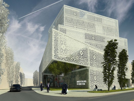
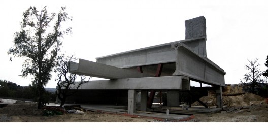
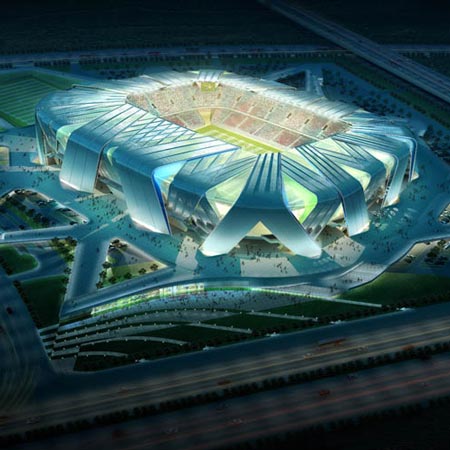
House of Music by Coop Himmelb(l)au


October 21st, 2009

Austrian architects 
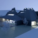
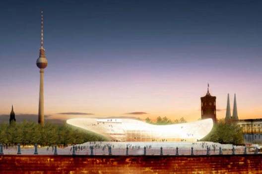
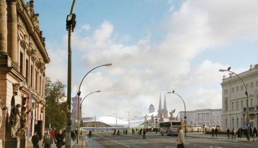
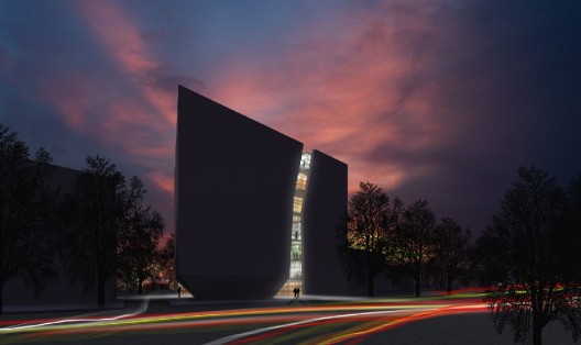
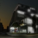
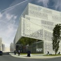
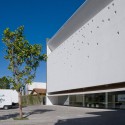
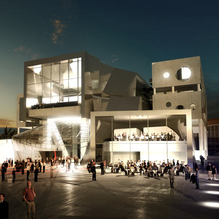
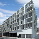
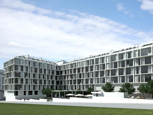
Coop Himmelb(l)au have unveiled their design for a performing arts centre in Aalborg, Denmark.


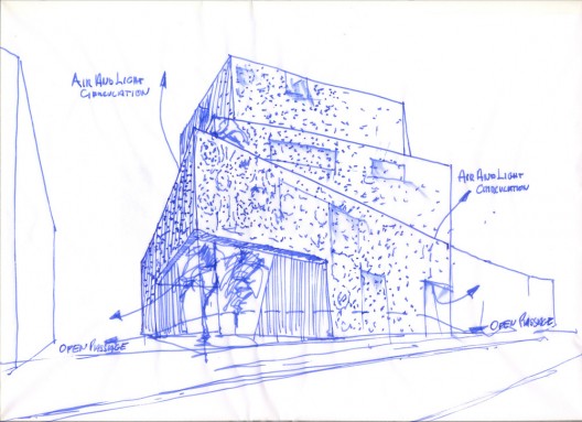
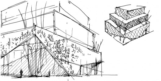
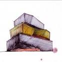
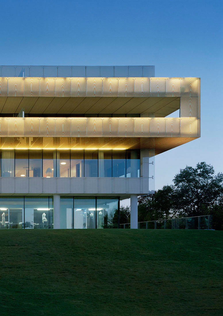
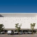
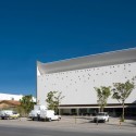
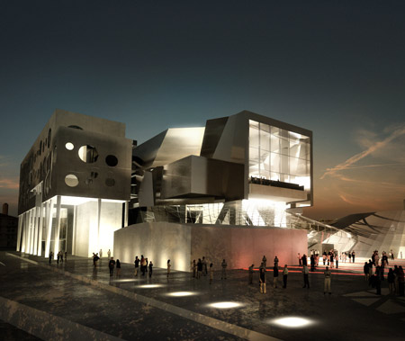
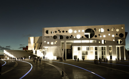
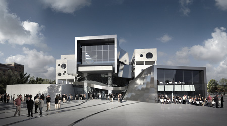
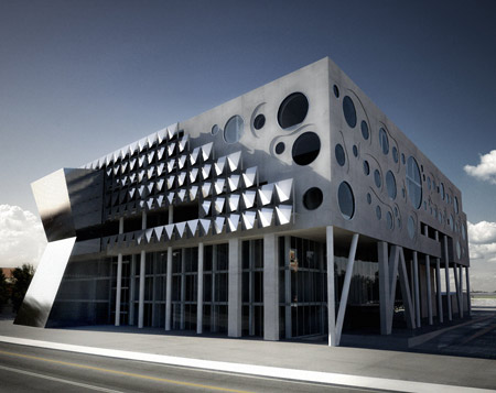
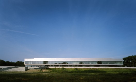
Called House of Music, the project will consist of a 1,300-seat concert hall surrounded on three sides by music, education and performance spaces.

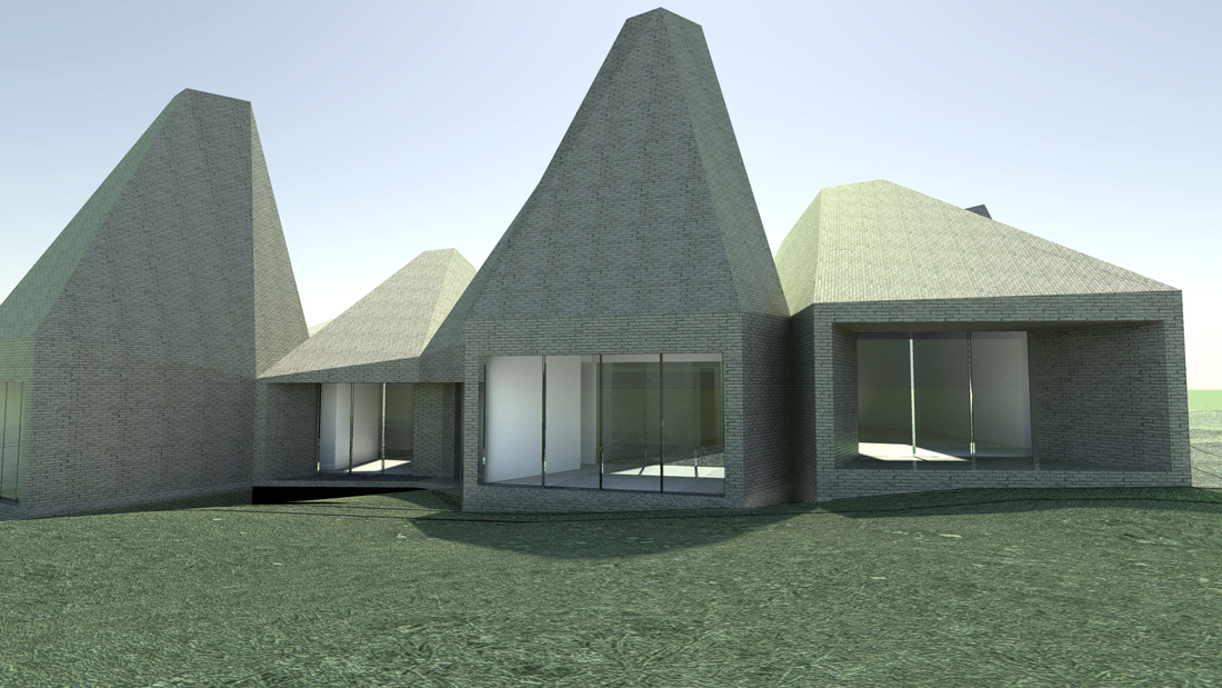
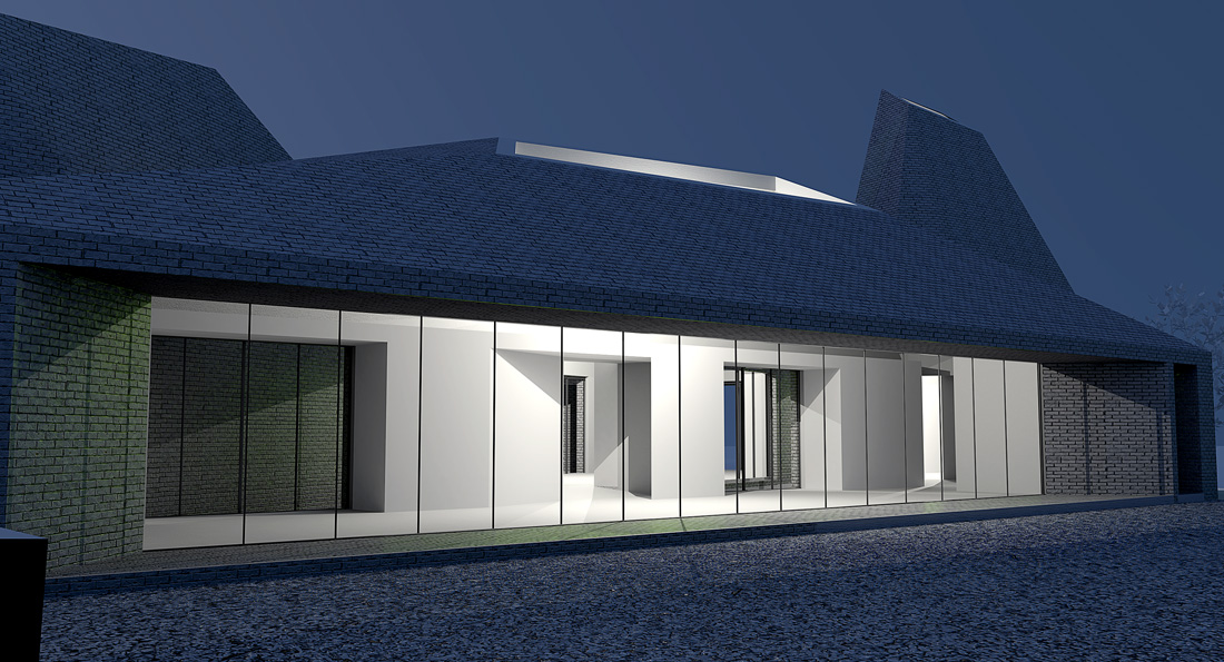
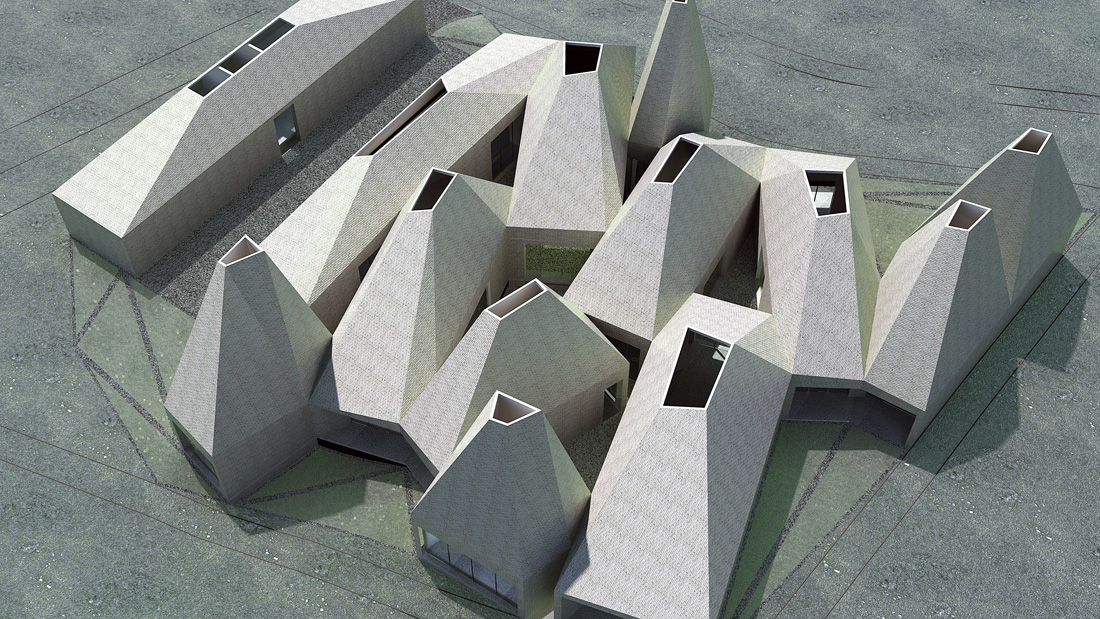
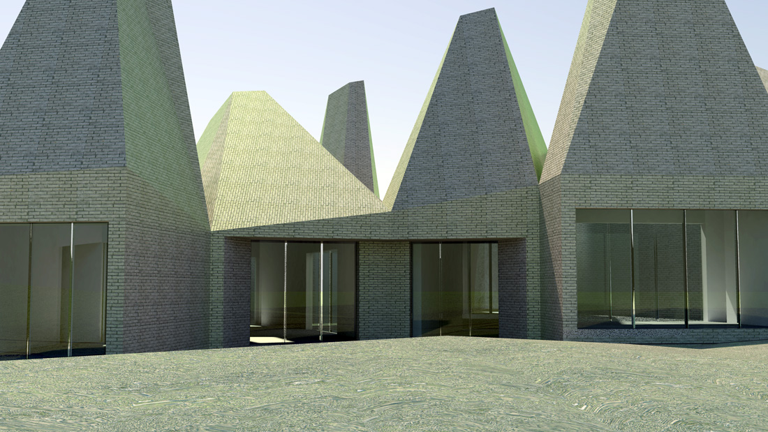
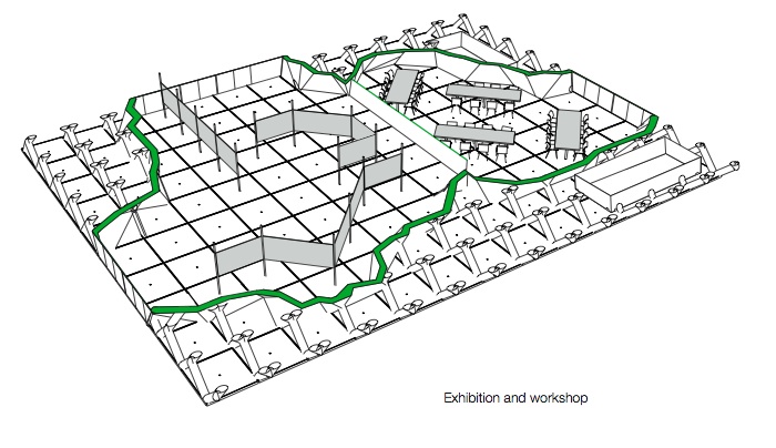
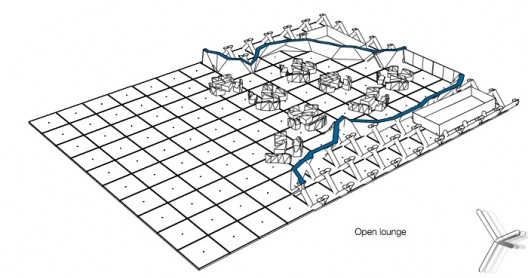
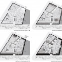
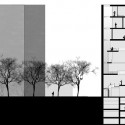
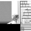
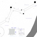
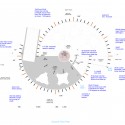
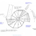
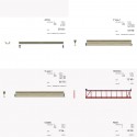
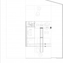
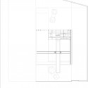
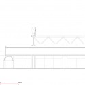
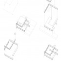
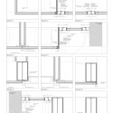
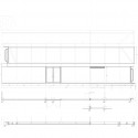
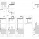
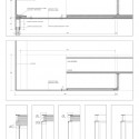
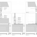
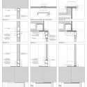
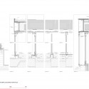
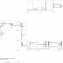
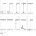
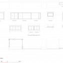
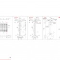
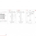
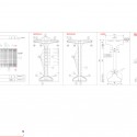
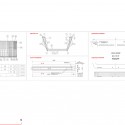
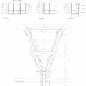
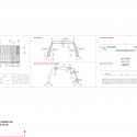
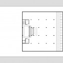
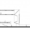
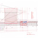
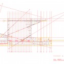
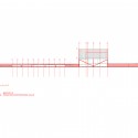
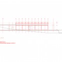
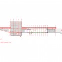
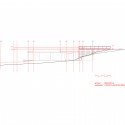
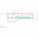
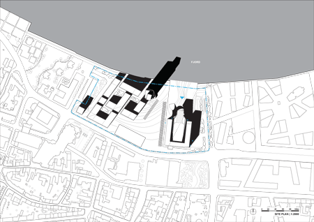
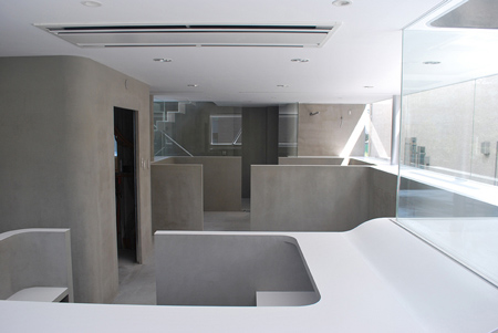
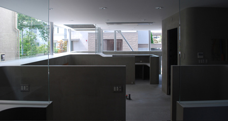
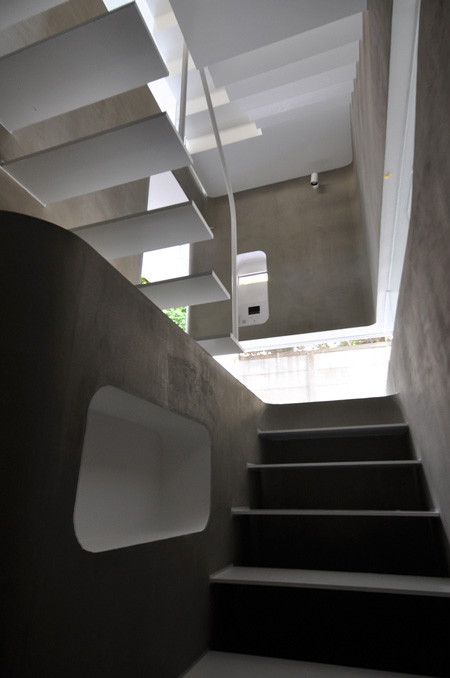
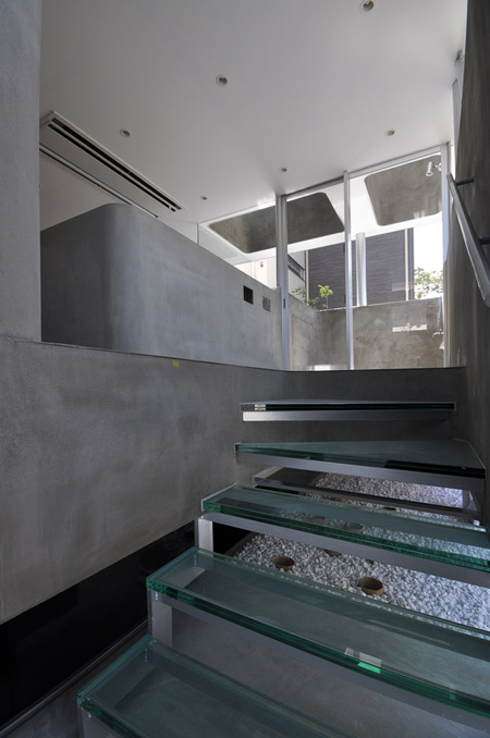
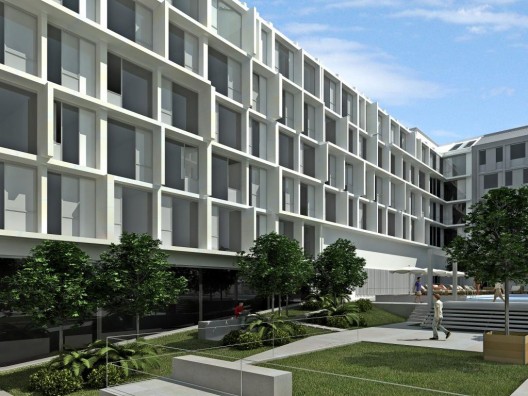
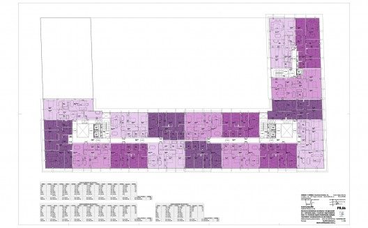
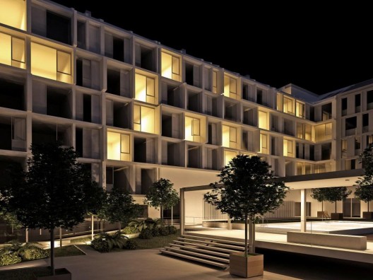
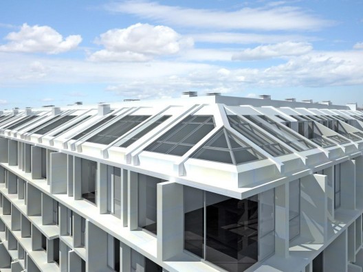
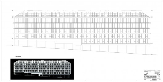
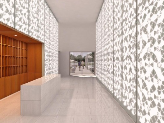
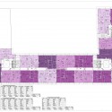
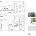
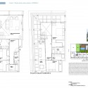
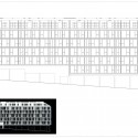
All images © COOP HIMMELB(L)AU. Expandable plans coming soon…

Here’s some more information from the architects:

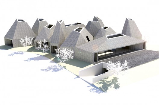
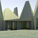
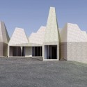
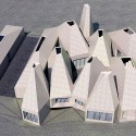
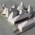
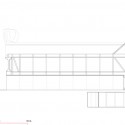
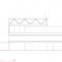
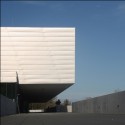
PROJECT HOUSE OF MUSIC, AALBORG, DENMARK (2003/2008-2012)
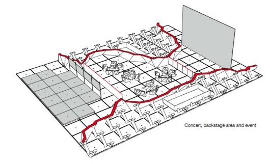
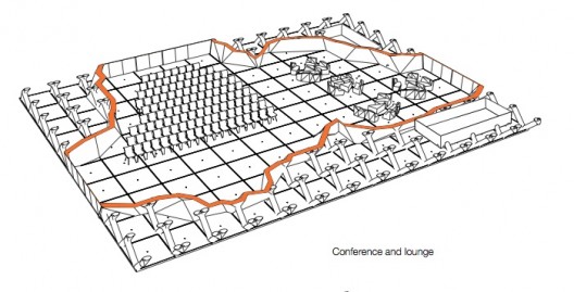
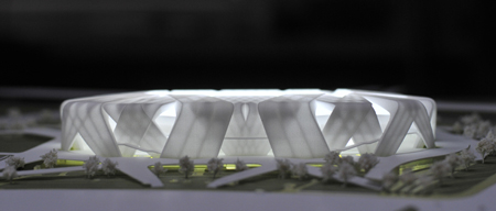
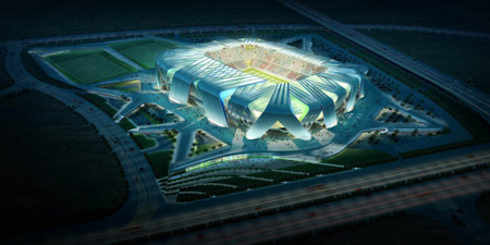
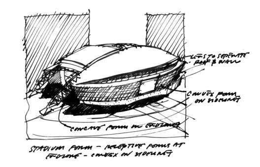
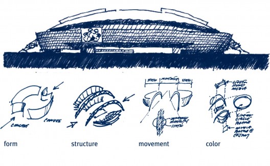
COOP HIMMELB(L)AU’s design for The House of Music in Aalborg combines Cultural and Educational functions with shared public spaces, performance spaces and infrastructure in an open system enabling synergy and exchange between the public, artists, students and educators – a shared Hybrid space.

Music, Creativity and Art are the centers of inspiration, both of the shared-synergetic behavior and of the form and expression of the architecture.

Formal and informal encounters and exchanges are enabled via public spaces that are oriented towards the adjacent Culture Square and Fjord, and are designed to serve as interchange platforms connecting the semi-public and private functions of the multiple institutions housed within, and providing areas of exchange of information, knowledge and inspiration for the various residents and the public in the House of Music.

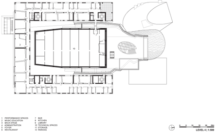
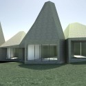
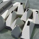
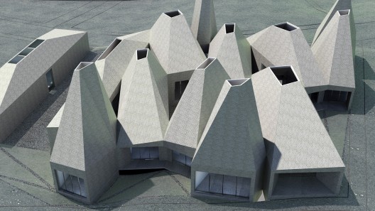
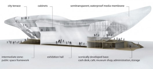
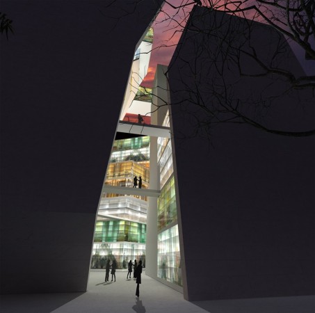
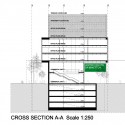
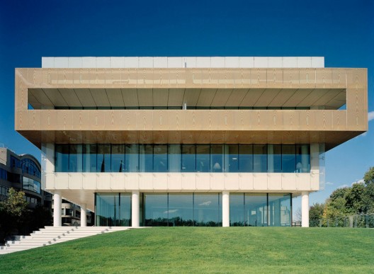
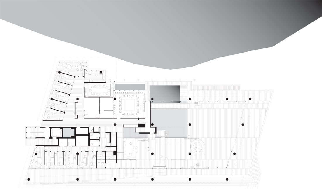
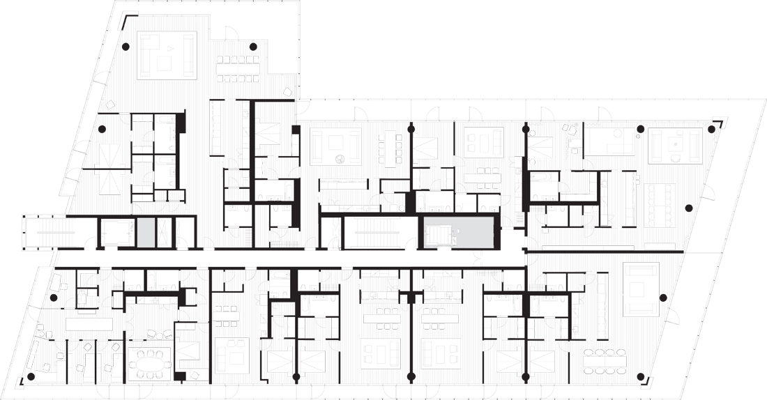
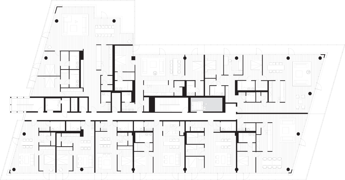
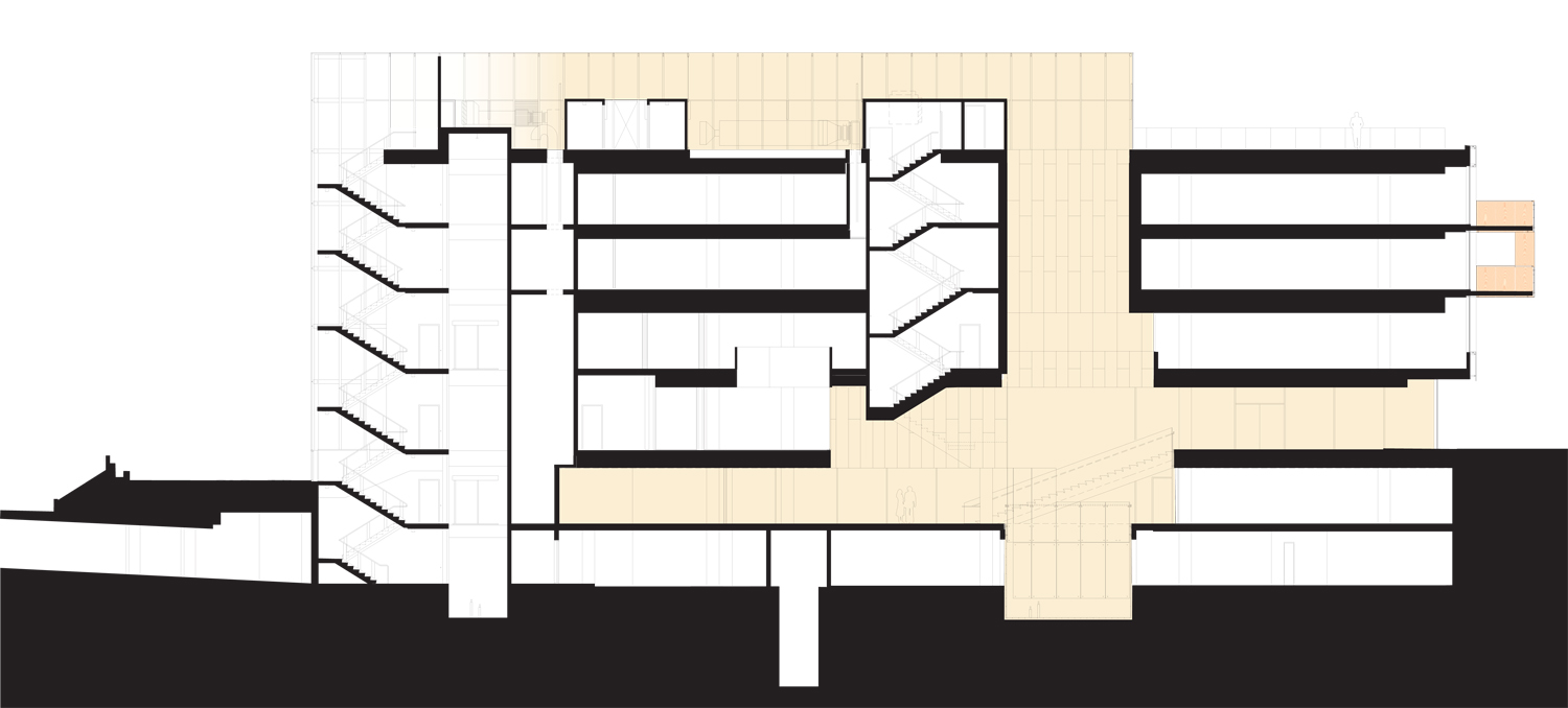
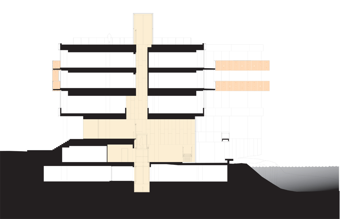
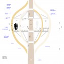
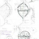
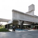
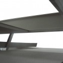
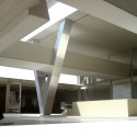
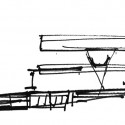
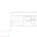
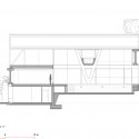
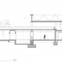
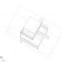
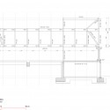
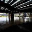
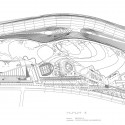
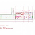
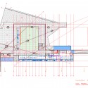
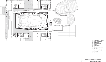
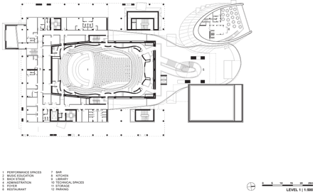
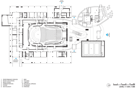
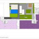
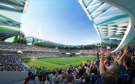
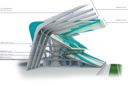
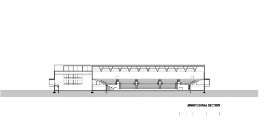
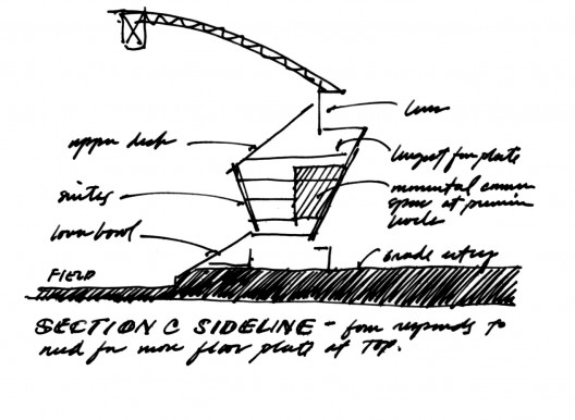
A 1,300 seat, world class, symphonic concert hall is at the core of a compact U-shaped block of music, educational and performance support spaces which wrap around the Main Hall on three sides. The Building composition opens to the north in a vertical public foyer with views over the fjord and adjacent Culture Square. Three additional halls of various sizes and functions complement the Main Hall and are organized below the Foyer in a vertical inversion of the classical front-of-house / back-of-house horizontal orientation, optimizing floor space and providing a lively vertical social space with a mix of users and visitors.

ORGANIZATION
The House of Music is organized around the concept of sharing and synergy, while recognizing the need for independence of the individual institutions within. Wherever possible sharing of spaces is enabled and overlapping of use of public and performance spaces is supported through the design.

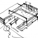
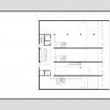
The basic organization uses the Foyer to connect a centralized Concert Hall with a U-shaped bar of Educational functions placed over the backstage facilities in a courtyard scheme with the Concert Hall as its center.
This typology is adopted to insure good natural light and maximized views within an economical and efficient system of circulation, and to establish close, central relations to the performance and public space of the House of Music.
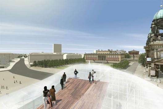
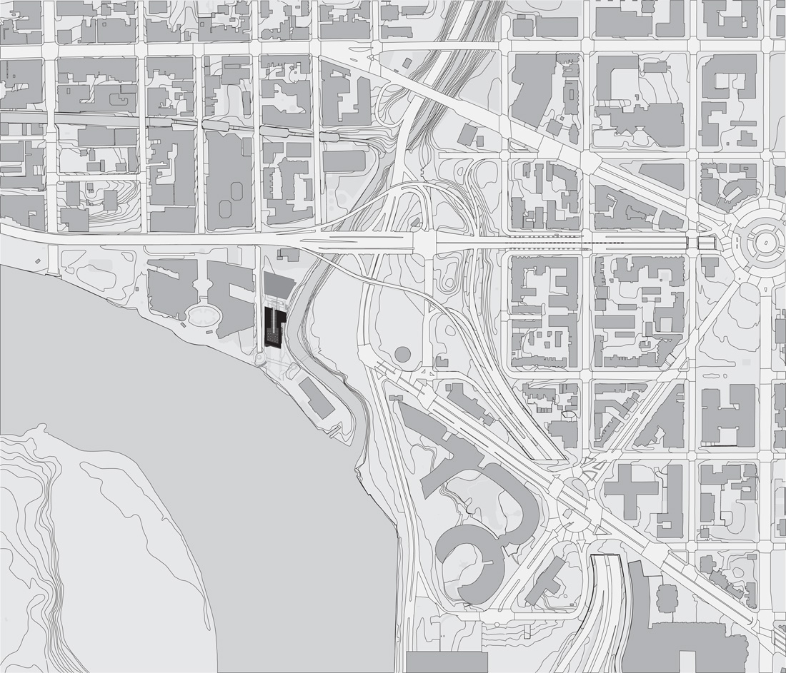
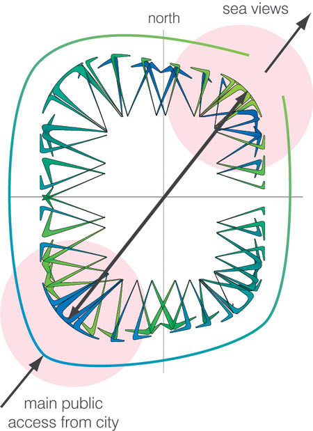
The “U” is oriented with the open side towards the Fjord where the Foyer is located facing onto the new House of Music square adjacent to the harbor front promenade.

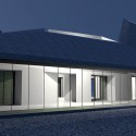
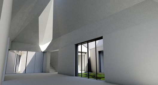
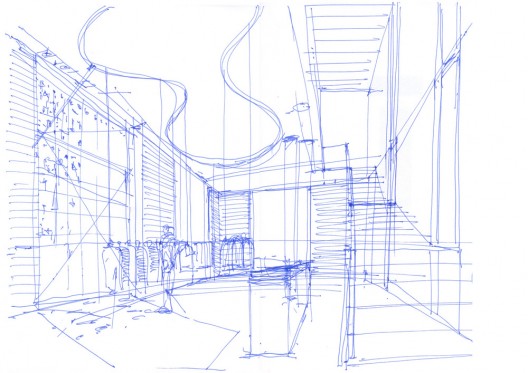
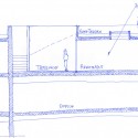
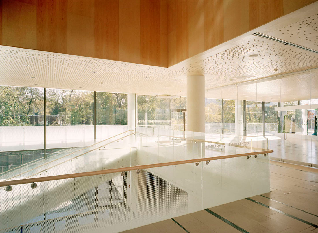
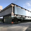
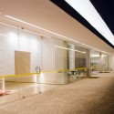
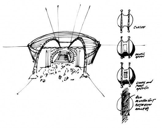
The Foyer is the main common and public space and connects the public to the Main Concert Hall and its balconies at ground level and above, and to the Intimate, Rhythmic and Classical Halls below. The front of house space of the Foyer is a compact vertical zone oriented at the same time to the Culture Square and the Fjord. This vertical organization serves to provide the most effective multiple hall front of house system for the public audience.
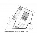
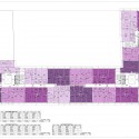
Deliveries are made via a service yard and entrance along Stursvej to the East of the House of Music directly to the stage level that is at loading dock height. The Back of House zone is a three-level U-shaped base wrapping the stage side of the Auditorium. The facilities of the Aalborg Symphony Orchestra are located in the uppermost third level of this base.

ACCESS AND ENTRANCES
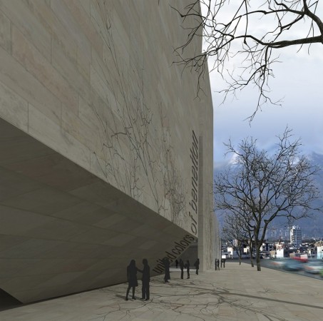
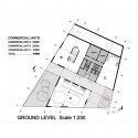
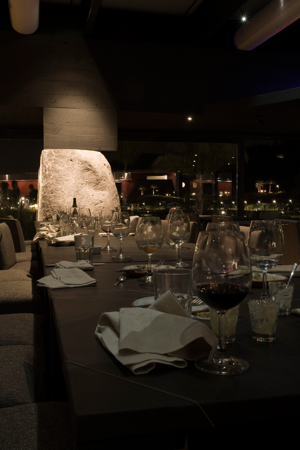
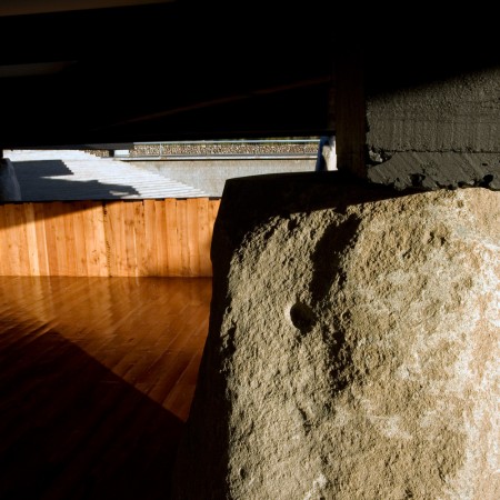
The Main symbolic entrance to the House of Music addresses the Limfjord and Promenade, and the formal expression of the Foyer reaching out towards the water. A taxi and bus drop-off from Stursvej to the East connects to the Foyer via the House of Music Square directly in front of the Main Entrance from the North. A second Main Public Entrance to the Foyer opens to the Culture Square to the West. The two entrances are formed by a combination of distinct architectural elements of the Foyer; the Restaurant Cone and a sweeping fluid roof, which are designed to encourage flow through the Foyer and mark clearly the entrances.
The educational facilities have a separate entrance lobby and vertical circulation opening to the Culture Square, however internally have connections to the common foyer space. The Aalborg Symphony Orchestra and visiting Artists share an entrance with the Service zone that is located at the Southeast building corner along Stursvej.
The practical separation of entrances and circulations allows all of the institutions to operate independently, while at the same time the location of common functions, such as food service, lounge and other common spaces in the Foyer, ensure opportunities for meetings and encounters between the various residents of the House of Music.
SYNERGY – INTERCHANGE LEVEL
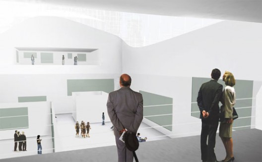
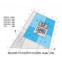
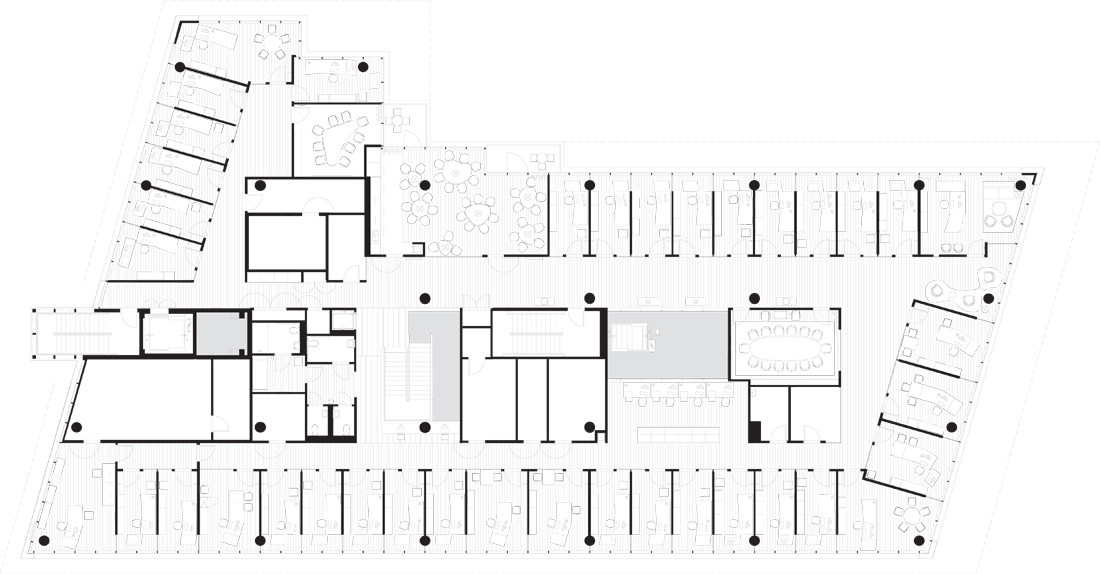
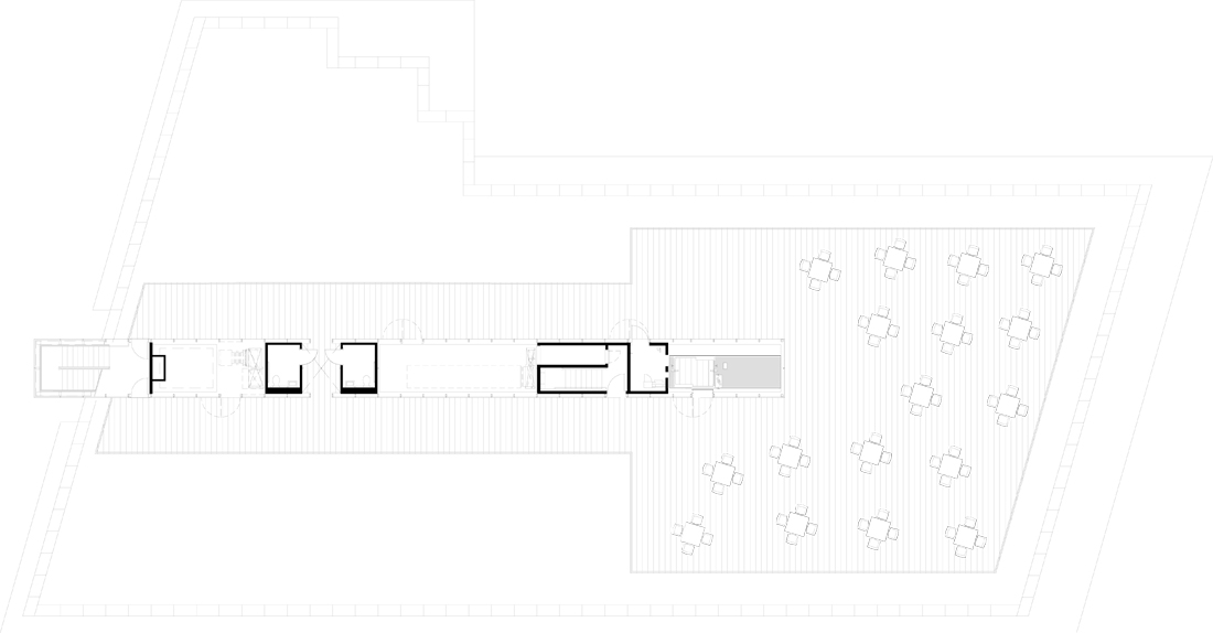
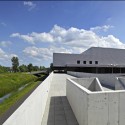
The Educational facilities of the Academy of Music and the Department of Music and Music Therapy of Aalborg University are located in a two-level U-shaped courtyard building, with the Concert Hall in the center. This “Educational U” is raised up above the back of house base creating a horizontal void which is then programmed with synergetic and shared functions, special lounges, view ports into the main Concert Hall and access-ways to the upper roof terrace.
This “Interchange level” is also the extension of the main public Foyer in a circulation loop leading from the ground level around the Concert Hall with views into the auditorium through special windows, and views out to the City from terraces. At the same time the educational residents are brought down to mix on this level in lounges, the library and exhibition spaces, also offered to the public. As the heart of the building, the synergetic “Interchange Level” reinforces the main topic of sharing and interaction in the House of Music.
CONCERT HALL
The Auditorium of the main Concert Hall is a modified shoebox designed for the optimal balance of acoustics, sightlines and closeness to the stage for the audience. The Auditorium will be among the quietest rooms for symphonic music in Europe achieving a noise reduction rating of NR10.
The architectural design of the space enables interactivity between the interior events and the Educational and Public activities outside of the auditorium through different view portals penetrating the auditorium walls and providing views into the Concert Hall space from the Foyer and the Interchange Level surrounding it.
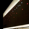
From the Foyer the Concert Hall appears as a monolithic form with natural materials and colors, however upon entering the auditorium the architectural language transforms into fluid curvilinear geometries bathed in color and artificial light, lending a special theatrical sense of atmosphere to the space.
For economy and optimal noise isolation, the Concert Hall is constructed on ground level as an entirely separate structure from the U-shaped building around it, and a separate structure from the three additional smaller halls located below the Foyer Podium. Within the Auditorium the audience is seated on three levels, with seating platforms and balconies that wrap fluidly around the space with varying curvilinear forms giving the interior a sense of intimacy and spatial connection to the stage that is distinctly different from typical long and narrow shoebox halls.
CLASSICAL AND RHYTHMIC HALL
The Classical and Rhythmic Halls are educational performing spaces that will occasionally include a public audience. These rooms are purpose-built for the respective intended uses of Classical ensemble practice and Rhythmic and amplified performance and practice respectively. A box-in-box design system provides a flexible and economical means to create optimal acoustical enclosures for these halls. The surface textures and geometries are carefully designed for the different specific acoustical needs in each of the halls. For horizontal reflection where needed, the acoustic ledges in the Classical and the Intimate Hall are floating freely from the walls in the spaces. Curtains for adjustable absorption are provided in both of these halls. The acoustical curtains recede into curtain pockets integrated in the box-in-box design of the walls of rooms so that they are not visible if not needed.
Reinforcing the closer relation between The Classical Hall, the Rhythmic Hall and the Music School, a workshop atmosphere is created by the use of day-to-day, unpretentious materials in a functional application. Perforated metal with partially absorptive panels behind provides the needed absorption in the Rhythmic Hall. A concrete floor creates a highly durable and easily maintained space.
Using the same material language for the two “Educational” spaces, a faceted geometry of backed perforated metal on the walls of the Classical Hall offers medium scale diffusion, while the textured surface of the material provides the needed small scale diffusion. A wooden floor warms the atmosphere and provides the needed functional surface.
INTIMATE HALL
The Intimate Hall is a medium sized room that can accommodate an audience of 300 visitors for multiple types of performances and is also intended as the principal practice room for the Aalborg Symphony Orchestra. Thus the room is designed with a flat floor and flexible acoustics achieved by horizontally deploying curtains which recede into curtain pockets integrated in the box-in-box design of the walls of the room.
Formally the Intimate Hall expresses the synergetic connection between the Public, the School and the Orchestra through visual connections through windows between the Foyer and the Hall, and through the pattern of the acoustical treatment of the walls of the Hall, reflecting the surfaces of the Concert Hall and the Educational-U façade. Projecting and recessed free-shapes in the white Aalborg cement concrete panels of the walls of the Intimate Hall function as large and small scale acoustical diffusion surfaces by varying in scale and height.
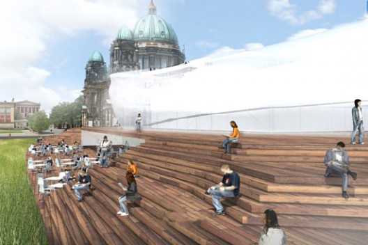
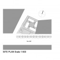
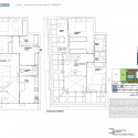
LANDSCAPE AND SITE DESIGN
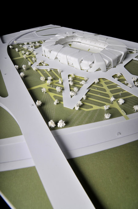
The design of the site emphasizes both the urban character of the House of Music area in the city and the natural aspects of the Limfjord and Aalborg stream. Both the Cultural Square and House of Music Square are seen as urban extensions of Aalborg and are connected to the existing pedestrian and traffic systems. An urban dynamic grid is created on the ground surfaces to emphasize the connection from west to east across the site and to the House of Music entrance. This grid is used as a guideline for paving patterns, drainage and LED lighting and together these design components provide texture, atmosphere, guidance and differentiate the scale and functionality of the urban spaces.
The extension and opening of the Aalborg stream forms the concept for a green park edge along Sturhsvej to the East of the House of Music. Visitors arriving by car move though this park space which includes lush extensive landscaping and trees as well as the re-opened natural Aalborg stream, and culminates in a formal drop off in front of the Foyer. Green areas and trees and small scale Urban Courtyards within the House of Music Center, are also included to provide natural elements, air cleansing and green edges connecting the House of Music Area with the surrounding landscape corridors and the fjord.
ENERGY CONSUMPTION
FOYER
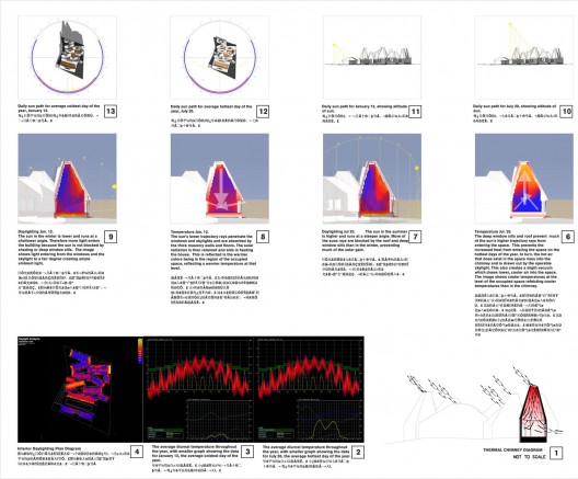
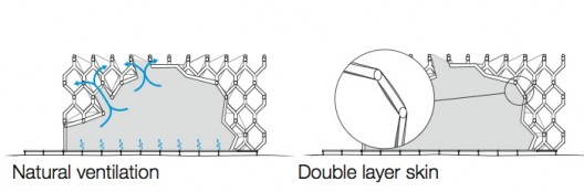
The Foyer uses natural ventilation for fresh air with low-level operable windows for intake and high-level operable windows and vents for exhaust. The system uses the natural thermal buoyancy of the tall vertical space to move the air, rather than electrical fans. The floor design employs a water filled radiant concrete slab used both for heating in winter and cooling in summer.
By ventilating the Foyer at night in the summertime the concrete walls around the Concert Hall are used as thermal mass to store energy.
The cooled walls from the night will radiate cool energy to the room during the day, while the heat accumulated in the walls during the day will radiate heat to the room during the night.

VENTILATION
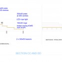
The ducts and air-handling units are designed with a low-pressure drop. The fans therefore use less electricity to distribute air within the building. The air-handling units are also equipped with very high efficiency rotating heat recovery devices. In the concert hall the air is supplied via a plenum beneath the seats in a very efficient low velocity displacement ventilation system directly in the level where the audience is seated. Air extraction occurs at the top of the room through grilles placed over the production lightning system. The heat from the lightning is therefore extracted before it can cause a temperature rise in the room.
In the 3 smaller halls the ventilations system is based on a VAV system (variable air volume) that is suitable where the heat loads vary. The system secures that air changes in the rooms are at a minimum. In the rehearsal rooms the number of air changes is determined by the number of people occupying the room. The ventilation in these rooms will be ON/OFF based on the use of the room ensuring that rooms are ventilated only when used.
In all offices, rehearsal and group rooms the ventilation system is based on cooling baffles. The air changes are determined by the occupancy load. The necessary cooling is supplied by cool water in the baffle. This system ensures that air changes in the rooms are at a minimum.
 

کدخدا

مدیر بازنشسته
Plastic Moon by Norisada Maeda Atelier


October 23rd, 2009

Japanese architects Norisada Maeda Atelier have completed a house that includes a dental practice and swimming pool in Tokyo, Japan.

Called Plastic Moon, the building is wrapped in three white bands covered in circular tiles.

The ground floor accommodates the owner’s dental practice with a separate door forming the entrance to the home.

A kitchen and swimming pool are located on the top floor.

Plans coming soon…

Photographs are by T. Sobajima.
Here’s a little text from the architects (and a lot of pictures):

Plastic Moon
Here metal molding forms have been translated into architecture shaping a smooth outside shell while forming gardens, rooms and furniture on the inside.

To highlight this layering structure also from the outside view, glass and “mold” take turns providing space and two entrances for private and public areas, such as the owners dentist office.

The top floor hosts the kitchen and a generous rooftop pool.


کدخدا

مدیر بازنشسته

Arial M6 / Carbajo Barrios Arquitectos


Architects: Carbajo Barrios Arquitectos / Manuel Carbajo Capeans & Celso Barrios Ceide
Location: Santiago de Compostela, Spain
Construction Manager: Enrique Martinez
Render: Carlos Pascual Ayestarán - Artquimedia
Interior Design: Fatima Amo
Lighting: Tokonoma
Aditional Support: Santiago Interiores
Building Type: Mixed Use_Residential / Commercial / Office
Design year: 2007/2008
Construction year: 2008/2011
Size: 20,000 sqm
Project website: Grupo Arial

Project

ARIAL M6 is a residential development comprising 78 flats of different characteristics distributed amongst five storeys and an attic along with ground floor premises meant for commercial use and a three-level basement garage. The building concludes with a private area destined for a garden and leisure activities, swimming pool and solarium.

Location

ARIAL M6 is located in the Avenida da Liberdade, the main boulevard within Santa Marta, one of the expansion areas of the city of Santiago de Compostela.
This location allows for an unbound development, with wide spaces and limitless surrounding views, both in its front façade towards the boulevard as well as to the rear façade to which there are not adjacent constructions, but open spaces, greens and sporting facilities.

Architecture and design

Architects Manuel Carbajo and Celso Barrios have combined the needs of a residential development with an image far from the standards under which these usually fall. To this effect they have planned a fragmentised façade, comprising a crucible of solid and transparent, and light and dark, using glass as the main material.

The roof carries on the façade with the same materials, openings and finishing, ultimately becoming the solid framework. From the exterior this is perceived as highly attractive as it steers clear of the classic disconnection between façade and roof, but it is inside where unique spaces can be enjoyed such as split-level glass-covered lounges, which provide the duplexes with an outstanding effect of a single family home.
Hence one comes across a glass building, scattered with vertical and horizontal sheets of white concrete, which far from intended for aesthetic purposes only, they have been conceived to create a sun protection mesh during the summer, still allowing the sunlight through during winter when the light incidence angle is minor.

Architecture and environment

This residential development makes use of clean energy by means of the installation of solar thermal panels on the roof destined to the contribution of hot sanitary water and heating. Furthermore, the energetic efficiency has been optimised with the installation of under-floor heating through hidden hot water pipes, as a result, the hot running water heats the floor whilst providing uniform and comfortable warmth throughout the home. There are multiple advantages to this heating system as it reduces energy consumption remarkably in comparison to the traditional radiator-based systems, with no heating power loss, avoiding dust carbonisation and allowing for each interior to be designed without having to take radiators into account.

The utilisation of glass in the façade and in the common areas for a better usage of natural light, the positioning of sun protection elements in the façade for the times of high exposure, water saving systems, the election of eco-efficient appliances and building materials whose production respects the environment are amongst the different aspects taken into account.
Exterior design

The façade comprises two main elements, namely: glass, whether transparent, translucent or opaque and vertical and horizontal sheets of white concrete, acquiring a solid and avant garde effect; efficient in relation to luminosity and sun protection as well as to maintaining the privacy within the home.

A 1.300 plus square metre area contains the private outdoor area of the development and includes a swimming pool area and solarium paved with wood, green areas, children’s play area and even a partially roofed area for holding celebrations and events.
Interior design


A single access is considered from the outside, through which to reach the three lift halls via a glass corridor which runs parallel to the garden. This layout allows for a continuous and unified main façade as well as increased security, better deployed communication areas and outstandingly high use of natural light.
The same criteria are followed with the lift halls in which a continuous skylight has been planned from the first floor to the roof, a feature which provides spaciousness and natural light to areas commonly characterised for being enclosed and gloomy spaces. At the communication areas amongst the different homes one will find a colourful perspective, highlighting the entrance to each home through the lightning and the colours of the materials, consequently achieving an remarkable aesthetic effect.

general plan 01 general plan 02 general plan 03
general plan 04 apartment 01 plan apartment 02 plan
apartment 03 plan apartment 04 plan north elevation
 

کدخدا

مدیر بازنشسته
Gama Issa House by Marcio Kogan


photo © Arnaldo Pappalardo
Project: Gama Issa House (02/2000)
Project architects: Marcio Kogan + // Oswaldo Pessano, Renata Furlanetto, Samanta Cafardo, Suzana Glogowski, Lair Reis, Carolina Castroviejo, Eduardo Glycerio, Maria Cristina Motta, Gabriel Kogan, Mariana Simas, Beatriz Meyer
Interior designers: Marcio kogan + Diana radomysler
Collaborations: Gisela Zilberman, Diana Radomysler
construction: 02/2001
Location: Alto de Pinheiros . São Paulo. Sp . Brasil
Site area: 1700 square meters
Built area: 700 square meters​
photo © Arnaldo Pappalardo
São Paulo, January 21, 2002 // text by Marcio Kogan
It is ten o`clock at night. Very hot. I use this moment of rare calm and solitude to design the new house. I look through the window and parked in front of the building is a BMW X5. A young man of about 27 slides out of the car with a stunning blonde fearfully clutching her Prada bag. An almost-black, almost-beggar approaches asking if he can watch the car for R$ 5,00. They go into a Japanese restaurant. On the radio, which I will turn off within ten seconds, there is talk of the most recent kidnapping and a prison rebellion. I read my notes of the first meeting with the clients, a couple in advertising. We spoke of an enormous library in the living-room with double high ceilings, enormous windows opening completely to the garden, a pool 3 x 30m, a kitchen with an orange lunch table in the center, two symmetric marble staircases lit by focused natural light, a precisely detailed work studio, spaces of rare and elegant proportions which always relate to the exterior differently, white textures, an Eero Aarnio ball club chair, minimalism, the 60’s, electronic music, Stockhausen Cage, the latest issue of Visionaire magazine, a recipe for spaghetti al mare and finally “My Uncle” by Jacques Tati.

I think of a single enormous volume wrapping everything: a white box. In São Paulo, we don’t need to be concerned about environmental coherence; it is total chaos, the most absolute chaos. In this city, the world’s ugliest, which overflows energy, vibrant like no other, loved and hated, anything that is projected will be totally integrated into the city. Ah, yes, don’t let me forget an enormous wall protecting the house, covered in natural wood (maybe from the last tree of the Amazon), and which, certainly, will be completely covered by graffiti, giving the final touch in perfect harmony with the environment.
From a humble architect of the third world.

Gama Issa House by Marcio Kogan
text by Marcia Argyriades for Yatzer

No article in the world can express better the letter from the architect which you just read; the needs and the taste of the occupants of the house “stirred” with the architects inspiration, creativity, know-how and design. The concept, a white parallelogram box which encloses 700 square meters of living space in two floors situated in a plot of 1700 square meters and enclosed by enormous walls protecting the house which will be covered in natural wood.​
photo © Arnaldo Pappalardo
Gama Issa is a modern sustainable house which despite the concrete block which forms the house has a transparency between the garden, the parallelogram pool that runs along the house, and the interior of the house. The transparency of the house is achievable through the large sliding glass panels which serve as a wall and have magnificent views of the garden and the pool. Natural day light and ventilation are available throughout the entire house.​
photo © Arnaldo Pappalardo
While when one sits at the garden and looks inside the large sliding glass panels, he views the never-ending bookcases, which occupy one wall on both floors, and run from floor to ceiling neither of which seem to touch the floor or the ceiling due to the construction detail which runs throughout the house. The house’s clean lines and austerity compellingly portray Kogan’s clean and serene design concept as opposed to the chaotic and noisy city of Sao Paolo. The house’s exterior is painted in a cold white tone to take full advantage of the Brazilian sun, and create a contrast with the surrounding environment. Despite the description of the architect about the city of Sao Paolo, Gama Issa House portrays calmness contrary to the noisiness right outside the tall white wall which sets the boundaries to this house.​
main entrance // photo © Arnaldo Pappalardo
The interior of the house continues to be covered in tones of white through the usage of various materials like a white toned marble staircase thus reflecting the ambient sunlight which surpasses the large glass panel windows. The house’s interior spares any unnecessary decoration and really sticks to the simple modern furniture pieces. The wooden floor makes a great contrast between the lighting pieces and the clean cut furniture of the comfortable and elegant lounge. Colorful modern paintings have been used throughout the house to give a vigorous tone. Interior and exterior construction details are very well executed and this shows very well in the end result.​
photo © Arnaldo Pappalardo
Gama Issa house has been awarded with the following awards:
+ 2004 // Merit Award // Brazil - IV Bienal IBERO Americana
+ 2002 // Merit Award // IAB Award // Housing Category
+ 2002 // Merit Award // ASBEA - Group of Projects
+ 2002 // Merit Award // World Architecture Award​
photo © Arnaldo Pappalardo


.
 

کدخدا

مدیر بازنشسته
Dalian Football Stadium by UNStudio


Dutch architects UNStudio have won a competition to design a football stadium in Dalian, China.


The building will have a double-layered, lattice-like roof inspired by traditional Chinese footballs, which are made from layers of coloured bamboo.

The stadium includes seating for 40,000 spectators, a TV broadcasting centre, players’ facilities and a VIP lounge.

Here’s some more information from UNStudio:

UNStudio/ Ben van Berkel’s design selected for new football stadium in China
Unstudio has won the limited competition for a 40,000 spectator football stadium for the most successful club in the Chinese Super League: Dalian Shide FC. The stadium will be built in the club’s hometown of the city of Dalian, on the southern tip of Liaodong peninsula in Northeast China.

The design for the 38,500 m2 stadium has been inspired by the colourful layering and overlapping of the ancient Chinese cuju football. The design weaves together the collective spirit of the spectators with the public realm and the urban context of the building. The main stadium houses spectator seating, TV broadcasting centre, administration areas, VIP lounge, players facilities and public concourse in a layered envelope which extends on ground level to provide outdoor public areas above decked parking facilities. In addition, the design incorporates two training fields on the 144,000 m2 site.
According to Ben van Berkel, “The design of the Dalian Football Stadium is inspired by the classic Chinese football, which was made by layering coloured bamboo. For the stadium design we appropriated this effect to generate a double-layered roof structure. This structure operates as a double concourse enclosure, encircling the tribunes. Splits and openings in between broad bands of the lattice structure enable views from the outside in and from the inside out.”

Stadium design
Essential to the stadium typology is the experience of the spectator. Aside from the basic function of a stadium as an arena for spectator sport with one central focal point, stadium design requires the consideration of many essential structural, programmatic, contextual, infrastructural and stylistic elements and the incorporation of these into a strong, integral gesture. Infrastructural considerations include ease of access and evacuation, visitor routing and parking facilities, while contextual considerations form an important element in both the relationship of the stadium to the city, its surroundings and its orientation with regard to nearby transport modes.
UNStudio’s design for the Dalian stadium presents an inclusive approach to stadium design where the articulation of the structure and the openings and overlapping moments of its double-layered envelope serve as the starting point for visitor experience and programmatic and infrastructural requirements, in addition to heightening spectator experience in terms of proximity to the playing field.
Ben van Berkel says, “A key feature of the Dalian Stadium is the proximity of the spectators to the pitch, thereby ensuring the best views from the tribunes and creating a true sense of engagement. As in theatre design specific views and focal points are required. In the Dalian stadium, we envisioned the playing field as the stage. A two tier seating system and curved outlines optimise the corners of the tribunes and allow the spectators to be as close as possible to the playing field.”

Dalian
With a population of 5.7 million Dalian is the largest port in Northeast China and forms an important centre of trade, industry and tourism. In 1984, the State Council approved Dalian as a coastal open city during China’s opening up to the West. In the mid-90s Dalian began an ambitious undertaking to become a world-class port city on the level of Rotterdam, and a host to international events. Radical city planning policies were implemented, improving the aesthetic appearance of the city and eventually transforming the centre of Dalian with architectural styles reminiscent of the Mediterranean and Sweden, thereby making it a unique city in China.
UNStudio’s design for the Dalian Football Stadium reacts to this setting by orientating the building in order to maximise both the use of existing transport modes and the views of the surrounding sea and mountains, whilst providing a unique sporting venue for the population of the Dalian.

Dalian Football Stadium, Dalian, China, 2009
Client: Dalian City Bureau of Urban Planning,
Location: Dalian, China
Building surface: 38,500 m2
Building site: 144,000 m2
Capacity: 40,000 spectators
Programme: Football stadium with two additional training grounds
Status: Competition 1st prize
Credits
UNStudio: Ben van Berkel, Caroline Bos, Astrid Piber with Nuno Almeida, Ger Gijzen and
Cynthia Markhoff, Luis Etchegorry, Shu Yan Chan, Ramon van der Heijden, Marcin Koltunski,
Fernie Lai, Patrik Noome
Advisors
Engineering consultants: ARUP Shanghai, China
Arup International Consultants (Shanghai) Co., Ltd
Sports consultant: ASS Planungs GMBH Freie Architekten, Germany
Traffic consultant: MVA Hong Kong LTD.
Visualisations: UNStudio / and SZ Silkroad Digi Tech Co. LTD., China
Animation: IDF Global Pty Ltd.
 

کدخدا

مدیر بازنشسته
City Sports Hall / AG Planum


By Nico Saieh — Filed under: Selected , Sports Architecture , AG Planum, Aluminium, Concrete, Croatia


Architects: AG Planum
Location: Varazdin, Croatia
Architects in Charge: Marko Cvjetko & Robert Jonathan Loher
Project team: Miron Hrzina, Ana Mrda, Bruno Lovrencic
Architectural design: AG Planum d.o.o.
Design of construction and installations: Coning Inženjering d.d.
Design of thermal and acoustic properties: Adapteh d.o.o.
Design of fire prevention: Inženjering Kosović d.o.o.
Design of elevators: OTIS dizala d.o.o.
Design of sprinkler installations: Pastor Inzenjering d.d.
Project area: 19,500 sqm
Design year: 2006-2007
Construction year: 2007-2008
Photographs: André Thissen, Miljenko Bernfest & Robert Les


The site of the building is unique among all other halls which has been built for the Handball World Cup 2009. The building itself is located next to the Drava river, which flows into the Danube close to the city of Osijek. It is surrounded with woods and meadows, and it is not at all ‘urban’, as it is described by the title of the project. It was big challenge to deal with two opposite terms – ‘city sports hall’ with all its programme, and the surrounding. It was wish of the city government to access the river – until now there were no public access to it, despite of the fact that it is consumed by the citizens of Varazdin for recreational purpose.
What we found in the beginning was a ‘Lichtung’ – an opening in the woods – where the hall had to be placed. So we first thought about a ‘lightholder’ – a place which is filled with light, and a ‘thing’ which doesn’t compete with this extraordinary natural landscape.

The first impression of this design was, even for us, a box which contains urban programms, such as sport, shops, offices etc. The second step was to soften the boxlike shape with sequences of nature, so almost from every point in the hall you can see the nature through a frame, which is formed by windows, doors or corridors. An additional element to perceive the nature is the access for visitors – the bridge across the drainage canal. They first access a kind of square where the Drava river is seen in its full width, then they turn for 180 degrees and enter the hall, the purpose of their coming. Another access is through a bridge-like terrace, 250 m long, which is placed parallel to the Drava river, so one can perceive the river in the full length of the terrace.
Programatically the hall consists of three different levels, divided in horizontal layers. The first ground level is the level for athletes and visitors of the wellness center. It contains all the technical rooms, all storages and a bowling hall as well. This level is ‘private’, and therefore introverted.
longitudinal section


The second level is public. This is the level of the entrance from the bridge. It has a long and narrow main entrance hall which leads to different smaller corridors to access the arena with 5000 seats, which is the only room in the whole building with no perception of the surrounding natural context – it is focused on the sport topic, or whatever happens in the arena. The corridors who leads to the arena are attached to the box, glazed and have a full perception of the nature.
Next to the main arena lies another smaller hall for training purposes, with a smaller audience of 200 seats. This hall is opened, filled with natural light and is an opposite figure to the dark arena.
The third level is office level. It contains the hall management, a press room and offices.
In designing the shape of the building we wanted to keep as quiet as possible. The main corpus of the building is cladded with aluminium stripes, which are folded in horizontals lines. The joints are very precise, whereas the aluminium has different forms, according to termal stresses in the material.
All glazed openings are in the same surface as the facade, so you get this skin-like appearance, which is mounted on a raw basement, plastered in black with smaller openings, and the access elements – bridge and narrow terrace in raw and imperfect concrete.
The interior is designed in basic elements only for the visitors – for simple and easy orientation. Every side of the arena is painted in different straight colors. The color-concept was developed by a known ex-rapper in Croatia. This colors give a warm contrast to the ‘coldness’ of the facade and the interior of the arena.

The arena is kept in three colors – the brown of ground level, the grey of visitors level and black of the construction and technical level.
The orange wall in the smaller hall attract the light from outside.
To resume, we didn’t want to build a building which wants to attract more attention then the origin landscape. We wanted to keep the silence and horizontality of nature and the easy but strong flow of the river.
 

کدخدا

مدیر بازنشسته
Dallas Cowboys Stadium / HKS


The new Dallas Cowboys Stadium, designed by the HKS Sports & Entertainment Group opened June 6 for it’s first public event. The new venue, located in Arlington, Texas, is the home of the Dallas Cowboys, one of the National Football League’s (NFL) most watched teams in the USA.
At over 3 million-square-foot and a capacity of up to 100,000 fans it is the largest NFL venue ever built, and maybe one of the most spectacular stadiums worldwide. You can read more key highlights after the break and more images of the stadium.
Key Design Highlights
Designed to be open or closed, depending on weather conditions, the expansive retractable roof is the largest of its kind in the world and measures approximately 660,800 square feet. When closed, the roof encompasses 104 million cubic feet of volume, making it the largest enclosed NFL stadium in the world. The retractable roof is designed specifically to emulate the current Texas Stadium opening which is recognized around the world and allow views inward and outward. Each panel can open or close in 12 minutes. From directly above, the entire playing field can be seen and the opening itself is visible from an elevation of five miles.
The stadium features two monumental arches, soaring 292 feet above the playing field, which support a retractable roof. As the longest single span roof structure in the world, each boxed arch is 35 feet deep by 17 feet wide. Weighing 3,255 tons each, the impressive structures span 1,225 feet in length. The arches form a striking silhouette on the Arlington landscape as sunlight reflects against the metallic surface during the day and a tailored lighting system reflects the form at night.
The stadium features the largest retractable end zone doors in the world. Each has a five-leaf, clear, retractable opening measuring 120 feet high by 180 feet wide. The five 38-foot panels take only 18 minutes to open or close. By using clear glass for the door panels, spectator experience panoramic views from within the seating bowl and when circulating through the stadium concourses. Moreover, the operability provides air circulation during game-day and non-game-day events.
One of the most compelling architectural features of the stadium design is the canted glass exterior wall. The 86-foot-high glass, curtain-wall surface slopes outwardly at a 14-degree angle to create a luminescent glow, day or night. A fritted glass system transitions up the elevation to create a dynamic, ever-changing aesthetic depending on the time of day. At night, a series on internal lights gently wash the glass wall to create a glow across the facade.
Within the seating bowl, Cowboys fans will be provided with a one-of-a-kind feature, a center-hung video board. Hanging approximately 90 feet above the field from the rood structure, the innovative video center spans between the 20-yard lines and features four individual boards – two facing the sidelines and two facing the end zones. The sideline boards measure 72 feet tall by 160 feet wide, while those facing the end zones measure 27 feet tall by 48 feet wide. All four boards are angled toward the stands for optimal viewing. The stunning combination of these boards will immerse spectators with video imagery, creating a premium on upper level seats and presenting the game in a way never before experienced. Streaming across the interior seating facade is a vivid 360 degree matrix board, which offer advertisers “moments in time” during the game.
A signature architectural element for the new venue is the 365 entry. The elongated arch form stretches 224 feet and is detailed with steel plating. It simulates the monumental arches while framing the Dallas Cowboys Pro Shop and box office. This entry is framed by two dramatic 30-foot-tall light walls, providing an upscale, vertical space for both game days and events during the week. Metal canopies are attached to the light walls while fountains activate the space.


کدخدا

مدیر بازنشسته
Wilton Pool House / Hariri & Hariri


New York-based Hariri & Hariri Architecture have completed a 1200 sqaure ft pool house which rests upon the 3.5 acre property of a suburban Connecticut residence. The design of the pool house serves as a contrast to the traditional architecture of the exisitng home. The dominate extended ceiling provides shelter for those lounging around the pool, enjoying the water, or sitting on the patio.
More about the pool house after the break.

Designed as “a minimalist sculpture in the landscape”, the pool house is characterized by its long angular archway of wood which spans the length of the pool and then bends to provide cover for an outdoor seating area. The frame is made of Brazilian Walnut and makes “the place warm, nautical and sculptural at the same time.”

The wood floors extend past the interior of the home to create a hovering deck above the pool allowing users to lounge right above the surface of the water.

Inside, the pool house contains a living/entertainmen t room, kitchen and bar area, and a simple bathroom. Glass sliding panels enclose the structure allowing it to be transparent and light. By opening the interior spaces, the areas do not detract from the wrapped wooden component.

As seen on Home and House Design.


Project: Wilton Pool House
Architects: Hariri & Hariri Architects
Location: Wilton, CT, USA
Total Lot Area: 3.5 acres
Total Poolhouse area: 1,200 sf plus 3,630 sq ft poool and stone terrace
Program: Spa, pool, indoor/outdoor living space, bath & kitchen
Status: Completed 2007
Image Credit: Paul Warchol
 

کدخدا

مدیر بازنشسته
The Shard by Renzo Piano Building Workshop


Here are the latest images of The Shard, a mixed-use tower at London Bridge in London, designed by Renzo Piano Building Workshop.

Construction work has started on the 306 metre-high building, which will sit on an irregular-shaped site adjacent to London Bridge station as part of a new development called London Bridge Quarter.

The design consists of several glass facets that incline inwards but do not meet at the top, and is inspired by the masts of ships that once anchored on the Thames.

The 72-storey building contains offices, apartments, a hotel and spa, retail and restaurants and is topped by a 15-storey public viewing gallery (below).

The Shard will replace the 1970’s Southwark Tower building on Bridge Street which has since been demolished in preparation for construction, which is due to be completed in 2012.

Here’s some text from Sellar Property Group, the developer:

THE SHARD AT LONDON BRIDGE QUARTER – A WELCOME ADDITION TO THE LONDON SKYLINE
The Shard
The Shard is one of the most enigmatic buildings to adorn the London skyline in recent years. The vision of its creator, the much lauded Italian architect Renzo Piano was for a vertical ‘City in the Sky’; and the Shard at London Bridge Quarter with its mix of offices residences, hotel, restaurants and viewing platforms will herald a new era in high rise development for London and will become emblematic when all eyes look towards the city in 2012.

Increasing density in central London, particularly near major public transport nodes, is key to London’s future development. Improving the efficiency of the public transport system and maximising the use of space around transport hub is essential.

Given the Shard’s location above one of London’s key commuter stations, bus interchange and two main underground lines, a high density development was deemed not only possible but very desirable.
At an inspiring height of 306 metres (1,016 feet) and with a total 72 occupied floors reaching skyward into a breathtaking 15 story spire, the Shard London Bridge Quarter is set to be the tallest building in Western Europe.

The Shard immediately adjacent to London Bridge Station will rest elegantly on the London skyline, providing a welcome new symbol for the world financial capital. The Shard replaces the Southwark Tower, a 1970’s building located on London Bridge Street.

The Shard offers high density vertical development at a transport hub and will be the UK’s first truly mixed use tower, devised to interface with London on many levels.

The master architect, Renzo Piano, designed the Shard as a ‘vertical city’ that includes a public piazza, 586,509 sq ft (54, 488 sq m) of world class office space, an exclusive collection of residential apartments which will be the highest residential apartments in the UK and will be serviced by Europe’s first 5-star Shangri-La Hotel, retail space, restaurants, and a public viewing gallery.

This will all ensure that it becomes the beating heart of a regenerated London Bridge Quarter. Inspired by the spires of London’s churches and the top sails of the ships that used to moor on the Thames, the Shard will be a light and elegant presence in London’s skyline. The plan is generated by the irregular nature of the site. Each facet forms a shard, a plane of glass gently inclined inwards, rising towards the top. The corners are open and the shards do not touch, allowing the building to breathe. In turn the glass surface fragments as it rises and the tower dissolves into the sky.

The Office Space
The Shard offers 54, 488 sq m (586,509 sq ft) of flexible prime office space and is set to become the premier commercial address in London. Over 45% of the Shard has already been pre-let to Shangri La (floors 34-52) and to Transport for London (floors 4-10). The remaining available office space offers all the amenities one would expect from a desirable central London address. The highly flexible floor plates are efficient and effective with space nett internal floor area ranging from 2,790 sq m (30,032 sq ft) to 1,349 sq m (14,521 sq ft). A key feature of the office floors is the naturally ventilated winter gardens.

These spaces were first devised by Renzo Piano for his acclaimed Aurora Place skyscraper in Sydney, Australia. These multifunctional areas make the most of the stunning views across the Thames and from Hyde Park in the West to Canary Wharf in the East from the Shard. The winter gardens can be used for a variety of purposes and allow occupants to enjoy natural light and air within the office. The offices within the Shard are accessed via a dedicated entrance on the concourse level of London Bridge Quarter. The office entrance also benefits from direct access to London Bridge mainline station, the bus station and the Jubilee and Northern lines on the Underground.

The Hotel
The first Shangri-La Hotel in the UK will occupy floors 34-52 of the Shard and will contain 195 rooms and suites. The hotel will operate on the simple yet powerful philosophy of a warm, efficient and seamless service that has made the Shangri-La Hotels and Resorts Group famous. The Hotel will also feature a signature Shangri-La Spa on floor 52, which is available to guests as well as the residents and workers in the Shard and London Bridge Place. The Hotel also has its own entrance on St Thomas Street with valet parking and taxi drop off point directly outside.

The Apartments
An exclusive collection of apartments at the Shard are arranged on floors 53-65 and are the highest elevation residences in the UK. With their amazing vistas across the London skyline they will be one of the most coveted addresses in the world. The apartments will be the ultimate in sophisticated and contemporary living, with each being custom designed to the resident’s exact specifications. The apartments will also benefit from all the services and facilities of the Shangri-La Hotel. To ensure the maximum levels of privacy synonymous with an exclusive address, residents at the Shard will have their own private entrance on St Thomas Street.

The Public Viewing Galleries
Uniquely, the Shard will be open to the general public who can visit the viewing platforms on floors 68-72. These viewing galleries offer breathtaking 360° views across London. The viewing galleries are accessed directly from an entrance on the mezzanine level at below ground level so that visitors do not cross over with any of the other users of the building. The galleries are expected to attract over half a million visitors a year and with visibility at 800 ft (almost double the height of the pinnacle of The London Eye) are certain to become a major tourist attraction.

The Shard will be a striking new addition to the London skyline, commanding panoramic views across the capital doubling the height offered from the London Eye. The Shard will become the tallest building in London as it reaches the maximum height allowed by the Civil Aviation Authority with unobstructed views thanks to its proximity to the river.

Restaurants
The Shard will contain an exciting mix of world class restaurants and cafes for the enjoyment of residents and visitors alike. With its prime location on top of a major transport interchange, the Shard is expected to become a destination in its own right with people travelling from across London and the rest of the UK to dine in one of its restaurants (located on floors 31-33) and experience the highest view in the United Kingdom.

Public Space
The development of the Shard and the creation of London Bridge Quarter has provided the opportunity to transform the transport facilities at this major London transport interchange. London Bridge Station is one of London’s busiest railway stations, with an average of over 350, 000 journeys through the station each day.

In addition to a new concourse for London Bridge Station, a bigger bus station will be constructed to the north of London Bridge Place with 15 bus routes, as well as riverboat and taxi stands. The train and tube stations will be extended covering an impressive 61 underground and 247 rail destinations.

London Bridge Quarter will also include a significant new public square with ever changing art installations, cafes and places for visitors to the area to relax.

By bringing the soul back into the heart of the city, London Bridge Quarter will benefit not only tenants and residents of the Shard but also the local community by becoming a vibrant public space for everyone to enjoy. When completed in Spring 2012, the Shard London Bridge Quarter will be an awe inspiring part of the London skyline.

With its hotel, restaurants, luxury residences, flexible premium office space and public viewing galleries the Shard is a welcome addition to this long overlooked area of Central London. The Shard will form the nucleus of London Bridge Quarter, a large scale regeneration program for the area by Sellar on behalf of LBQ Ltd. This far-reaching program will improve the local district and reinforce the importance of this gateway destination for the benefit of all of London.
 
بالا